


Atze Peng
-
Posts
32 -
Joined
-
Last visited
Posts posted by Atze Peng
-
-
I have following problem.
I have a picture where some parts are to dark on it. If I enlighten the whole stuff, other parts get to bright. A mate of me said in Photoshop you can do something about it with a vector mask. Well, I don't know what this is or if there is a similiar function in Paint.net or maybe a Plug-In. Otherwise I really need help how I can handle this.
-
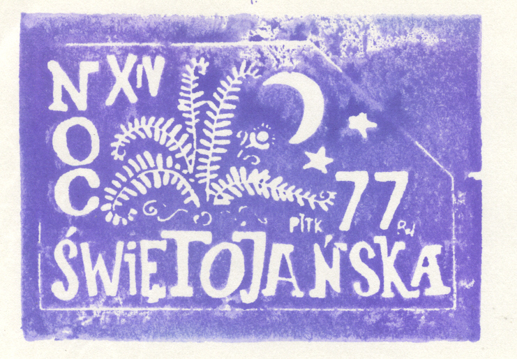
Well its a stamp print and I want to archieve the whole thing at all, not just special parts in this effect. If some look bad, I still can skip them.
-
Arrgh, I meant stamp.
This is the effect I'd like to archieve: http://jedynka.om.pttk.pl/galerie/Piotr ... a_1977.jpg
-
I'm trying to get a effect similar to a stomp when used, but im seriously out of ideas. Anyone got some?
-
I Love TrackMania tis awsome, nice screens by the way

yup, hopefully there will come something new soon.
Here is something I did with the antiquing tutorital:

-
Oh I like that a lot, Atze Peng.
I did something similar but my laptop crashed and I lost it....silly me for not saving!

Thx but the Rays are improveable. I may will try it again these days. Already got some ideas, to bad the Dent-plugin makes them look less realistic, but the turning of the rays make it look better than without.
Edit: I've tried some stuff, here is the outcome (still improveable):
Any Ideas to improve the Rays? Did it with 2-3 Zoom blured layers and different settings in Dent's plugin and an Cloudlayer with settings 'Overlay'


-
How about this one: Crushed sun short before imploding.

-
You have to upload it on a picupload site (tinypic.com , imageshack.us , etc.), tale the URL (http//:www.xyz.com/xyz) and and use this command, where you but the URL inside: [img*]URL[/img*] but without the *
-
Well I tried a bit with colors and different effects.
Here are my results:
This was my first try and I added some colors.

This doesnt look like an planet due to the mud, but because of the effect it still looks nice somehow.

Here I played a bit around with colors and other effects and tried to get lava. (click on the picture for bigger size)

Here I got some lava and gas pouring out. I did that with several layers and cloud effect(click on the picture for bigger size)

-
I combinied this tut with the Antiquing one.
Thats the outcome (didnt had an different motive right now)

-
- [*:3rfbhjl7]Create the text layer, white on black:
- [*:3rfbhjl7]Use a large, blocky font
[*:3rfbhjl7]Blur this layer with a gaussian blur so that the details of the text are still recognizable (holes in letters like 'A' shouldn't end up closed). One eighth the point size works well. The stronger the blur, the less readable the final output will be.
- [*:3rfbhjl7]Use a large, blocky font
[*:3rfbhjl7]Create the difference clouds layer
-
[*:3rfbhjl7]Set the blending mode for the clouds layer to 'Negation'
[*:3rfbhjl7]Render clouds with the scale for the clouds at roughly twice the font size.
[*:3rfbhjl7]Repeat it a bunch to get a whispy look
I dont get this part. What do I have to do excactly?
- [*:3rfbhjl7]Create the text layer, white on black:
-
Searching after thinking would be better^^
-
I made this Pic for a Bannercontest for a Website:

I know, the Car still sucks. Next week I get a new PC and can do the screen of it with much higher Quality. Should look better than.
Anway, some Tips to improve? Especially some tips for rendering would be nice (well, this one looks so bad, due to the bad quality of the original Screenshot)
-
Actually, my good sir, that is very simple to figure out. Wikipedia says that A4 paper is 210×297 mm. Let's convert that to centimeters, 21x29.7 cm. Now go into Paint.NET, and simply insert those numbers in the "Print Size" box.

And Paint.NET outputs: 794 x 1123 px (That's the default of course).
To anyone else: If I am wrong, please do correct me.
Yeah I got this solution right after posting.
Should remember following thing:
Step 1: Thinking
Step 2: Posting
And not the different way >.<"
-
How much Pixel does a A4 Paper got?
-
Thats already nice. Any other suggestions?
-
How to do a nice background with paint.net?
Dunno how to do.
Would like to give you an specific pic for it, but I don't have one, was just wondering. When you post examples or something, please also tell me how you did it.
-
I think and will always think that Boltbait's version was better, but if Atze Peng wanted to achieve the effect that i came up with, then thats his choice.

In the case I used it your way worked out better imo.
-
really nice boltbait, but already got the effect I wished for thx to lfc4ever, but I'll remember ur stuff there ;-)
-
PDN have a Pencil sketch effect. Looks like that last image, IMO
I stated above, that it doesnt really look like a drawing, atleast not at the picture I want to use it at.
@ LFC4EVER
thx, this really helped me a lot.
-
http://tutorials.designnation.de/worksh ... -Zeichnung
like the last pic here
-
Then it wouldnt look like a drawing either. More like some drunken picasso for poor guys
-
Well, there is this function in paint.net, but somehow it doesnt really look like it, when I use it on a car with metallic look, could someone help me how 2 do? It shouild look like a real drawing.
-
thx Zizoiz for ur nice praise, didn't want to spam, otherwise would've said something earlier hehe.
Here a new one:

Didn't made much on it. First I sharpened a bit and then I cut out the parts I wanted to do black&white. For the font I used "Drop Shadow" & bulged it a little.


how to copy this Photoshop effect
in Paint.NET Discussion and Questions
Posted
Well I've seen an effect in an youtube video a while ago when they are doing afterwork on the models faces and going over it with some kind of circle making the colors similiar to remove some spots in the face. I thought this function seems pretty interesting - not only for faces. That's why I'd like to know if there is some way of copying it in paint.net or a plug-in or something.