


ZizOiz
-
Posts
617 -
Joined
-
Last visited
Posts posted by ZizOiz
-
-
Wow - I like ALL of your work! Very nice stuff. And as Axle said, new piece is EPIC!
Thank you!
-
drawn in pdn??? still, EPIC. i like your work

Thanks!
I drew it in pencil, and inked the majority of it with a variety of felt tip pens that were a recent purchase. Then I scanned it in and colored it only in PDN.
-
I finally finished this, after more than 30 hours of work, and I suspect, more than 35 hours.
It's certainly on the the largest pieces I've ever done, if not the largest (photobucket decreased the size back down to 1 MB, methinks) and it's taken one of the longest times to do a picture I've ever taken.
However, I would like to make this picture be the best it can be, so I'd appreciate anyone who'd enjoy nitpicking at the smallest details, like the angle of the shadows cast by the houses, the shading on the domes at the top of the village, point out if the water streams look funny at all, etc.
Here it is:

Click for view at maximum size.
-
Hello, Kevin B, and welcome to the Paint.NET forums!
I like the way you combined the images, though perhaps you could try making Homer cast a shadow on the ground in front of him, since he's blocking out the light from the explosion there. If you're, by any chance, looking for new things to make with Paint.NET, I would recommend checking out the tutorials section of the forum. There a plenty of neat tools and tricks to learn that make working with Paint.NET both easier and more fun.
-
My favorite is the Demonata signature. The more detailed skeleton is set off perfectly by the abstract, yet somewhat detailed background. The image as a whole ties together quite nicely, as with the rest of your signatures.
-
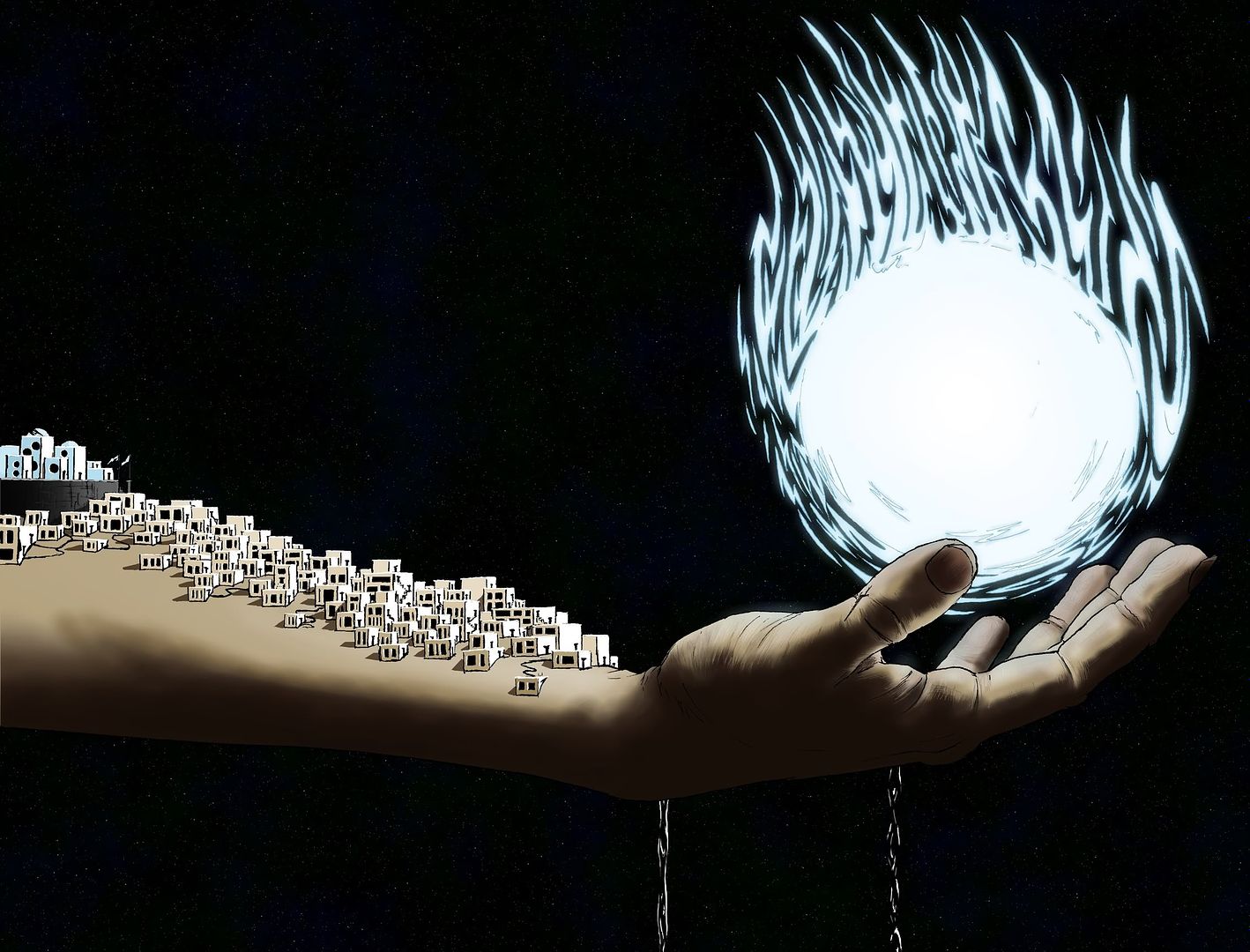
I concur. The texture on the planet adds dimension and interest to the whole picture. It looks a bit like the ground is layered, somewhat like waffles stacked atop one another. The cascade of stars also adds movement to the piece, since they become greatly more prominent and dimensional on the right side of the image, fully balancing out the flare of the sun on the left.
-
Goonfella, if I may say so, the table is quite amazing. You use shadow to excellent and realistic effect--the only thing that looks slightly off to me s the disconnect between the shadow cast by the legs of the leftmost side of the table and the surface of the table itself.
The small detail you added on the most prominent corner of the table--the small gleam really soften's the table's edge and makes it much more realistic.
-
Belated thanks, HELEN, survulus, Cola, Gamer_World14, and Jokes On You.
During my absence, I have created a few new things, most notably these two pieces:
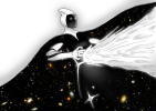
Sketched with pencil. Scanned in, inked and colored with PDN. The stars in the cape are from a Hubble deep space photograph.
Sketched with pencil, scanned in with lineart done in Adobe Illustrator CS. The color is PDN.
If I finish the current object of my attention tonight, I will edit the post to show it, as well.
-
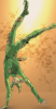
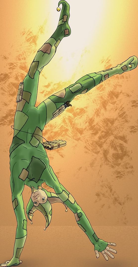
...triple post :shock:

anyhoo, I'm quite proud I actually managed to draw a somewhat proportionate human being without it looking the the person was dead.

So I made it my background. Click for bigger.

-
1.Use the color picker to choose a color from the dark part of a portion of your image.
2.Click on the little square above your pallet and click on the next square in your pallet. (if this is the first time, this should be the first square)
3.Use the color picker to choose a color from the light part of the same portion of your image.
4.Click on the little square above your pallet and click on the next square in your pallet.
5. Repeat steps 1-4 for each part of your image.
6. Select the first color, and color the part of the image it's from using the brush tool.
7. Repeat step 6 for each color you chose
8. Resize
Hope this helps
-
you could have asked this in your own thread, as the pictorium is only supposed to contain one thread per user, but...
it looks like you're trying to post pictures off your computer without uploading them to the internet.
Obtain a Photobucket or Imageshack account and upload your pictures onto their sites from there. Copy the url of your pictures and use that as the image location.
Alternatively, look at this.
-
the text in thy christmas sig looks sort of like candy canes in wrappers, the way you applied the shines to them.

Wonderful work, as always.
-
You might want to look at the tutorials section for text effects. While there are no tutorials doing exactly what you want, you could do all of them and/or modify them to suit your needs.
This one looks like it might help you most, though.
-
I really like your second abstract, your first wallpaper and your second uncategorized images, especially the wallpaper and the uncategorized images as they use color to draw attention to one part of the image. The last, especially looks like a prism.
-
I would reccomend simply choosing two colors, a light an a dark, for every part of the picture, and going over the picture with the brush tool, and later resizing. There may be an easier way of doing this, but this is the simplest I could come up with.
To come up with your colors, simply use the eyedropper tool on an average pixel for an area.
Hope this helps.
-
I really like the double ribbon around the present. (and of course the wrapping paper)
I wish I could tie a present with a double ribbon. That would be lots of fun. And then maybe using three or nineteen. Nineteen... that would just be mean, since you'd have to slide each individual ribbon off before you could open the present.
-
Certainly. The tutorial there will go over the basic functions of Paint.NET, including blend modes if you go to Layers at the top of the tutorial, then go to Layer properties.
-
I really like the flow of the piece, and the color scheme ties it together. Your Christmas ornaments I like.
-
I like the way the purple tint of the picture unifies it. Are hose rose petals falling on her?
As for your photo manips, I like the second one. The cards are sort of half there, though. I would recommend blend modes if that wasn't your intention.
-
Welcome to the forums, Noogai131! Make sure to read the rules....
excellent work for your first time using Paint.NET, I hope to see you continue to post here and grow.
-
I really like your second sig- the hexagrid is used very well in it. And your spaceship is most excellent.
-
Monkeys! not another double post! :o
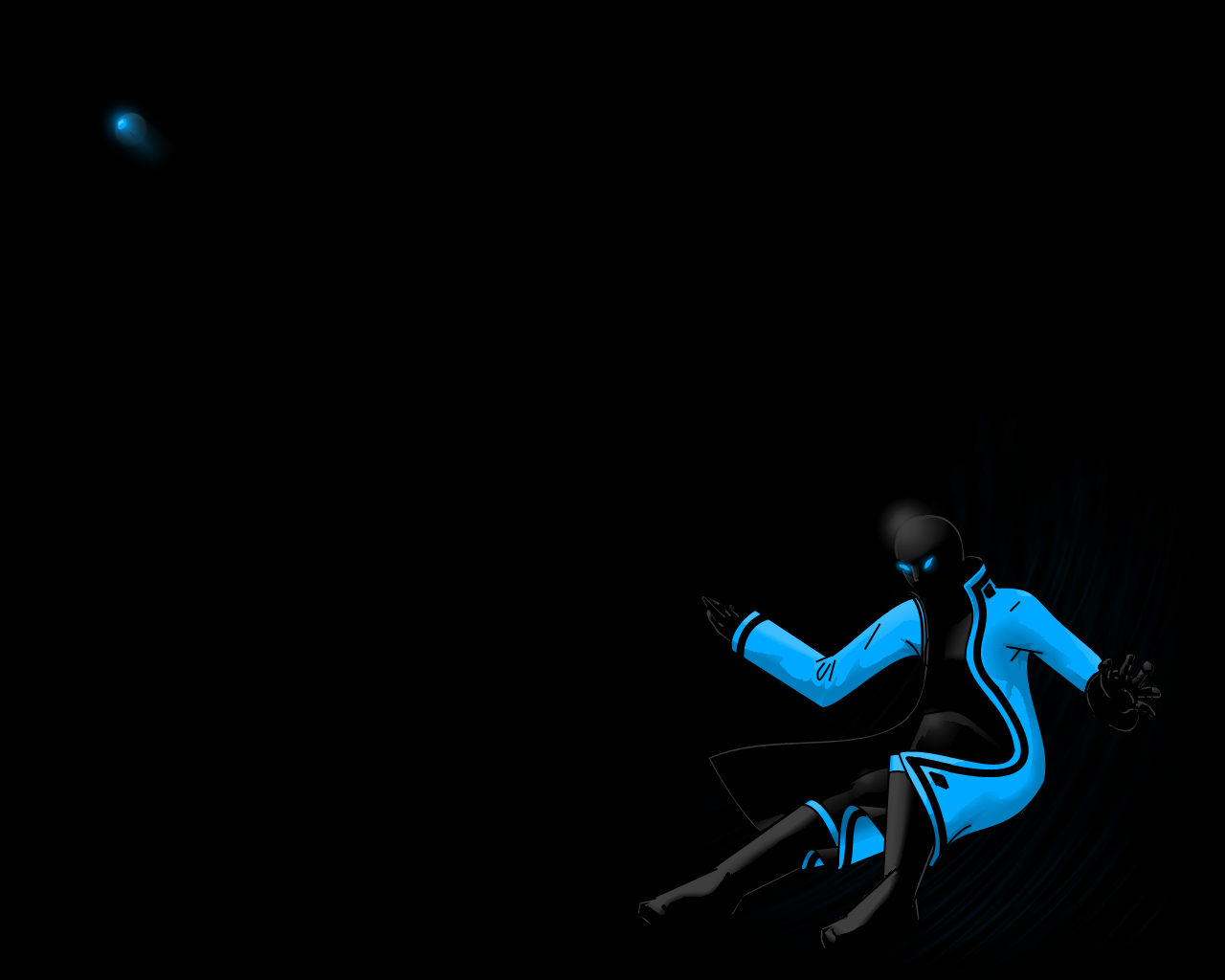
I liked it before the change. I like Nab's idea and intend to try it out on some stuff but your image seemed to lose something to me and didn't fix the whole problem. The lighting or color seems different, maybe it made it a little darker. I would think that you put countless hours in on a piece like this and what are a few more hours. If you really want to get rid of the line drawing look, which for itself is a nice look, I would use the smudge tool. It would take painstaking hours of work but the piece is worth it. And that is the most I have ever had to say about anything. I just like it so much. It is a great piece as it is but it could be all that. It is like a glimmer of hope in a dark cold world.Thank you very much!
 It is like a glimmer of hope in a dark, cold world.
... profound, but so true.
I liked the 1st version better, but either one is a testament to your pdn skills.
Nice work
Thank you!
here be my submission to the holiday card contest. I be quite proud of it!
-
put one in a layer on top of the other in a single picture.
From here, you can do two things I can think of off the top of my head.
1.erase the part of the top picture that is not in focus
or
2. Use the clone tool, with the source set to the bottom layer(press control while clicking to set the source, and make sure the right layer is selected) to draw on the top layer.
Hope this helps
-
I believe in the top part of the dialogue, there are options to include the sides and top and bottom in the rendering of the shape. Simply uncheck the option to include the top and the top should dissapear, rendering an open box.
Is this what you mean?


Image Umbrella: Realistic Images
in The Pictorium
Posted
I think I spot on the left side of the cup, lower line, a part where it goes a tiny bit over the side of the cup. It could just be in my head, since I see something similar on the other side that looks just fine as it is.
Other than that, it is an absolutely marvelous rendering of a teacup, especially the subtle but effective reflection on the side facing the vewer. It really adds to the realism and dimension of the piece.