


LFC4EVER
-
Posts
2,430 -
Joined
-
Last visited
Posts posted by LFC4EVER
-
-
Rim Changes - Cutting the old rims out and replacing them with new ones will help. I suggest to replace it with a head on view rim image, that doesn't have any noticable perspective, then use Layers > Rotate/Zoom to match the perspective of the car.
Skirt/Bumper Changes (such as make the skirts and bumpers look bigger then they actually are) - You could try cutting the bumpers out and scaling them to your liking. If you want the tuner bumper kind, you'll have to find a stock bumper image of a similar perspective to get a good look, and replace it, or you'll have to draw one yourself..
Lowering Effects - Cut the whole body of the car out and paste on a new layer. Move down to your liking.
Colour Changes (such as 1 solid colour or how to make look 2 tone) - If you've cut the whole body out, use either color filter, curves, or Hue/saturation to change the colour. For a two tone effect, make the body grayscale, and use gradient mapping.
Background Changes - Cut the whole car out, and place on a new layer. Delete old image layer, and place new background image below the cut out. Having similar lighting conditions helps immensely.
I've edited some tips in the quote above. What i've written is in bold. Additional plugins you may need are in italics. You can search for these individually or just go to the plugins section of the forum and download the packs from threads that are pinned.
http://www.isimonbrown.co.uk/cutting-out-images/
If you want to customize a car this tut will be a big help in doing what you want to do. You'll have to cut each part out that you want to modify or replace.
If you're relatively new to PDN, then i suggest familiarising yourself with the program by trying out some tuts in the newbie playground, here: http://forums.getpaint.net/index.php?/forum/20-newbie-playground/. Modifying a stock image of a car to look tuned is not easy, and will take a fair amount of effort if you plan on changing the stock car significantly, which it looks like you're planning to do.
Good luck, and don't give up. Persevere and you will succeed.

-
I think the page would be better if the translator wasn't with the actual content, and in the sidebar or something. Also, not liking the poor quality of the image in header, but i think you've done that to keep the file size down?
Its great overall though. Like Crimson said, very intuitive.
-
126,000 x42,000 pixels, whoa. Thats 5300 MegaPixels lol. I doubt you need such a high resolution for a 30x10ft banner, unless you need it printed an exquisite detail. I think that a smaller canvas size would work, but if you up the dpi, then you could probably get away with working at smaller sizes. I'm not too sure though, i don't print much of the stuff i do on PDN.
-
aguba, your text effects are amazing, really amazing. Just love 'em.

-
you have some good work here and i can see you're experimenting, which is fab. The fiery, twisty, snail type piece is my favourite. Looks great!

I've gotta say this though, judging by the quality of the work you've posted in this gallery, it doesn't seem to me as if you made the following piece entirely in PDN, especially the water.
http://i1028.photobucket.com/albums/y348/PsychoHarmonic/th_boom.png
It looks to me as if you used a stock and photo manipulated it. You may think different, but many others and I think that it is ok to use stocks in your work. What is seen as 'wrong', is claiming that you created the stock from scratch. Thats my view anyway.
I'm just putting this out there, and I may be wrong, in fact, i hope i am, because the effect that was supposedly acheived is incredibly realistic.
-
..but i do asure you that is it a pixel image.
I don't think so. I took your image, and then one that flip posted (resized to 100x89) of course. Ran auto level on both. The same horizontal stripes occur in both. There is really only one plausible explanation for this, and most of us know what that it.
see below for proof.

-
If it was 100% in PDN from scratch, its astounding work. You really should try and recreate the effect, or something similar and post a tut. If thats not possible, then please post the .pdn file somewhere. I'd love to take a look!
Btw, my only critique is that the colours are too monotone. Some variation in hue would help.
__________________
olav.k.m, that texture is awesome. Fabulous piece!

-
If I'd have known LFC4Ever was entering, I'd have hung up my mouse.
I think the quality of the entries is a testament to the friendship, support, advice & encouragement we receive through the forums. Well done all!
Haha, thanks.
Everyone who entered produced some fantastic work, and i agree with barbieq25, the work does show the significance of the community-like feel of the forum. People are improving in their artwork constantly. Its great!
-
You can post your masterpiece in the Pictorium for everyone to see though. We can all gaze in awe at it, perhaps?
-
I've made the the starfield, but thats about it. I hope to enter this, but i'll probably enter the next one if i can't meet the deadline. Extending the deadline isn't really necessary if an additional 2+ entries are given in.
-
Clever tut and a great result. I'm gonna experiement with this to try and mimic PS' chisel hard layer style effect.
Thanks.
-
This tutorial may help: http://www.isimonbrown.co.uk/cutting-out-images/
combine it with alpha masking and you should get yourself a clean cut out, except the hair, which is always a problem.
-
try the above plugin. you'll need to make white dots on a black background for it to work though.
-
@ LFC4EVER: Seeing the thumbnails I thought it was just going to be a clouds, noise, motionblur kind of fur, but that looks really good. The (lighter) wavy hairs stand out in a good way, making the fur look "sharp" and detailed.
Thanks.
the lighter hairs stand out because each shade of each strand of hair was done invdividually (gradient bars
), but i've still gotta get the layered look right, it seems off to me at second glance. -
great tut and a neat result.
olav.k.m, that is a very realistic toad texture. Awesome.
-
I also agree on not tiering the competition, and Possum said it well, the more simple the comp is to run the better it is for everyone.
A single difficulty tutorial competition is fine as it levels the playing field, and the need to differentiate between which tutorial falls into which category is eliminated, which is great as i think that if there was to be a novice, medium and advanced boundaries the line would be considerably blurred.
I like the idea of the PS and GIMP tuts competition too. would be interesting to see other peoples methods to produce a similar result.
-
uvah, i'm glad you perservered with the tutorial, but although it may have been difficult, you've got a fantastic result thats looking really clean. Awesome job.
if you want to add some 3D thickness to the text, flatten the text without the drop shadow onto a transparent layer and use the trail plugin. It may work, i havent tested it though.
btw, sorry for the late reply.

-
Yeah, the plugin above is your best bet, but bear in mind it outlines the text you have already written, and if you want you'll have to remove the original text if you just want an outline. This plugin may help in doing so:
-
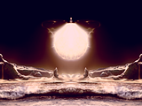
Nebulae has too much contrast. =(
Make the planets look better by giving the texture more clarity. Give it a tad more contrast, perhaps?
Keep it up.
-
Spectacular work. Can't really add any extra improvements, they've pretty much been said already.
Only problem for me is the orange planet, not feeling the colour of it, but thats just me, proabably.

Can't wait to see the finished piece.
-
oh, ok then. Igonoring the UI, the plugin is fantastic. Saves a lot of selecting and moving text letters individually to get the right look. thanks!
Hope you wont mind some more suggestions, but i'll suggest anyway.
- add an open type font compatability.
- perhaps a kerning in the y axis option?
- scale the text from the centre of the text, not the top left?
anti-aliasing doesn't always work at larger font sizes if set to 2. it works pretty much all the time if set to 1.
Thats.. about it.
Great work though! Loving all of it, well, most of it.
-
The c4d going thru her face is so she doesn't look pasted on.
Not a good idea. Dont place something over the focal point just to make it seem like its not pasted in. To make something not seem just pasted in then add effects around the focal point, in the foreground and background. you could also blur some elements for a greater sense of depth.
The sig isn't bad itself, good colour variation and some fairly interesting effects. the dots are too uniform though, some variation in size would help.
Keep it up.
-
congrats to yellowman on winning and well done to everyone who entered.
I'm gonna enter the next one; hoping for a good theme.
-
why not have a drop down box for each character and just one slider? That way you can choose which letter to adjust the kerning on and adjust the slider for the chosen letter?
btw, i have no idea whether or not the above is possible, i'm just throwing out an idea here.

Goonfella`s Gallery - New Frontiers 28.02.16
in The Pictorium
Posted
Xbox looks like it was cut out from an official advert or something, its that good. Awesome job on recreating it.