


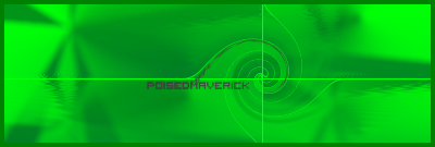
PoisedMaverick
-
Posts
100 -
Joined
-
Last visited
Posts posted by PoisedMaverick
-
-
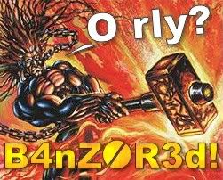
BLAH!
BLAH!
BLAH!
I've been lacking ideas, majorly.
It's quite sad.
And because of it, I haven't been around the forums lately.
I'm just dumb.
But, I forced myself to think in a chair and conjure up something.
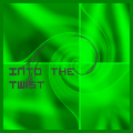
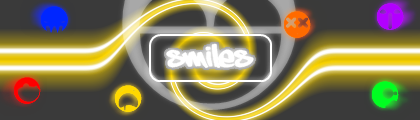
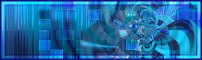
Here's the new sig/ava combo: REPEL
 |
| 
-
Wow, thanks Helio. =/
I was actually thinking about taking a shot at entering, but now since I've seen yours, I know I stand no chance.

Good job.

-
WOW.
These floor me away.
Really.
They'are at a level where I really can't properly give criticism.
Are you for sure that the first and last ones are 100% PDN?
-
Hey all!
Thanks for the comments guys.
Sorry I've been away.
Life's been hectic with school ending and what not.
But I've still been working in PDN, just most it of was Photo Editting.
I did manage to make something I was/am very proud of [more of sig than ava].
-
I was just simply experimenting with new vector brushes.
But I like it enough that I want to work with it.
I was told that it's overly contrasted and has too little colors...
What shall I do?
(I also don't like the text font and placement, but is it fine?)
-
Thanks!
Yeah, ZizOiz! That was my first thought too!
Haha
-
@PoisedMaverick- I'm glad you like it. The cube one was just a Shape3D job on a gradient background, so not too hard...
Yeah, I figured as much, but it's simplicity still makes it nice.
-
Wow.
You're obsessed with death, eh?
They made me laugh.
Yeah...
-
Wow, that's pretty nice.
I have yet to get into the planet/explosion creations yet, but these are pushing me more now.
Great Job.
-
Wow!
I have the same thought/question as -Epiration-!
haha
I give you mass-kudos for that work.
Makes me feel like I should just quit making creations cause your's just blows mine away.
-
I actually really like your current signature.
I love that font, and the placement on it is really good.
-
I really like your 3rd image, and your latest ball/orb image. They are really cool and inspirational.
-
Just for the use of that picture, D.A., you are forever a hero to me.
Lol
I actually really like your 3D Cube and your sunset sig.
-
6 things posted!
 +
+ 
Random Bars:
Then the three that I did following tutorials.
The one with the person isn't me.
I'm a MAN.
That's just my girlfriend.

-
Olli, I see coffee spots.
But really, I love your work; as simple as it is.
-
I don't know how to help you with the sword, but I think those flowers are awesome.
Can't wait to see your other projects.
-
I really like your stuff.
Your Sun and planet (first) is awesome, so is your sunset.
Great stuff, keep at it.
-
Wow.
I really like your work and style.
My favorite just might have to be the Blueish Rectangle thing. (Avatar?)
-
3, YES, 3 Added!
A cheap-rip-off of one of simple's signatures:
And my first Avatar-Sig combo, thanks to the artistic style of Crimson:
What do you think!?
-
I really enjoy your artwork.
I really hope that I can gain even a hint of talent from looking at your creations.
Wow
That sounds cheesy.
Haha
-
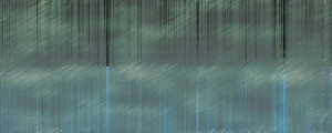
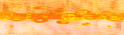
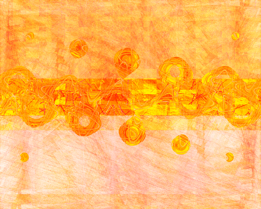
I finally worked some more on my randomness picture.
It's pretty lame. I just wanted to mess around with a a variety of effects.
But I guess it's cool to some extent.
It originally was supposed to be a wallpaper, so you can click on it to view it's original form, which I find to be pretty nice.
A lot better, eh?
[i realize there is no border. The reason for this = none.
 ]
] -
Thanks everybody.
So....
I ended up adding another layer for a very little difference.
And then change the color scheme to be more of a cyan-like color. I did this in consideration of IceFusion's comment as well as a bit more of a contrast. I'm not sure how well it worked. I also changed to border.
Yeah???
Nice work Poised pritty much the same comment work on your colour schemes i mean i love brightness and lots of colours but try to stick to 2 maybe 3 colours max then peoples eyes are not being dragged everywhere and no ones getting seizuresP.s i hope you like my tut i sent you
I'm assuming you're talking about my randomness signature(s). I just went crazy for about 10 minutes and ended up with that. I plan on changing it around to one specific color scheme soon.
P.s. I have yet to look at it, but thanks soo much.
-
UPDATE!!!
I added my current signature and avatar, plus the randomness signatures.
I'm am really starting to grow a deep passion for this stuff now.
Too bad my knowledge of PDN isn't growing as fast.
-
I find the idea good, but it doesn't look like there are that many layers of the render, and almost seems like you only have one layer of it.
[Whoa, that somewhat doesn't make sense, maybe?]
Hopefully you understood what I meant.
It might help if you changed the color scheme a bit.

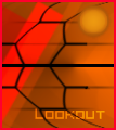
PoisedMaverick's Signature Sigs [Added~Imbued Combo 9.30]
in The Pictorium
Posted
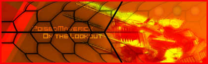
AYE!
I am back.
And with my return, I bring you the imbued combo!
It may not be much, but I tried a few new things, and got a decent result.
Also, the render was hard to work with.
Here!
--
PLEASE be sure to check back soon.
I plan on making a lot of stuff within the next few days.
I just hope I can make some times to sit down and do them in a sitting or two.