


bEPIK
-
Posts
288 -
Joined
-
Last visited
Posts posted by bEPIK
-
-
i think he means plugins like tube oblique to bend the text...Text isn't editable in Paint.NET, but you could resize it and recolour it using several different other tools.
Nope, that sounds like floating window tools to me (

 )
) -
He was referring to the Floating Tools Window in Paint.NET.
-
Opening the effect in the middle of the image - It's been suggested but I don't know whether or not it's going to happen. I hope it gets implemented.
Only goes down to 1 - You don't need to do all those steps you can press 'OK' and then Ctrl+Z (undo) and Ctrl+Y (redo) to see the changes. I agree though, it would be much more convenient
Open up at 1 instead of 2 - I agree with that as well but if every effect/adjustment had an option for it's defaults individually, it would confuse the bejeebers out of people new to graphics editing. So maybe an option to 'remember last used' for both effects and adjustments, individually. Or ONLY change sharpen's default to 1 and leave no options for the others.
I like your ideas
-
I'm the other way. I much prefer it in the "photo' submenu because the majority of the time that is what the plugin would be used on (for my needs at least) and because my adjustment menu is already huge.
Either way it's still an excellent plugin. Thank-you very much Tanel.
-
Try using geometry. Look at the image, do you see the patterns?


The complete image will be more complex than this but the angles for everything isn't hard to find out. Just use the Line/Curve Tool to draw over the compass and (while the mouse button is still held down) look to the status bar. This will tell you the offset, angle, and length of the line. To get the squares on the correct angles use Rotate/Zoom (Menu>Layers>Rotate/Zoom or Ctrl+Shift+Z). Remember/learn to use layers.
I hope that helps and good luck!
-
This is my favourite tutorial and was one of the first pictures I did. It was difficult for me back then but the end result was good, but I wanted to make it different, so I did.

I changed it to a 8Bit PNG for people with slower internet connections
Thanks barkbark
-
...is there an easier way than what I'm doing...
Yes. That's what layer saver is for. I'll post a few screen shots in a minute so you know how to do it.
This is how you do it:
1. Make your PDN and a folder (organisational reasons). I'm gunna call mine 'Ball'

2. Load your new PDN ('Ball') into Layer Saver and use these settings*

3. Open UnFREEz, highlight your new gif files, and drag them into UnFREEz

3a. Make sure that the layers are in their proper order. My 6,7, and 8 were in the wrong place so I had to highlight and drag them again
4. Shower me with praise

I haven't used layer saver many times (this mini-tutorial was the second time I've used it) so I may have done some things that were unnecessary like naming the layers 1,2,3 etc.
*possibly/probably with minor adjustments in the names of 'File' and 'Folder'
-
This topic explains everything that you need to know.
-
Paint.Net currently requires .NET Framework 2 and to install that windows installer 3.1 (which is safe by the way) is needed. You didn't need to do anything last time because somebody who has access to your computer may have have gone to 'Windows Update' and installed all the 'Custom' updates.
Rick Brewster (the guy who made Paint.net) knows about the problem that you're having and has fixed it. The fix will probably be included in the next update (Paint.NET v3.5) and should come out 'soon'.
If you can't wait;
Download this: Windows Installer 3.1
Then this: NET Framework 3.5 SP1
And install them in that order.
-
@Drone - Perhaps you're using a non-Official Windows theme. That can stuff up a few things.
Just to clarify the official Windows themes (that I know of) are: 'Zune' (not included in Xp but it is still an official theme), 'Windows Xp' (blue, green and silver), all the 'Windows classic' ones, and something called 'Royal'.
-
Could you please post the picture. I've got an idea.
-
If you mean like this:

You need to install Ed's Plugin Pack. Then you need to open your picture and duplicate the layer. Next, go to "Effects>Colour>Extract Channel..." and choose "CMYK - Yellow" (because the car is yellow) and make sure the "Grayscale" box is unchecked. Now set the edited layer's "Blending Mode:" to "Multiply" by double clicking on the layer. Install and adjust the hue and saturation by using this improved version of Hue and Saturation. Finally Erase out the parts you don't want to be affected.
Here's a PDN of it if you wanna have a look
You could do that way or you could choose the quicker way by using the Conditional Hue and Saturation Plugin, but that can sometimes yield less than professional results because how it changes the Hue and saturation is not as good as how Tanel does it.
-
1. Download this Program - FileTypesMan - and Open it
2. Look for the Extensions you want to edit
3. When you find one Double click on the 'Edit' row and change the 'Command Line' to:
"Where you installed Paint.net\PaintDotNet.exe" "%1"
(with the quotes)
So you would most likely put in:
"C:\Program Files\Paint.NET\PaintDotNet.exe" "%1"
(Again WITH the quotes)
If the file doesn't have an 'Edit' thingy at the bottom, make sure you've got the offending filetype highlighted, click on 'Actions' (at the top)> New Action. Then for the top two boxes type 'Edit' and for 'Command-Line' put in what I explained in Step 3.

If you do that you can put in ANY FILETYPE (although you should probably make sure it works in PDN). I hope I wasn't too confusing :?
-
An hour, 2 minutes and twenty seconds for a worthwhile feature. Seems reasonable.
-
I don't think 'Cristiano' has a 'h'. Also use a transparent gradient or something on the left foot; it looks like it's been cut off. Other than that it's pretty good. :o I like how the thick line flows with the direction of the kick.
-
Wouldn't organising effects be better?
"Ability to organize/manage effects -- This one's interesting. Now that there are so many plugins available, people now need the ability to organize them, like into sub-menus or something. Will probably make it into a 3.x0 release (3.20? 3.50?) "
Now I'm not saying your idea is bad, but considering that you might be able to organise your effects in a 3.x release it would just slow Rick down. Effect menus a bit larger than the floating windows would be very nice, much better than 3 columns. But it could work well if your submenus are huge, it might look a bit ugly though. Also that could be fixed by menus inside menus with the current plan (the ability to organise effects). So I reckon it's a no-go, unless it's quick and easy to implement of course.
-
Qwerty is what you're looking for the Selective Palette plugin? (Scroll down)
Here's How to Install Plugins
-
How about an option to show 0,1,2,3,4,5 or 6 rows of the colour palette when the Colors Window is in 'less' mode?
-
To choose whether or not pdn automatically deselects a layer which you turn invisible. And whether the new layer that is selected is above, below, or the last visible layer used. For example if you're working on a layer and you deselect it, Paint.net moves the focus onto a new layer. This can get annoying depending on what you are doing.
Also the option to automatically select a layer when you click the empty box. It's caught me a million times where I've thought that pdn would have selected it when I turn the layer back on.
-
Learn How to install plugins, This Tutorial (for the design of the logo), and go to Dafont (website for free fonts).
Once you've got the hang of those Get the Alpha masking Plugin and Read How to use it. You can use Alpha masking to fit the 3 inside the apple (with aliasing (smooth edges)).
Follow that and you'll be able to make that logo in no time.
-
Is this the list? And what I do so that I don't Have a duplicate of my moved image is press just the arrow key and then press ctrl+arrow how ever many times I want.
-
How about an option to choose whether a new layer goes above or below the currently selected layer.
Also how about an option to have left click on a nub to do a bezier curve, and right click on a nub do a normal curve - the opposite of the default.I use the Bezier curve 99% of the time. So I would very much like a setting to choose between:1. as now.
2. Always Bezier.
3 Always normal.
-
Pipp try making the words have more contrast and adjust the lightness to the brush on top of them. Since I don't have the PDN I've affected the whole image but personally I love high contrast, like what you've done with the player. Ive also shifted the hue (more aqua) and (added more) saturation. Or maybe that would move away some of the focus from the player. Just try it and see if it looks better.
You can use Silhouette+ to make a alpha mask from the words then use the mask on the brush overlapping it so it only affects the part of the brush that is on top of the word. I also like the contrast from the background the the player in the top picture (the edited one) - but again that's could just be my preference.


RedFalcon that looks a bit too cluttered to me - The focus should be on the player on these kind of images. See how when you look at pipp's picture you attention goes immediately to the area where the player is. Yours does that to some extent (with the change from blue to orange), but it could be better. Try doing this by darkening the area that's not around the area close to the player.
Also it looks like you haven't done much work on the actual player and have just made a background and put him on top. Try brightening him up, using some Photoshop brushes (just convert them to PNGs - there's a tutorial on the forum) and then adding more contrast . There's also room for improvement on the font, there's a few good tutorials on making your own have a look around for them specifically Jake2k's 3d text tutorial.
Where do you guys (Pipp and RedFalcon) find these pictures? Could you please give me a few links?
-
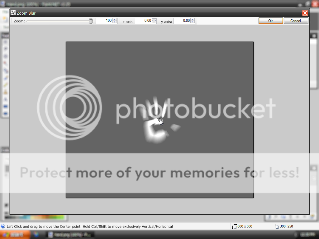
All my Center based Effect GUI Ideas. You can click on them to make them full size.
Idea1

Idea2

This idea (and idea3) would have this in the statusbar

Idea3

Idea1 was to make the sliders positioned more logically. Notice the Horizontal increase/decrease arrows are flipped 90degrees making it easier to know which way it's going to move. I've put that on all three of them.
Idea2 and Idea3 remove the sliders but retain the functionality of them, look at the status bar and you'll understand.
Personally I like 1 and 3 the best. Idea1 because of the naturalness of it. It does what you think would work like if you knew nothing whatsoever (or very little) about computers. And I like Idea3 because it allows greater accuracy and is still sort of natural (though not as simplistic as Idea1 (because you'd have to hold buttons instead of move sliders)). What do you guys think?

 )
)

I can't edit text :(
in Paint.NET Discussion and Questions
Posted
How about this plugin? I'm not sure how well it works as I don't use/need it.