


tourist
-
Posts
117 -
Joined
-
Last visited
Posts posted by tourist
-
-
You know, I would walk a mile for that camel OMA. There are a lot of great looking pieces on these last few pages, I'm impressed.
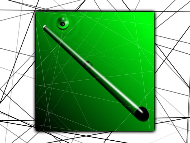
Myself, I have put the airplane project in the hanger for a while. It is keeping the pool table project company.
Not real sure where to put this :?: :?:
I have not been on the board for over a year now. I've been busy getting married, moving, and starting a new career. It is good to be back. I may have some time to get back into this great past-time. I was very surprised to see this image in the Gallery. Thanks so much for that!!
More to come in the future...
-

How's this?

Ha Ha that is great
 . Is that Detroit?
Here's one.
-
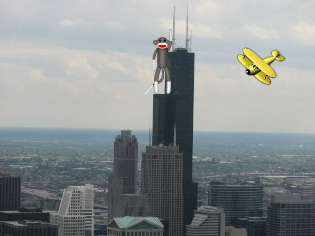
King kong! and your airplane. in the same picture. so funny, so cute, so good.
thanks for the chuckle.
ciao
You're welcome. 8)
-
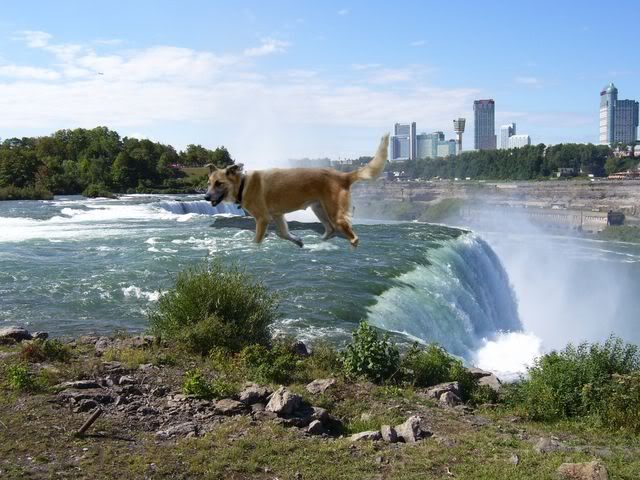
Oh my God!! What is going on in Chicago??
-
Anybody ever have one of these?
-
The image looks neat, but - The Republican Convention? - Naaahhh, I can't believe that, Tu Quoque Touriste, fili mihi ?
Ciao,
There's nothing wrong with being a Republican, is there? I don't know any Italian :? .
Janettsue, you must have your own special color palette. Nice!
-
Thanks ya'll. Yes I am from the deep south
 .
.Nice looking fruit Oma. The beverage also looks real good there Crimson.
I made a rendering of the Republican National Convention stage (bored, I guess
 )
)
-
worldnewser you have been busy! the olympics one is good, but I Love the rift manipulator and the planet is super. I went over to your da account for a better look and the rings are spot on. very very good.
tourist why did you call that one dogbone? That is very stylish looking. I just think it is so creative. great great great job.
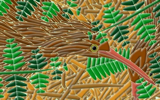
must be the night for birds. I had thought I was finished earlier this evening but something was nagging at me about my last picture....so I went back and reviewed it. now I'm hoping I'm done any comments or further additions to this one? please post them in my gallery that way I can find them when I make next picture. thanks
as always thumb here larger version in my gallery pg 11 along with screen shots
Your bird is very nice and very creative. All I did with my bird was follow my fiancee into Michael's (a craft store) and buy a book called camoflauged birds (I think). Someone else did the drawing, I just did the coloring. It does make an interesting desktop background as will some other birds from the book.
-
You know, I would walk a mile for that camel OMA. There are a lot of great looking pieces on these last few pages, I'm impressed.
Myself, I have put the airplane project in the hanger for a while. It is keeping the pool table project company.
Not real sure where to put this :?: :?:
-
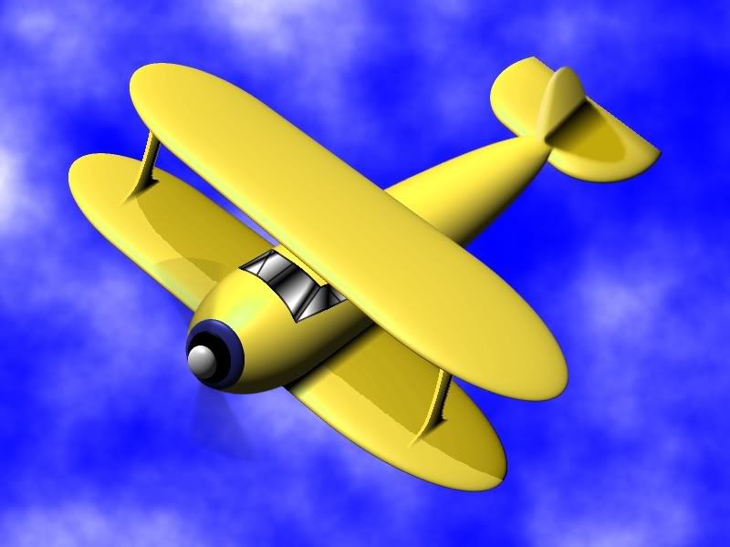
This is my first try at flying. I'm going to take a few more lessons
-
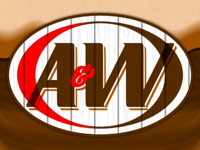
tourist love the A&W that is such an icon in Canada. 50th aniversary for the popular drivein restaurant this year. you captured it perfectly.
ciao OMA
Cool! The restaurants have the root beer on tap, which is very tasty, one of my favorites. I just stumbled onto this site Root Beer World.
I had no idea there is so much root beer out there. I am going to have to try some of them in my travels.
Also, thanks for the compliment, topezia.
-
Janettsue I like your work. Your choice of colors is always nice.
A & W Root Beer's got that "frosty mug taste".
-
Paint.NET does not support creation of icon files.
Did you use an icon filetype plugin to make the image into an icon file?
Yes I did. I followed your link and found out that I can open icon files in Paint.NET, but I am unable to create an icon file from scratch.
Thank you. :idea: What if I open an existing .ico file and delete everything within it, replacing it with the above image and save that? Will that work?
:arrow: Now I am even more confused. I looked in a folder on my computer and came across some icons that I created a while back using Paint.NET (:?
...from sratch. -
I want to use this image as a Icon.

So I saved it as an .ico. Then I tried to use it as an icon and a windows pop up says that "compass.ico contains no icons".
I am confused. Can someone help?
-
-
Nice tutorial Heres My go! i did it with funky colors!
You mean..."where's my go?"
 . You may have forgot to add the image to your post :wink: .
I made this one a while back...
-
I really like the trees, Topezia. The whole thing looks amazing!
I thought these 2 things turned out all right. If you want to do this glassy effect, when motion blurring the original image to add depth, put one of the motion blurred layers aside until you finish with the depth of the object. Then lighten the color of the layer you set aside and put it on top of the depth layer. Confused yet
? Look at steps 3 and 4 of Jake2k's tutorial for a reference on adding depth to (text).
-
Thanks. It makes some nice effects.
-
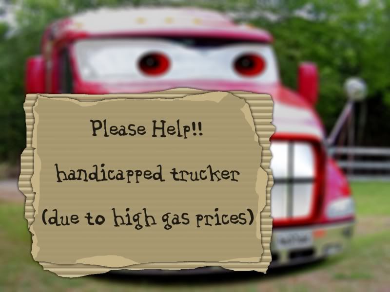
I made this thanks to OMA'S Corrugated Cardboard tutorial. I don't really need help, but things are getting tough...for everyone.
-
You have some real nice works. I especially like the fan and the light bulb.
-
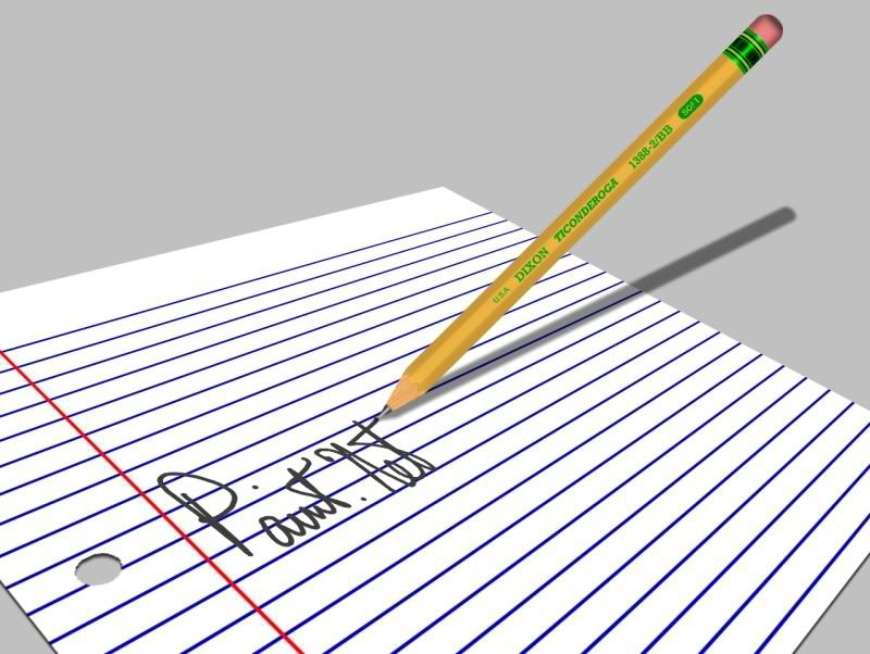
I really like the pen Topezia made on page 17. Nice work. The Sea-thru bottle looks very nice also.
-
Thanks for all the comments on the pencil. I'll work on it and make it look completely realistic.
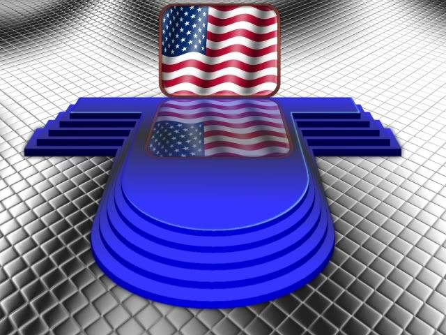
The flag looks good, Drew. Now just attach a rope to it and run it up a flag pole.
-
OK, here's my updated pencil. I think it looks a little better.
-
Excellent work! I think that you could make the lines for the sides less obvious, and maybe make them thicker with a blur so they look like edges. You could also make the green things less shiny, and darker.
That is a good suggestion. It would look more realistic like that. Also I need to work on the eraser some. I made a cursor out of the pencil that turned out OK.
 . Is that Detroit?
 )
)
Image Umbrella: Signatures, Avatars, Logos & Text
in The Pictorium
Posted
Here's one I made a while ago...