


Dalton
-
Posts
460 -
Joined
-
Last visited
Posts posted by Dalton
-
-
:shock:
I'll have to try this!
Nice.
:]
-
This is pretty cool.
Do red colors and it looks like uhh... what's the name?
Liquorish.
[offtopic](Wow! Firefox says I spelled that right! woot woot!) [/offtopic]

-
Nah! I get them at Costco in the bulk pack. 8)
hahahahahaha!
-

ehh.
still working on it.
-
Yes!
I was just going to try and use a regular blur the other day to do something like this... but this is soooo much easier!
Thank you!
Btw, nice job!

-
Wow, this is really cool.
Nice job.
-
Wow.
That's nice!
I'll have to try this sometime!
*bookmarked it*

-
I've got 2 bricks and 2 varicose and i've got a error with my version(3.20)
File: C:\Program Files\Paint.NET\Effects\jchunn.dll
     Effect Name: PDNPI_IndirectUI.Bricks
     Full error message: System.InvalidCastException: Specified cast is not valid.
  at PaintDotNet.PropertySystem.Property`1.ValidateNewValue(Object newValue)
  at PaintDotNet.PropertySystem.Property.SetValueCore(Object value)
  at PaintDotNet.PropertySystem.Property.set_Value(Object value)
  at PaintDotNet.IndirectUI.ControlInfo.SetPropertyControlValue(Object propertyName, Object controlPropertyName, Object propertyValue)
  at PDNPI_IndirectUI.Bricks.OnCreateConfigUI(PropertyCollection props)
  at PaintDotNet.Effects.PropertyBasedEffect.CreateConfigDialog()
  at PaintDotNet.Menus.EffectMenuBase.RunEffect(Type effectType)
Aren't you supposed to have the latest version?
=========================
I'll try this plugin in a few!
-
Poll closed! Ahh!
Wiki won i think.
-
It is font Calibri, it is ClearTypeFont, it makes clear that I don't see that little crookid(or something
 )
)No, I won't do gaussianblur, it is not so beautiful and is unsharp.
I'm satisfied with this signature
The only one thing I want to know, what for sort font -expiration had use in his tutorialYour decision.
And..
here's the visitor font..
-
Looks like the text on the left is a little crookid. (spelled wrong? idk)
Maybe that's just me..
And maybe blur (gaussian) your line that goes from top to bottom..
but other than that. It's nice.
Oh yeah. Blur your line... *the one that's white, and low transperancy* or something like that. Idk. But use a little blur on that.
-
Wow.
That's awesome!
I'll try that sometime.
Good job!
-
L'amo!
^^
i believe thats Italian for i love it :wink:
Hahahahha!
I thought you'd spelled lmao wrong.
But then i read the rest of your post.
-
oo i really like them both, why not combine them into one? i think thatd be kinda cool
Hmmm.
I'll try a little something later.
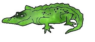
heres a crocodile i just drew
Haha. Nice.

-
the brush is on the new one
old one is this one..
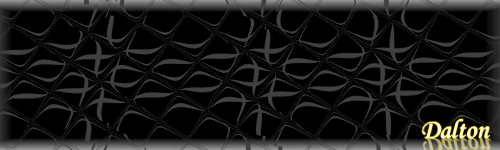
And thanks. I know the background is simple..but that's kinda what I was aiming for. I have no idea why. I just did.
-
Ok.
This is the new one..
And since this is such an active topic chances are you didn't see my old one.

Here's the new one.
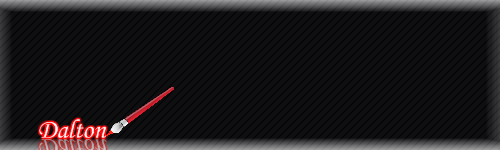
*i had to crop that brush from the pdn logo.. and change the color on the tip... not the easiest thing and I don't it doesn't look that good...
*Old:
Which one?
I don't really like the background on the old one...
:?
-
Mah new siggay!
Still not the best..but I just couldn't get it to work right. I need more plug ins.
Anyway. Comments welcome.

Normalize and Egalize
in Plugins - Publishing ONLY!
Posted
That's pretty cool!
Don't know if i'll ever use this... oh well.
=]
I'm gonna download it anyway!