


-Expiration-
-
Posts
1,076 -
Joined
-
Last visited
Posts posted by -Expiration-
-
-
Yay!

Thanks!
-
Jeez, it's just one extra click ...

-
Yeah. Unfortunately, it's a pain finding good stocks, Poseidon was fairly easy, Zeus required a long search, Hades will probably yield poor results. :x
And I redid the Zeus sig. Is it better? :o

EDIT: Woops, almost forgot stocks.
-
-
Haha, it's okay. Just wanted to let you know.

-
That "guitar" is actually a noose. :shock:
-
Thanks for this guide tHs, its really helping me learn more as I go along. I'm going to have to try that C4D trick sometime.
Looking forward to additions!
-
Okay.
*goes to remake sig*
-
:shock:I absolutely love this! The text is awesome, flow is great, and lighting is great. :O Awesome, simply, awesome.
For realz?! I feel so proud of myself.
Is there anything I can improve on though? You didn't mention depth. :o
EDIT: Following my Greek Mythology theme ...
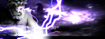
Once again, I used a few stocks:
I don't like this one as much as the Poseidon one.
-
Congrats to all the winners!

-
Some tag-ish thingy. I guess.

Lots of stocks used, namely:
As usual, how can I improve, constructive criticism, blah, blah ...
-
Yes. But I posted the link to the corresponding plugin's thread in my previous post, so there's no need to go through the trouble of sifting through the Plugin forum's pages to find it.
-
There's the Octagonal/Quad Reshape/Matte plugin that can do this, but is more limited than Photoshop's transform, if I recall correctly.
-
I think you accidentaly clicked the New Topic button instead of the Post Reply button. Don't sweat it though, feel free to post again, a mod will take care of this mishap.
-
We could do something like this.
-
You're still breaking a rule.
-
Hmm... Looks more like a 'Vp' than a 'Tf' to me. :?
More like a TVp to me
, but if you imagine the "f" being one of those fancy ones, then you can kind of make out a "Tf".Yeah, after I study it for a bit I can see the 'Tf', but at first glance I read 'Vp.'

-
Well, I have been working on some new Tag Flow logo ideas, and this one is just a bit ready. There are some places that need cleaning up and reenforcing, such as the left hand side of the 'T', but what do you all think?
Edit: By the way, there is a white outline around it because it was meant to be viewed on dark backgrounds. I recommend taking a look at it that way


Hmm... Looks more like a 'Vp' than a 'Tf' to me. :?
-
Thanks tHs. I'm glad to be sponsored by TF.
-
Hehe, thanks Crimson. :AddNoise:
:AddNoise: -
Holy carp!
Awesome!
... *speechless*
-
I agree, it looks better than before. However, the tree looks somewhat awkward in my opinion, the branches area looks quite too short and wide, maybe extending it up a little? Maybe even have it breaking out of the sig's boundaries, since you still have 30 pixels of height to add on before reaching the limit. Other than that, I like it!
-
Thanks! Can't wait to see your finished work!
-
...aaaaand I'm more cool than you. ■
8)
Woops, missed this post.
 Nice thats good
Good luck in future comp's anyway
Thanks! I'm getting an entry ready for another competition, actually.
Wish me luck!You know, at this rate, Xpired might become the next Ash. I don't think I could sleep again, knowing that. :?No ... I don't think that would happen. Ash and I don't really do the same kinds of things. I mainly use PDN for design and stuff, and Ash makes realistic things. Also, Ash doesn't really like the use of stock photos, judging from his works, while I consider them to be a large part of my artwork. So we're kind of heading down two separate paths here. :o


trying to draw after selecting
in Paint.NET Discussion and Questions
Posted
When you select something, you can only draw/affect whatever is in the selection.