


cooldude2222
-
Posts
51 -
Joined
-
Last visited
Posts posted by cooldude2222
-
-
Well, he doesn't have an account.
I'll get him to make one asap though.
-Cooldude2222
-
Well, my friend is looking forward to something like paint.
If that is possible, of course.
Personally, i am looking forward to v4.xx too, but my friend has his projects too, and was hoping to be able to use something similar to paint.net.
-Cooldude2222
-
Hey there people. Well, my friend has been wanting to use paint.net, but am unhappy with some of the current features.
Here's his message to me.I really like your application called Paint.NET. However, I really don't like the fact, that you have to use a thousand, fancy windows waving around the whole computer desktop.
I'm therefore asking if you could make a small modification, so that I don't have to do all the selecting colors thing ect.
In small windows, but in the top menu bar instead?
E.g. Instead of selecting colors in the circle-shaped color thing, why not just a drop-down menu bar item saying 'Select Color', or perhaps an icon next to the other ones symbolizing a color selector?
This could be just as a secondary release for "Those who hate child windows".
Thanks in advance,
In other words, my friend is just asking for a change in the UI, as he finds it a case of "too many cooks spoil the soup".
He's simply asking for a personal modification of the UI or a secondary release of Paint.net.
So, mods, admins or programmers, i hope my friend's query could be acknowledged.
Thanks in advance,
-Cooldude2222 -
@ncfan51
Hmm i get your point about the white being a little too strong.
I'll work on it

@worldnewser
Once again, yeah. i understand that the white is kinda too harsh.
I'll take your suggestion

@Myrddin
I'm lost :shock:
:oops:
Also, anyone noticed that the edges of the win flags are kinda glossy and glassy? (the original/real one)
Any idea how that could be replicated?
Thanks in advance
-Cooldude2222
-
hey there!
Now i'm back. again. here. (i know it isnt a good thing)
So, yeah. now i need help with Project Vista, a project i'm working on to recreate vista.
And i thought that my previous ViOrb was disgusting.
So i decided to remake it.

Here's something for you to compare to:
As you can see, the reference is much "glassier" and shinier.
Any suggestions on how to get that appreciated!
Thanks in advance
-Cooldude2222
-
I like your desktop.
And the thumbdrive.
So cool!

Hmm hey thanks!
I'm planning on redoing my ViOrb though.
Gonna be busy :S
-Cooldude2222
-
So i was talking with my friend on Msn and he said he had just downloaded inkscape, he made a pirate.
I said i was going to download to and try , but actually i was doing the whole thing in paint.NET
so after 50 layers and 2 hours work this was my final :

Heck lol.
50 layers and 2 hours? never thought so.
But i dun think that's pixel art :O
-Cooldude2222
-
Update on Project Vista!
Constructive Critisim appreciated!
-Cooldude2222
-
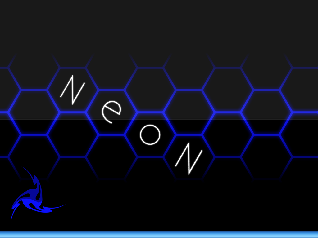
Hey there!
So yeah, i'm back with a little something.
Recently, i got into the visual style mood (thanks to a certain someone whose name starts with -E and ends with xpiration-
 )
)So anyway, i've been making wallpapers to go with the visual style.
So yeah, here they are:
Anyway, in the first wallpaper, something just seems to be lacking.
And in the second wallpaper, any idea how to make the hexagons with the letters somewhat, pop out?
Something like..... make it look nearer to you then the other hexagons?
Thanks in advance
-Cooldude2222
-
@barkbark00
Now that you mention it, i seem to have missed out on the "continuity" of the loops.
I think i'll work on it.
@LFC4EVER
Though i agree using shape3d would be a good way to get things done(in this case), i must confess that, i totally am clueless on how to do things when it comes to using shape3d.
@Ash
Would you mind leading me, or us(being others), on how to get this, so-called, spiral bound notebook rings?
(Hope i don't sound like i'm demanding for it to be done)
Thanks in advance
-Cooldude2222
-
I like the paper...
Regarding the rings, It looks like they get wider toward the back. Being a spiral-type binding, I would expect them to slant a little on the back end. Maybe you could just get rid of the dark back area on side of the other...?
Actually, if you do take a close look to spiral binding notepads, you would realise that, their rings, when look from the top (making sure there's no parallex error), you would actually be able to see the back parts of the rings.
That's why there's that dark back area, the darker, back parts of the rings.
-Cooldude2222
-
topezia just did a good one in the Pictorium you can find it under Image Umberalla Realistic Images page 17 and she explained the steps further down the page to me.
ciao
Though Topezia's "tut" is quite well written, i actually already got to doing it, adapting the same method i used in drawing the punch ring
on my old website logo.

I replicated it, and this is what it looks like now
Thanks for all the help!
-Cooldude2222
-
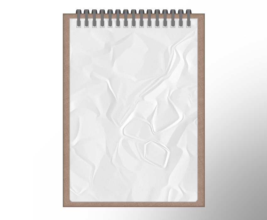
This is something I did a long time ago. Not sure if it's something like what you were wanting to do:
[attachment=0]notepad.jpg[/attachment]
The rings were just an ellipse, with a linear gradient, then median blurred, copied and aligned on different layers.
Well, my notepad has the rings at the top.
But i'll try modifying it a little.
Cheers,
-Cooldude2222
-
Hey there!
I've been working on a website template mock-up.
And i need to know, how can one get to drawing realistic notepad rings?
Thanks in advance.
-Cooldude2222
-
Well, new image posted!
-Cooldude2222
-
New image done!
Its my desktop screenshot. lol.
Enjoy!
-Cooldude2222
-
Hang on i'll try to find it again
edit: i found it
here you go.
http://hv-designs.co.uk/2008/04/10/usb-stick-tutorial/
-Cooldude2222
-
Update.
Added a new image!
Check it out!
-Cooldude2222
-
@livewrong811
Well good luck on the trees then!
looking forward to seeing your end product!
-Cooldude2222
-
@livewrong811
Are those supposed to be trees?
if they are, i think the leaves are wonderful
But i wouldnt say the same for the trunks.
Maybe a little wood texture on them?
Also, roots dun look like what they look in your picture. lol.
-Cooldude2222
-
The WinAmp Button is STUNNING! it all looks pretty neat and well designed
radial Strike is cool , with Brushes?
Lol, no.
You've got it all wrong.
Just some everyday "cool effect IMO tuts" lines-polar invert
Added with tile reflection and twist
-Cooldude2222
-
May i know what do you mean by bringing out the texture all the way?
I dun think i am heading the right way with that line of advice.
Mind explaining more about it?
-Cooldude2222
-
@cooldude2222 not bad do you have a picture of what the cardstock you want to use looks like? PM me with it if you have a link.
if its what I think you are after you just need to get rid of the black outlines.
Well Oma, i dun really have a reference.
it was simply just done on my imagination.
So, any suggestions? i have a feeling it looks very cartoonish.
i cant get the paper texture.
-Cooldude2222
-
Well, this is supposedly what my website logo looks like atm.
The grey and yellow parts are supposed to be pieces of card.
Here's what it looks like now:
Any suggestions on how to make it look as realistic as possible is welcomed.
Other constructive critisism is also appreciated.
Thanks for reading!
-Cooldude2222
Alternate User Interface
in Paint.NET Discussion and Questions
Posted
Heh lol
i didnt mean to disturb you then.
-Cooldude2222