


the-silent-9
-
Posts
176 -
Joined
-
Last visited
Posts posted by the-silent-9
-
-
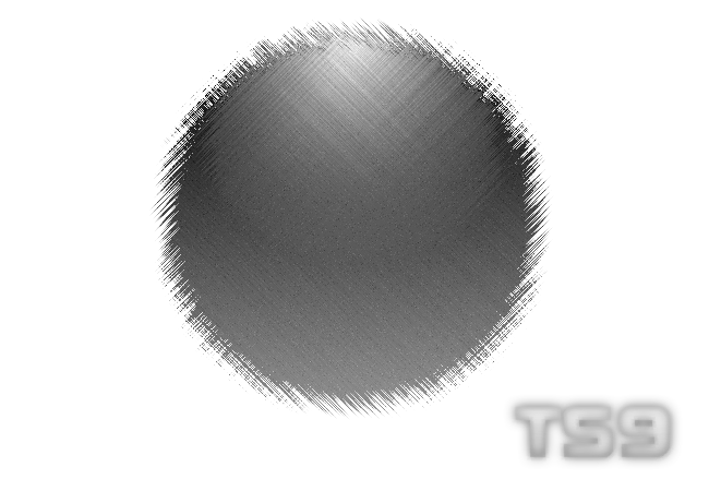
i actually happen to be a huge fan of this effect myself. here- on whatever object you wwant to add a glare (a orb for example) take the tool selection (for a orb make it the circle selection) and place it however large, and whever you want the glare to be. then use your gradient tool with your primary colour set to full white, and your secondary to fully transparent, drag it down through the circle you made with the selection tool. then diselect and blur it a little. i
(i know that wasnt realy good but if you can make some understanding out of it, then thats all you realy should need to know, or at least the basics.)
-
now i find this very funny. i actually made this for a friend of mine who siad HE WANTED it.
@ k. diggy (thats my short cut for calling you now) lol, thats funny. pimp suit.

-
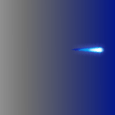
alright, becuase ppl did catch the question, ill post it agian. what do you like better? this sig:

or the one im currently useing???
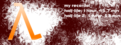
@ ruben: i like photography. im a photographer myself, and an apprentice photojournalist. do you use the process of lambda? (speed blurring?) probably not if you use digital cameras. :evil: film is better.

-
hey what about my sig related question? i need some info!
@ revenge : and yes i like the car. nice.
-
alright, well these are both basicly the same thing. the first is way before i was finished and wanted to see how it turned out. the second is the finished project.
EDIT: i changed the picture / fixed the picture to make it look better.
-
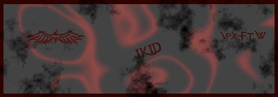
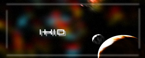
ok.. one thing. am i the only one whos noticed that SOMEONE (rick....) is allowing a advertisement to show for PHOTOSHOP!? at the top of the page? well... someones gotta do soemthing about that.
anyway, heres a sig i made for my friend ikid. i dont know if he likes it or not. oh well. i think i did a good job. feedback appreciated.

I love it
 I like the way the red blurs into the gray.
PS
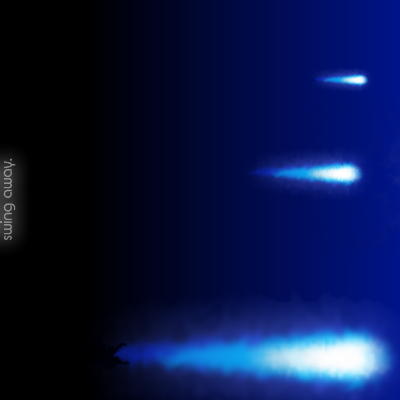
Here's three Sigs, any tips, suggestions?
Any tips on them?
hey, thanks.
sorry dor dbl post, im at school again.
-
heres a avatar i use on another website.

-
ok.. one thing. am i the only one whos noticed that SOMEONE (rick....) is allowing a advertisement to show for PHOTOSHOP!? at the top of the page? well... someones gotta do soemthing about that.
anyway, heres a sig i made for my friend ikid. i dont know if he likes it or not. oh well. i think i did a good job. feedback appreciated.
-
heres my trie. i deviated a little from the regular pathway, but hey, i like.
-
i think i may have double posted. sorr yif i did. but anyway heres a sig i made.
edit: heres some playing i did with my old image. i think i like it better without the square behind it.
-
that looks pretty tight, you can kinda see the clock but not really, but i still like how it looks
aorry it took me so long to get round to it. working on a piece. but thnks. thats what its suposed to b like. its behind glass.
-
nice effect! i like it. good job.
-
this actually took me a while to get. its 11:11 o-clock. the worst time of night.
EDIT: yea i know what you mean. i use different methods as well. thats how i make my symbol. speaking of which im gonig to try makeing one useing glow.
-
great job!
-
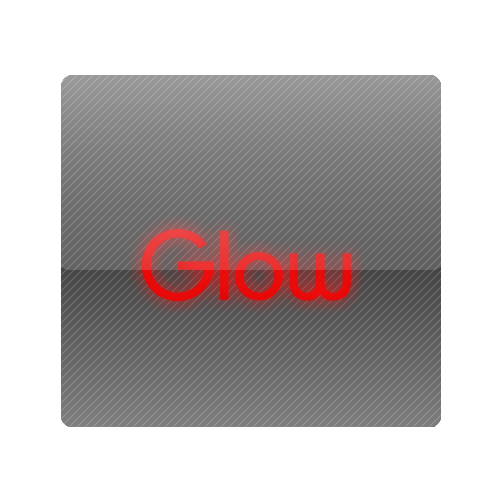
im gonig to be honest with every one here. ive NEVER used glow before. i figured id try it out to see what it does. im posting this one because i like what it does to text.
-
Because I'm too lazy to make my website:

The only real problem I encountered was antialiasing having to do with filling the shape. It was a pain and is still a bit aliased. But I like the graphic overall.
Another thing, I have always been a fan of the glow effect, especially for text. I just can't stop using it!
sorry for double post, but i was wondering, you wan t help? i do html. and i can do some good skinning/ website art.
i had my own sight, but didnt get anywere with it lols.
-
man this bites. im at school and nsome of the pictures are locked. at least i can see soem of them.. as long with you avatrs ans sigs!
(is there anyway around a schools filter without hacking it???)
-
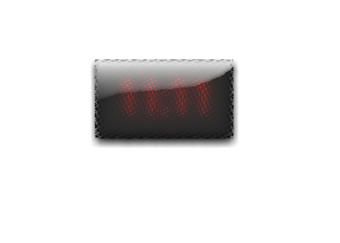
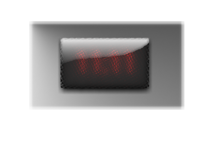
One. The colors are less abrupt.
kk. thx. but do you think you could elaborate more? just trying to get feed back =)
The first image seems more fluid...it has more subtle changes in color than the second one...which goes from white to black really fast. Not so great...and the text is unreadable in the second one. For what it's worth.
alright. cool. i was hoping someone would notice. you see i wanted the text to be unreadable in the second with durastic colour changes. but i wasnt sure what one was my favorite till now. thx.
-
One. The colors are less abrupt.
kk. thx. but do you think you could elaborate more? just trying to get feed back =)
-
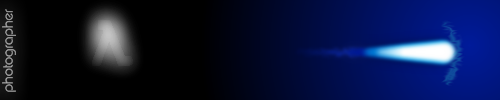
hey, i havent posted anything new in a while, so i figured id make something. ive been busy with my photogaphing. ah. its not much, but still.
EDIT:
ok i made two of these. tell me which one you like best.
VERSION 1:


-
that would be nice. good idea.
-
its possible, but you need to post an image, and you need to describe more.
-
i kinda wanted you to say that, panhead. i wanted it to look plain, just like this one.
-
omg, like this is a great movie, and ther emakeing a part 2.


The Pictorium! Post your created or edited images here!
in The Pictorium
Posted
its been a while since iv eposted. i dont get a chance to use the internet that much... and guess what!? ITS MY birthday. yay!
heres something i cooked up of one of my favorite bands.