


taboo
-
Posts
107 -
Joined
-
Last visited
Posts posted by taboo
-
-
I also made a flag for all the unrepresented masses:

-
Beauty - nice ps translation:

-
If you decide to move forward on the project, let me know. You already have a choir of voices trying to participate; more than enough, most likely. The publishing process requires plenty of work, but it also requires focus. Too many voices will make it difficult for readers to follow your writing.
If you discover that you have everything under control, you probably don't need additional coaching. However, if you realize that you do need help developing and implementing a productive strategy, feel free to contact me. I poke around the forum occasionally - if only for the April Fool's Day activities.
-
I'm not an expert with pdn, but I have an education in the outlining, writing, editing and publishing of books. If you are serious about the project and would like some help, let me know.
Before you start stringing a book together, you should focus your first-step efforts on developing an outline. Then you should develop a summary (yes, before you begin writing the content). If you are interested in more than a compilation - if you are interested in publishing your work - then you want to outline, summarize and pitch the project to someone before you write it.
This will save you weeks of work.
-
Your signature is a beauty, eh?
-
I haven't commented on anyone else's gallery; but I found myself agreeing with everyone's thoughts here and quickly realized you deserve the praise you're receiving. Your work is very slick, very attractive - and has an understated unique flare that most modern designs seem to lack.
Because I don't think anyone has mentioned it, yet, I wanted to give you kudos on your wiki-skin. Beautiful stuff, Exp.
-
Thanks to both of you (david.atwell and BoltBait),
Actually my Effects folder isn't too cluttered. I just find myself holding on to certain older .dll files in a separate folder when authors come out with new .dll files (because of the way certain features get phased out).
Then, like david.atwell pointed out with Outline (w/space, by the way) Object.dll, some files with similar objectives going by similar names are written by different authors.
- So, I have these in my Effects folder
- which produces this menu (note the icons)
It tuns out that Outline Object.dll (with the space) is pyrochild's work (thanks for the tip, david.atwell) and has its own icon; and both the OutlineObject.dll (no space) and the Outline.dll effects are yours (thank you, Boltbait). The icons are the same but the effects have different options available (though I'm guessing one of them supersedes the other:
Anyway, thanks again.
EDIT:
Speaking of messes, this response took about eight tries and is still fairly illegible. Sorry 'bout that.
-
First of all: beauty, well-done, right-on, and thanks.
Now, to the meat:
Now, if you still have the following effect dll's installed, you can delete them:
- FlipPlugin.dll (The one done by Illnab1024 and me) - Replaced with flip.dll in this package.
Arrows.dll - Now included in Paint.NET
Portrait.dll - Now included in Paint.NET
InkSketch.dll - Now included in Paint.NET
GaussianBlurChannel.dll - Replaced with GaussianBlurPlus.dll in this package.
Halo.dll - Replaced with Outline.dll in this package.
Also, user MadJik has written updated (better) versions of my Grid Maker plugin and my Wet Floor plugin. So, if you want those effects, go download MadJik's plugin pack.
Thanks to pyrochild for beta testing these updates and for giving me valuable feedback prior to their release.
Enjoy. 8)

So, I've been sifting through my Effects folder today, tidying up, doing my best to delete old, obsolete and doubled files. I have a few that I wanted to delete and replace with your new goods, but I want to make sure I'm not making more of a mess for my efforts.
Files I want to delete but my cajones are too small to pull the trigger
1. PortraitEffect.dll (same as Portrait.dll?)
2. (This might be weird.) I have all of these:
- a. Outline.dll
- b. OutlineObject.dll
- c. Outline Object.dll (note the subtle, maddening difference)
- d. Halo.dll (which I believe is the only file you suggest we delete, here)
3. Finally, should I delete all the files you've described in this post (colorbalance, steganography, pastel, transparency, etc.)?
Okay then, Taboo. That's enough shaming yourself for the day. Thanks again, BB.
- FlipPlugin.dll (The one done by Illnab1024 and me) - Replaced with flip.dll in this package.
-
-
-
-
Here are a few different brush packs I made. The brushes are a little large (not too bad - the largest is under 25k), but what the hey.
EYEBALL PACK

-
I like the sigs mentioned here, but nobody has mentioned thirdstreettito's or Expiration's - I thought those sigs were particularly sharp.
-
the back ally...
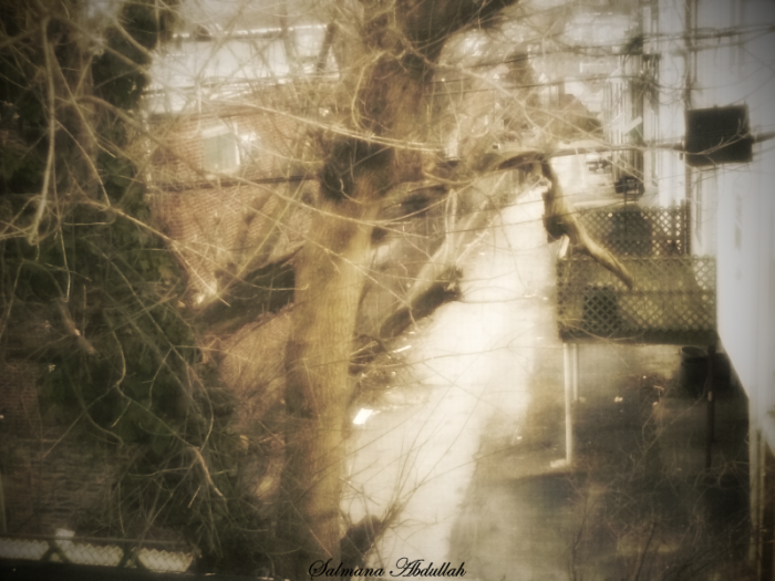
i took the picture in the morning and i edited it in PDN

Wow . . . there's a startling resemblance to my own back alley . . .
-
If you draw your lines with anti-aliasing off ( :AntiAliasingOff: ), it'll work better.
You know, I've been meaning to ask about this but . . . well, I haven't. My question is this: how often do you use the line/curve tool, bucket, brush, clone stamp, etc., with anti-aliasing off ( :AntiAliasingOff: ) ? When and why?
I keep AA set to "on" pretty much by default, and rarely give it any thought. Apparently, my brain has been set to "off" by default. Is there a rule of thumb, here (besides to set my brain to "on")?
-
I thought. i'm going to enter and i was happy till i saw OMA's , expiration's and Taboo's

Thank you . . .
. . . but, the Love Chip? I mean, what else does a signature need?
One question: I noticed that a few people referenced more than stock images - they also offered the name of fonts. It's not in the rules, but I thought I'd mention my font (Roadgeek) just in case.
-
Here we go:

The one stock-image (baby profile) comes from my own photo, and the manipulation has been the logo on my website for almost three years.
-
Everyone is making good points; however, as someone mentioned already drive-by style in this thread, there is a legibility issue regardless of how appropriate a font might be for a particular signature, and regardless of an individual's personal taste. Even some of the standard fonts, though attractive, can be very difficult to read on web pages, not to mention inside images.
-
Ed, that's pretty hot.
Before I started reading the thread here, I was imagining some sort of plugin that operated along the same notion as Rotate/Zoom, but would allow you to input options such as number/location of vanishing points, horizon - something like that old perspective worksheet you'd make in 7th grade:

And then, maybe, the plugin would let you cram an object surrounded by transparent pixels into the vanishing point guidelines you choose. I hadn't really thought about the difficulties involved, huh? Very tricky.
Ed's plugin wasn't what I expected, but it definitely adds something that I probably will use every time I open paint.
Thanks.
-
You have a lot of company. L-M discrimination difficulty is quite common...
True . . . although, I read somewhere about a more common "difficulty" that resembles L-M interpretive deficiency. If my memory serves me, which it probably does not, the common difficulty comes from what are believed to be lazy receptors - and with a little work, an individual can somewhat improve the degree to which he interprets L-M wavelengths.
I cannot stress enough that these are very rough approximations!I wouldn't put too much faith in them, especially for 'diagnostic' purposes...
I understand. Since yesterday, I followed up my post with a little corroborative research, which produced similar results. Rough approximations or no, your plugin seems to be a pretty accurate indicator of which wavelengths are less visible to someone with L-M color blindness.
I can't think of any way to determine exactly how accurately your plugin reproduces an L-M deficient's visible spectrum; but I wouldn't sell the farm to purchase stock in the Vischeck: Daltonize system, either.
Thanks again, Ed.
* By the way, during my obsessively compulsive researching, I found that, typically, the word "colorblind" is just that: a single word without a hyphen; however, "color blindness" is supposed to be two words. Weird. But not weirder than I am. Blah.
PS. Ed Harvey, I love your signature.
-
Very interesting. I happen to be colorblind. My deficiency relates to the interpretation of the long/mid wavelengths in the spectrum.
1. I spent some time reading and playing around with the images provided at Vischeck: Daltonize. I left the math-work alone; however, I found their work with the pre- and post-Daltonized images of the fruit vendor disappointing. I began to wonder to what degree a person with "normal" color vision noticed a significant change - whether the spectrum-contrast in image-4 (attempted colorblind simulation, post-Daltonizing) seemed in any way enhanced from the spectrum contrast in image-2 (attempted colorblind simulation, pre-Daltonizing). For me, the only difference was that image-4 looked rather muddy. And I wasn't able to distinguish the various, suggested fruit-types in either image-2 or image-4.
2. Then I bumped over to the Stanford Project Write-Up. The write-up was wonderful, and the visible spectrum comparisons were fascinating.
3. A while ago, while maintaining a weblog, I posted an article related to color blindness and the different ways people see the world. I had posted various colorblind test examples, so I took those images, opened them in Paint, and manipulated them using Curves + --> Advanced by setting the input to Hue and output to Value/Brightness. I was then able to see each and every embedded image within the tests.
4. Finally, I downloaded EdHarvey's cool simulator. After opening an image in Paint and duplicating it twice - for a total of three layers - I titled the background layer "norm" and left it alone; I titled the middle layer "protanopic" and, you guessed it, used your effect to simulate a red-deficiency spectrum; and, lastly, I titled the top layer "deuteranopic" and, you guessed it again (nice work guessers, you're two-for-two, I'm unspeakably proud of you all), simulated a green-deficiency spectrum.
I had always known that I was colorblind, that L-M wavelengths were my interpretive deficiency, that I have trouble seeing certain reds and greens. But it seems that, while I do have trouble interpreting certain degrees of "red," I am utterly inept at distinguishing any degree of "green" at all. I must have tweaked about 100 images in the last two hours, discovering that I could hardly tell any difference between these original images and the simulated deuteranopic images.
Basically, I'm now thinking that I can't see the color green whatsoever. Wow. I'm also looking out my window and feeling very thankful that snow is white, and sky is blue.
-
Beauty. And thanks again, Madjik.
-
Much thanks, Madjik.
One question, though:
Add Noise +viewtopic.php?f=16&t=20315
There is not more need to have this one as the modification is now in the standard effect...
/delete the addnoise.dll from your effect folder/
I have "AddNoise2.dll" in my effects folder . . . is this the dll I need to delete?
-
he/she is forced to speak with a language more complex than anything he/she could have imagined. The learning curve is quite impressive.
That's only true when the student is given a subject or objective. But many tut in the forum just "do what ever they want" and not "forced to speak with a language more complex than anything he/she could have imagined", As you've put it.
Hmm...let's see. If we apply this case to the forum would be like:
Ash: Teach how to make my saber tooth tiger, do it, do it now! Your grades depends on it!
Noob: .....uh...ok :shock: , Lalala, whatever...I'll make something with radial blur + Polar Inversion. Done!
PDN users 1: This suck.
Noob: This is my 1st tut and I'm a noob and only 13, so don't yell at me.
PDN user 2: yeah don't hate
PDN user 3: I agree with user 1....
And.... round and round we go, when will it stop? Nobody knows... :PolarInversion: :ZoomBlur: :PolarInversion: :ZoomBlur:
All joking aside, Noob does NOT = bad tuts.
So, it's a cool idea in some cases, but might not work here. :?
Ha . . . I just caught this response. Nice point, Ash. But why doesn't PDN User #1 simply peek into the tutorial, identify the fact that it's another Neat Design tutorial, and then, without rising to the occasion, mosey ever onward along his artistic way? He might have a chuckle to himself, thinking, "Ah, Noobs! What would we ever do without them?"
Maybe you'll look in on a Noob tutorial from time to time to see if the water is warm enough, worthy of a soak. But you're experienced enough not to waste too much time lounging around the kiddie pool.
All I'm saying is this: if the Noob is looking for a peer-support forum, he'll find it somewhere, even if it isn't here. You don't need to respond to that sort of thing if you don't want to support it. And if you spy a Noob genuinely trying to work through a tutorial - even if he hasn't yet mastered the art - it will probably benefit everyone in the long run if you appreciate that genuine effort. Eventually, the Noob will get it right and he'll no longer be a Noob. Then he'll post tutorials that everyone will want to see . . . .


help! omg feather problems!!!!!
in Paint.NET Discussion and Questions
Posted
actually, i have had the exact same problem for a long time - so i haven't used feather for months. :shock: