


Blooper
-
Posts
2,003 -
Joined
-
Last visited
Posts posted by Blooper
-
-
The blending is fine. You just need to add effects, like streaks of smudging or c4ds.
-
Great work on the background, but it seems the way the texture of the planet is applied onto the sphere is weird. It seems there's a lot of lines going like this:

-
You need to have an idea of what would be reflected, draw it in black and white, reshape it so it fits the perspective, set to color dodge, lower the brightness so that it looks good, then alpha-mask the reflections that don't land on the star.
-
Oh, I didn't see that part of your post. Either way, you need more reflections on the gold, sharp ones preferably.
-
The star doesn't look like gold because it lacks reflections. But the Walk of Fame's stars aren't golden.

-
Not sure if this is in here so:
If you have an aliased circle, radial blur at around 2px is an effective way of "feathering"(easiest if circle's center aligned).
If your circle-shaped picture is not one solid color you might mess up the image with this method (obviously) so making a selection using ellipse select, containing all but a few pixels along the edge of your circle. Then invert selection and run radial blur, like so:
^ click it!! ^
To get the perfect selection, select the transparent area with the magic wand, fill in the selection on another layer; run Gaussian blur (~5px radius), and use the magic wand's tolerance to have an optimal selection, as opposed to relying on hit and miss.
-
The perspective is off, you should be seeing more of the upper face of the cylinder for the pawn.
Also, that font isn't working with the sig, just go with all caps Arial in size 20.
Nice concept, by the way

-
No, at least not on dA. The thumbnails get messed up if they have a transparent background, and besides it's a logo, the background it's on at the moment doesn't matter.
-

A personal logo. All heavily modified Helvetica, except for the heart.
-
I meant mine

-
I just use the isolate lineart plugin...
That method is outdated, gradient mapping yields (or at least yielded, I don't know about the new version) better results. Isolate works too.
-
anyone like my current?
The effects are really messy, especially the yellows.
-
snip
I don't know where it fits
Abstract.
-
I've noticed the issue with the line tool as well - I thought it was just me. It's incredibly difficult to get an absolutely straight line and to be sure you've got a straight line, because even when you know you've got a straight line because the pixels are all lined up and you're zoomed in quite a bit, the flashing little square dots along the line (the handles you use to create curves etc.) don't seem to be all lined up - either they seem just ever-so slightly off-centre from the line or some seem to be slightly below, some seem to be dead on-centre, and some seem slightly higher. It may just be an optical illusion, but it's a tad irritating.
That bug's been filed so hopefully it'll be fixed soon.

-
That's excellent work, Skull. How about "barren"?
Also, I'd suggest adding a layer, pasting the sig in it, and running autolevel, then playing with the layer's opacity to reach optimal contrast and brightness.
-
Thanks Rick
-
The line tool doesn't seem to be working properly... When I press Shift and draw, it ends up curving slightly on its own, no matter when I release shift. It's like this in v3.5 too.

These are all with Shift pressed.
-
Doing it right now, but since it didn't mention it in the bug fixes I figured it wouldn't have changed. I'll report back in a minute.
E// Nope, hasn't changed
-
Bump, any help for this?
-

It doesn't curve a whole lot but it's significant.
-
Whenever I try to draw a line while holding shift to keep the angle, when I release the mouse button, the line seems to curve on its own... This wasn't happening before v3.5. Am I missing something, or is it just a glitch?
-
He's right though, it's what most people's first animation is. And it's definitely not different
-
thought this was signatures, AVATARS, logo&text??? I do have an avatar lol
It's not RPG avatars we're talking about. The picture up to 120*160px wide and tall above your name is an avatar
-
This doesn't really count as a sig...
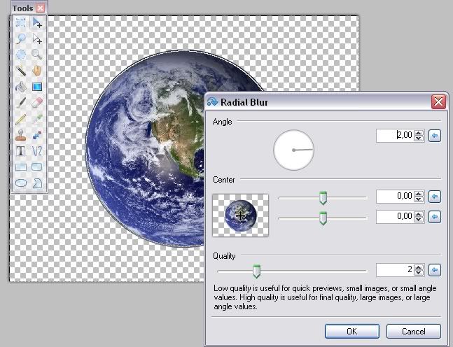
Image Umbrella: Signatures, Avatars, Logos & Text
in The Pictorium
Posted
Chris, you want your signature to be a scene. The starfield is a good start because it's a fitting background, but your render has a white light coming form the top-right, but the light source in your sig is behind him and it's red.