


Kerry
-
Posts
56 -
Joined
-
Last visited
Posts posted by Kerry
-
-
Let me preface by saying this wasn't my corny idea...I have a friend who works with Catholic youth and begged me for a favor.
What I need help with is how to add the gray shadows to the letters I've put in. I'm having a hard time keeping the curves crisp like the stock image.
Any advice?

Edit: Here's an example of what I'm getting if you look at the first O; this is with an insanely long list of steps including duplicating the layer, darkening it, cropping it, feathering, cursing...

-
The skin color looks good on her arms, but it looks too yellow next to the eye and lip colors.
The lips look a bit off to me--is the color lined up with the original lips?
The fingernails would look better with a bit of pink instead of having them the same color as the rest of her skin—she’d look more natural.
Good job overall, and thanks for sharing it.
-
I like the monochromatic scheme, but the blue on the laptop’s screen could be more cyan to fit better with the rest of the piece.
The edges of the laptop are aliased; perhaps a feather is in order if you still have it on a separate layer somewhere.
I can’t quite decide if your name is at the right angle to look like it fits on the screen. It’s close, but maybe not quite there.
The left side of the piece has wonderful texture, and the right is empty. Perhaps you could put an image on the laptop’s screen instead of adjusting the color and text.
-
Kemaru--It's not bad. Remember radial blur is your friend.
-
Santa and the elves would both be perfect for Christmas Cards.
You have a very unique style. I love the texture and dimension in your work.
-
Thanks, Oma, and thanks again for the tip.

-
Breakfast cereal of choice:

-
Helen, I really enjoyed these:

And I LOVE the skater girl!

-
Thanks, Konkust.
Sometimes you have to let go of your fear of drowning and just...fall in...

-
Hi, all.
I've been poking away at a sword, little by little. I can't for the life of me get a blade I like. :?

Here's one use for it:

-
Try experimenting with blend modes for the sword.
Will do. Thank you.
I love the flowers!!! How'd you manage to do the leaves? If you don't mind, could you please list the steps?
Thanks! Er...there were a bajillion fiddlings on those, and it's been a while since I made them. :? I think I started with a curve, duplicated and flipped the later to make the outside shape, then filled it with a linear reflected gradient...but it looks like I put another curve down the middle and blurred it because the gradient didn't give me a dark enough line. I did lighter lines around the outside edges to add more dimension. From there, I distorted; they're all the same leaf, distorted differently. I played around with bulge, twist, and sine waves.
I think that is much more than a happy incident, is a very well done job, neat clean and really cute!p.s.: for the sword you might try some of the tuts about brushed metal
Thank you, and good idea.
I think those flowers are awesome. Can't wait to see your other projects.Thanks! Wait--I'm supposed to have other projects? :shock:
-
Here's one I could use some help on. I'd like the sword to look fairly realistic, and I haven't managed it yet.

Thanks for taking the time to check out my work!
-
Hello, all. I'm finally getting around to posting some of the pieces I've been playing around with.
This first one is a the result of a happy accident with Madjik's Radial Colors and Kaleidoscope.

The blue one's my favorite. It was the first one, and the best, I think.

-
Something in that sig just isnt right...
I like it so far. I think what's throwing me off is the perspective; the text tilts one way and the splatters tilt the opposite direction...that could work out in your favor if you can find a way to make it look like it was purposeful.
-
The tub one made me laugh, and the owl is very cute.

-
Thanks for the tutorial. I must confess, I made the orb eons ago and only just now found a use for it.

I have kidnapped a friend's avatar and am feeding her little piggy only chili--a WMD in production. :wink:
-
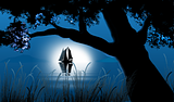
The sunset is beautiful.
-
You've made wonderful improvements. I can't pick a favorite, though.
-
The Vegas page is nicely done.
-
The first render looks awesome!
Science lab? -
I really love Aile's, and nearly picked andRoll's for uniqueness, but I think I'm going to go with MadJik's. She's gorgeous!
-
I'd also suggest trying some tutorials. Each tutorial will tell you which plugins you need for that project and give you an idea of how to use them. If you just download all of the sticky'd plugins right off the bat, you'll be a bit overwhelmed.
-
I like everything but the hats.
They don't seem to fit, and it looks like they're on their foreheads. Maybe try sliding them up/back and making them a bit wider.


Image Hospital: Help With Image Problems Here!
in The Pictorium
Posted
Wilco. I had cropped with the line tool, but hadn't thought of using the line itself. Why do anything the easy way?
Thanks, Ash.
Edit: Much better. Ta.