


dawmail333
-
Posts
76 -
Joined
-
Last visited
Posts posted by dawmail333
-
-
XP SP2, as I see no point (even as a .Net developer) to update to SP3. Seriously, why?
-
Experiment 2 is out!
-
Yeh, it worked for my school library card!
I used it because my card didn't have a barcode. :shock:
It'll be great for a joke though...

-
When saving PNG files, I reckon we should be able to turn the gamma setting off. The reason being: IE7 changes the colours the image renders as, read here for more info. It's the only time Internet Explorer has stuck to a standard and had everyone hate it for it. Ironic, isn't it!
Anyway, if you can even just add a gamma-less entry into the filetypes box, it will save me having to use TweakPNG on every picture before it hits the net.

-
w00t! A reply!
I haven't done new work for a looong time...
But something I have done:
-
-
Well, I have made a program that changes files into text and vice-versa, so I'll get the two pieces of code (file <-> byte(), input <-> encrypted) soonish. I'll translate them to c# first though...
-
Great way to give the source code too! I'm going to modify it to add encryption. Soon, we'll have to collab together so we can make one that can hide files! (Put the pdn inside the png!)
EDIT: Once I finally get my head around the c#...
-
Can you use some
System.Security.Cryptography (or whatever it is)
so we can encode it with a password? So pretty much;
-
[*:2debk22q]You insert the text & settings
[*:2debk22q]The plugin encodes it (into gobbledy-gook)
[*:2debk22q]The result is inserted verbatim
[*:2debk22q]The encode function is invoked, so the encryption is reversed as it comes out,
[*:2debk22q]The user gets the plain text (if they put in the right settings, otherwise they get Chinese. :wink: )
I used it once, but I forgot the namespace. You should be able to find it again.
-
-
-
My idea is that a new layer blending mode could be added (similar but NOT the same as multiply), where this particular layer acts as an alpha mask, so you can just then merge it down to alpha mask without saving to save a mask file. Would this be feasible? (Pretty much like Multiply without showing black).
-
If you visit this site http://www.hollisterbay.com/, you'll see that it has (mainly around text) these sort of sparkly glittery things. I've wondered how to recreate them, but Sparkles (the plugin) doesn't seem to do a good job (for this purpose). Any help?
-
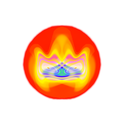
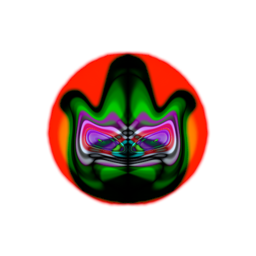
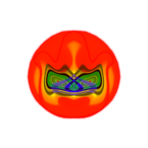
Experiment #2:


Full sized wide-screen (1440x900) wallpapers if you are interested. Tell me if you want a tutorial on it.
Experiment #1:
The Mask:
This technique gave me not one, but 3 pictures! They're showcased here:
Mask of Flame:
Mask of Darkness:
Mask of Shadows: (WTH I know...)
That's all from me.
-
Thanks, now I just have to work out how to make the bullethole more realistic (as in less pixelated).
-
Could someone give a shattered glass tutorial, like someone put a bullet through a glass window or something?
Much appreciated.
-
There was this tutorial where you could make a folder looking thing, and I can't find it again. Does anyone know where it is?
EDIT: Found the link:
Found it from here:
-
The text should be separate from the background. (E.g. the text should be on a different layer)
-
One thing I have used this tutorial for is "gloss maps"
It works very well to put a sheen onto things that should have them. I've used it on armor, shields, cloth, anything that needs some gloss or shine added.
Could you give an example?
-
Okay, if you were using a smaller font size, the median blur should have still left you with gaps in the middle of the words. Then (hopefully the text is on a separate layer), then you do the drop shadows which gives it a sort of outline. Then you blur it to a whacky level, use the mask and boom! You get embossed looking text. So yeah, the drop shadows should change the appearance, but you need it to have a white backround, say, to see the difference. And the text must be on a layer with nothing else on it.
Hope that both helps and makes sense.
P.S. I may have missed steps in my bit up the top, so follow the tutorial at all times!
-

How is it?
I used layers>zoom to 1.5x on the drop section, and I used drop shadow on the droplet, instead of using the circular area.
-
It's cool, but what is the best way to anti-alias it? I used outline object, but that takes a lot of fiddling and give rounded edges. Keep in mind that any antialiasing will need to avoid changing alpha values because that stuffs the reflection up. (It won't show any of the reflection there, no matter how high your 'ignore pixel' value is).
-
Pretty cool! I don't care if it isn't chrome, it still looks cool.
I am finally going to use my marking criteria:
Usefulness: 4 (Can be used for just about anything, so long as it's blocky)
Readability: 5 (Perfect grammar, easy to read)
Uniqueness: 5 (Haven't seen anything like this)
Checkpoints: 2 (Need more so we know what we are doing with smaller text)
Personal Opinion: 4 (Cool and scalable, the basic idea can be used in many ways)
Total : 20/25
Not bad at all.
Here's mine:

-
Yeah, that wasn't my photo. I was hoping there was something simple like making a transparent circle above it or something like that. Thanks for your advice!
-
How can you remove dust spots out of a digital camera shot? Is there any easy way to do it?
For anyone who doesn't know what a dust spot is:
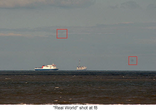
Can anyone help? Thanks in advance.


paint.net Shortcut Cheatsheet
in Miscellaneous
Posted
Awesome!
(Had to keep the chain going, as every reply has ended with one of these)