


agent387
-
Posts
153 -
Joined
-
Last visited
Posts posted by agent387
-
-
It is very plain, but plain is good, especially in this case, I think the colours go together well, and also the linesblend in well and add interest. What do you think of mine two posts above?
thx...i no i usually do more complex things.....yours is much better after you fixed the text and the colors work great with each other
-
i got a new sig/avatar.....tell me what u think about it so i can improve! i no the bottom left cornor of the avatar need so help but what else because this usually isnt the style i do
-
":1p3xk21f]Heres my Crystal ball picture
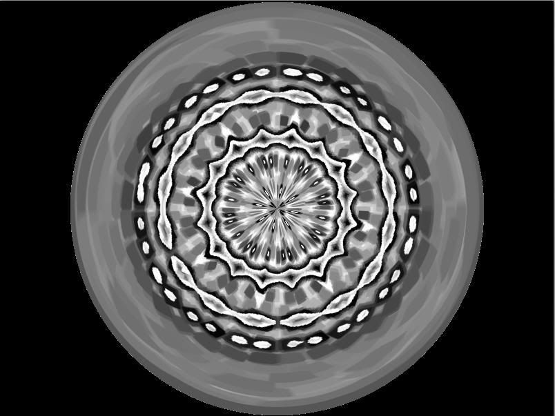
likee ?

try using antialiasing around the edges
-

new sig...lol its spring finally and this represented spring to me very well
-
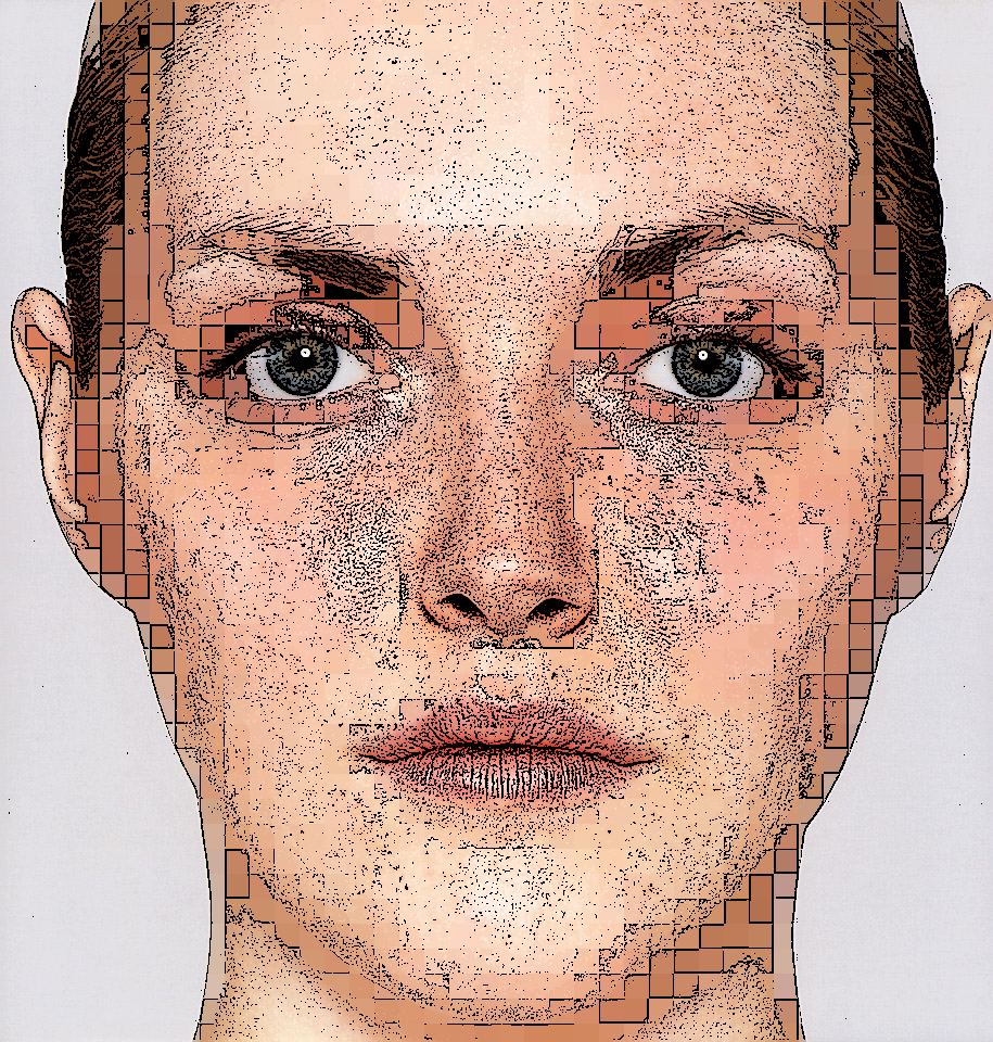
well im back....i dont know waht happened i guess i just got caught up in a lot of things but im glad to be back and i need to do a little warming up cause i havnt used pdn in a while so this piece isnt that great but i thought it was pretty cool
glad to see you back this is a really great picture. I especially like the square pixel looking boxes in some key area.
good job.
thx oma...i havnt done anything in a while and i thought id try something different and it came out pretty cool. i wont win but it is a start to get back in the race....i just check up on a lot of the people that have been here a while and there is some great work everyone has really improved there work or at least if it needed improving. when i looked at some of the work being dont i couldnt believe that in such a short time that i was gone such improvements could be mad so congrats to everyone on pdn...lol that was cheezy but i mean it
-
not all that great but pretty cool i guess
-
well im back....i dont know waht happened i guess i just got caught up in a lot of things but im glad to be back and i need to do a little warming up cause i havnt used pdn in a while so this piece isnt that great but i thought it was pretty cool
-
is this simple enough for the sotw?

-
my entry for sotw:
-
no stock images used
-
-
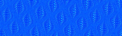
sorta like a water sig:

I thought this one was cool:
-

[comments?
remember to use anti aliasing (AA) :AntiAliasingOn: when u cut out images...use the tut how to cut out images the easy way 2.
-
im not gonna lie hat looks pretty crappy^^^^and i dont get the hand thing...it makes no sense
-
how did do that^^^^^????
-
heres an animated sig i just made...not all that great:
-
u should...i think it would be great and it would spark a lot of other ideas.....!!!!!!!!!!
-
comn lets get this show on the road.......voteeeeeeeeeeeeee and tell us the results...i wanna find out who won!!!
-
hey guys i was just thinking....maybe then next sotw theme should be the new millennium...i no its almost 8 years too late but i thought it would be a fun theme to do.just a suggestion...tell me y'all think!!!
-
very nice tut....as always ash
-
@verndewd i love it but i was wondering if u ciuld make a small and simple tut on how u make that kool look to you stuff...not the chrome stuff but the other part of all your work!!!
-
i dont no if u can post suggestions of new themes but i thought this one would be fun...i no its 7 almost 8 years too late but i thought that a new millennium would be a very cool theme!
-
it was just supposed to be an illusion...also boltbait i love that it is awesome...i was thinking of doin something like that because i saw the tut the=at one person made that wasnt all that great
-
i just noticed that no one has done a gold tut or even tried to make gold...ive seen a lot of steel and other types of metals but never gold so could someone maby experiment with it and come up with a tut!!!ty
Agent387
Image Umbrella: Signatures, Avatars, Logos & Text
in The Pictorium
Posted
here is every single sig ive ever made...i like goin back and looking to see where ive come from...i havnt come that far...lol
]http://i210.photobucket.com/albums/bb192/agent387/water2.gif[/img]
the weird thing is that i like the second to last one and that was the first sig i ever made...