


Pizza Truck
-
Posts
20 -
Joined
-
Last visited
Posts posted by Pizza Truck
-
-
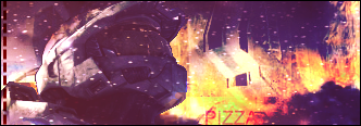
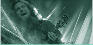
I mainly make sigs with Pdn, here's my latest stuff..
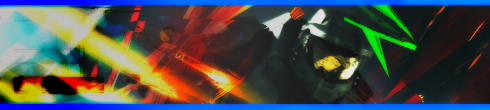
Green thing above his head killed this one. Meh.
Gift for a friend.
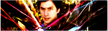
v2.
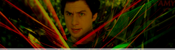
Another gift. (I'm nice :wink:)
Another lol..
v2.
Most current but not that great, I was satisfied with the text though.
About the gifts that don't have my name on them, I don't care if you don't think they're my work, they are and if you don't think they are then don't comment.
Edit: I posted this here a while ago, my famous Buzzkill sig remake.

-
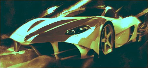
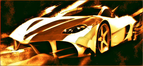
Possible Pool balls? I'll try some stuff with this.
-
Yes that too. Like when he's sees the box flashing he does a little more. The reason I'm spending a lot of time on it is because I'm entering it in the first animated .gif of the month on gamerzrealm.net and I really want to win.
-
Yes it's all pdn. And David, I'm thinking about making an updated version where the shoulders are realistic, where the wheel looks like it's turning, and where he turns his head a little slower after the block crashes.
-
From 7pm-3am and then from 2pm-7pm. So about 13hours.
-
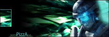
Here's mine.

-
Tryed to copy Buzzkill's sig.


-
Looks pretty good. The zoomed guy in the back has a little too much opacity, and the backround's got nothing in it. Although it does look nice and simple, and the backround is like desert sand eh? 6/10, good and simple but need more in the backround.
Can you please give me an idea of what to put in the background?
You need a bigger image to fill up the space. And maybe add some splatters or anything. Lines.
-
Looks pretty good. The zoomed guy in the back has a little too much opacity, and the backround's got nothing in it. Although it does look nice and simple, and the backround is like desert sand eh? 6/10, good and simple but need more in the backround.
-
Looks pretty good. The zoomed guy in the back has a little too much opacity, and the backround's got nothing in it. Although it does look nice and simple, and the backround is like desert sand eh? 6/10, good and simple but need more in the backround.
-

Looks like too much frosted glass that you didn't blur.
Here's my go at it.

EDIT:
Second attempt; I like it much - Great tut.

For the splatters, when I pasted part of the clouds I oil painted -1/65- then glowed -3/10/10. Set opacity to 135.
-
Looks like too much frosted glass that you didn't blur.
Here's my go at it.
EDIT:
Second attempt; I like it much - Great tut.
For the splatters, when I pasted part of the clouds I oil painted -1/65- then glowed -3/10/10. Set opacity to 135.
The Pictorium! Post your created or edited images here!
in The Pictorium
Posted
Ncfan, that's really good. I love it. :O
Here's some new sigs. I've really improved.
Yes I did use Paint.NET or I wouldn't post them here..
Please comment.