


Wither
-
Posts
1,068 -
Joined
-
Last visited
-
Days Won
2
Posts posted by Wither
-
-
Good day, everyone! Those that remember me will find that I return from my 10 year seclusion with more life experience! And a cat that I live alone with. Those that don't will get nothing of value out of this first paragraph.
I made a simple tool for plotting points on the canvas that I hadn't quite seen done the same way before. I had a need for finding particular points on an image and mousing around to read the coordinates on the bottom was tedious and less precise than I'd like. My solution was to draw a crosshair centered on whatever point you tell it. It can optionally place the [x, y] reference as an ordered pair nearby the point as well. It uses your selected Primary Color for everything. It's great for locating points on a GUI image (if you, like me, happen to be working on modding a game that uses a single image for its GUI elements). I'm sure you could find other uses for it! Screenshots included to try and demonstrate its practical usage.
My coding ability is mostly in the "pattern recognition" phase, but I figured there's no reason not to share it. Made in CodeLab, then migrated to VS for dynamic control over the input sliders. Please feel free to message me with coding tips and messages akin to "oh my god, I thought you were dead!"Thanks to the PdN Team for giving me well over a decade of entertainment in the world of photo manipulation!


-
 2
2
-
 3
3
-
-
@ jake - wow, and that's all I can say is wow. :shock:
@ Lego - I really like the fade effect. But... the red eyes seem a bit overemphasized.
---
This is something I'm working on for "The Lava Lounge"
We've had a few shows recently and we're nearly an official venue.
 haha
hahaI've taken it upon myself to make some interesting logos, the first being this.
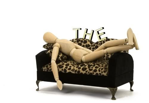
In the finished product, I want to use a picture of a real couch. I've got to get back to my buddy with the camera.

Any suggestions on making the letters look more realistic?
 Perhaps my standards are too high for my current skill level, but I want (maybe even demand) that they end up looking like physical objects. Like plastic letters we just had lying around.
 -
Yup, oma, I have a lot of catching up to do. My standards have been shattered! :O Looking back on what I made before, it all seems novice at best!
Anyway, Icey, yeah... Simplicity's grass is a debacle really. I did try to make the grass smaller farther away, but I didn't really bring it out enough. The effect is there, but it's far too minuscule to be noticed.
The roof was made with Shape3D, it's a cube on it's side, in fact, I couldn't get it to match the way I wanted, so I had to do each ceiling "wall" by itself. You can only see two, so I only bothered making two. As for the woodgrain on the table, there have been a few tutorials on the subject... The "meat and potatoes" of it can be boiled down to two simple steps.

Naturally, you'd want brown instead of black, but that's the idea anyway.
---
More of my "realistic" art is on my dA. Here are some highlights.
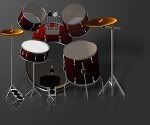
My semi-famous drumkit from so long ago.
A cigarette. Looking at it isn't bad for your health though.
All 100% PdN, of course... But really these are so old and there have been so many improvements... I'm no longer sure if that's an accomplishment anymore.
-
Yup, oma, I have a lot of catching up to do. My standards have been shattered! :O Looking back on what I made before, it all seems novice at best!
Anyway, Icey, yeah... Simplicity's grass is a debacle really. I did try to make the grass smaller farther away, but I didn't really bring it out enough. The effect is there, but it's far too minuscule to be noticed.
The roof was made with Shape3D, it's a cube on it's side, in fact, I couldn't get it to match the way I wanted, so I had to do each ceiling "wall" by itself. You can only see two, so I only bothered making two. As for the woodgrain on the table, there have been a few tutorials on the subject... The "meat and potatoes" of it can be boiled down to two simple steps.
Naturally, you'd want brown instead of black, but that's the idea anyway.
---
More of my "realistic" art is on my dA. Here are some highlights.
My semi-famous drumkit from so long ago.
A cigarette. Looking at it isn't bad for your health though.
All 100% PdN, of course... But really these are so old and there have been so many improvements... I'm no longer sure if that's an accomplishment anymore.
-
Depending on the situation, a trick I like to do is to change the color of something by imposing a color over it with a different layer.
Let's say you have the subject on layer 1, make layer 2 an Overlay layer, color it in, and there you go. It helps if the subject you want colored is gray-ish.
I can't guarantee it'll work for this situation though. :\
-
@Madjik - I love it.
@everyone else - :shock: Too much to list right now, but the past few pages are filled with some real gems.

---
To be perfectly honest, I made these too long ago to remember how they were actually made. ._.
-
@Madjik - I love it.
@everyone else - :shock: Too much to list right now, but the past few pages are filled with some real gems.
---
To be perfectly honest, I made these too long ago to remember how they were actually made. ._.
-
Wow. Just wow. We're all stepping it up, aren't we? Haha.
These are reposts, but as far as I remember, I haven't posted them in this thread. I don't think I have anyway. >_>
Icey's fish caught my eye and reminded me of these. One thing, Icey, the scales on most fish face the other direction. It seems funny that the direction the scales are facing is opposite. Also, that Pepsi can looks great. I can see you going places with S3D.
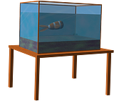
haha. If you look up in the corner, you can actually see where I forgot to erase the rear table leg.

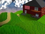
In all honesty, I'm not that pleased with this. (The clouds are just awful, for instance. Also, the simulated depth didn't work out so well, since I didn't make enough of a variation in the grass size... I could go on, but you can see for yourself.) But it was a massive project, the full-size being so massive that I had to work on it in portions. If I tried to do it at once with all the required layers, my computer would probably start asking around for hired assassins.
-
Wow. Just wow. We're all stepping it up, aren't we? Haha.
These are reposts, but as far as I remember, I haven't posted them in this thread. I don't think I have anyway. >_>
Icey's fish caught my eye and reminded me of these. One thing, Icey, the scales on most fish face the other direction. It seems funny that the direction the scales are facing is opposite. Also, that Pepsi can looks great. I can see you going places with S3D.
haha. If you look up in the corner, you can actually see where I forgot to erase the rear table leg.
In all honesty, I'm not that pleased with this. (The clouds are just awful, for instance. Also, the simulated depth didn't work out so well, since I didn't make enough of a variation in the grass size... I could go on, but you can see for yourself.) But it was a massive project, the full-size being so massive that I had to work on it in portions. If I tried to do it at once with all the required layers, my computer would probably start asking around for hired assassins.
-
@ Flow55 - I really like those. Though the purple squiggly tentacle things by the alien don't quite fit in, if you ask me.
@ mikeyv121 - Everybody likes Gir.
And those are quite well done.@ LFC - I really like the concept and colors, but consistent lighting may help pull everything together.
@ Blooper - You madman! :shock:
I hit up my photobucket to find them, there are even a few I completely forgot about. Most are for Wither, naturally, but there are a few for other people too. The farther down you go, the older they are.


This one here was for the youth group of my last church, I like the ocean spray look.

-
@ Flow55 - I really like those. Though the purple squiggly tentacle things by the alien don't quite fit in, if you ask me.
@ mikeyv121 - Everybody likes Gir.
And those are quite well done.@ LFC - I really like the concept and colors, but consistent lighting may help pull everything together.
@ Blooper - You madman! :shock:
I hit up my photobucket to find them, there are even a few I completely forgot about. Most are for Wither, naturally, but there are a few for other people too. The farther down you go, the older they are.
This one here was for the youth group of my last church, I like the ocean spray look.
-
I posted a short video on the first page, it only goes over the first part though. Really, all you do is repeat the first few steps with progressively bigger clumps of grass over and over again.
In case you missed it, you can watch it here.
-
I posted a short video on the first page, it only goes over the first part though. Really, all you do is repeat the first few steps with progressively bigger clumps of grass over and over again.
In case you missed it, you can watch it here.
-
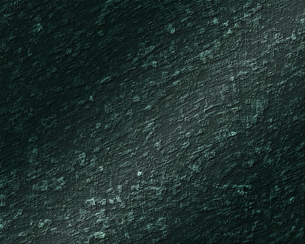
I started working on this today. I like how it came out. If I can find a good way to get to be able to make deliberate shapes out of it, I may have a new stone texture on my hands.
-
I shall open my first post in a good while with constructive criticism.
phrebh's lego guy looks awesome, but his head is hardly attached to his body... Was that intentional? >_>
Samurai Jack? Neat. I look forward to seeing what else you can do.
---
Now then. To show off what my mind produces when I've got insomnia! O:
Latest sig/av set.
And this thing, that I made last night, that gave me the idea. Bear no mind to what the text says (unless you're a Norma Jean fan, of course) and critique the background and stylization, if you will. :]

^^ Clicky
-
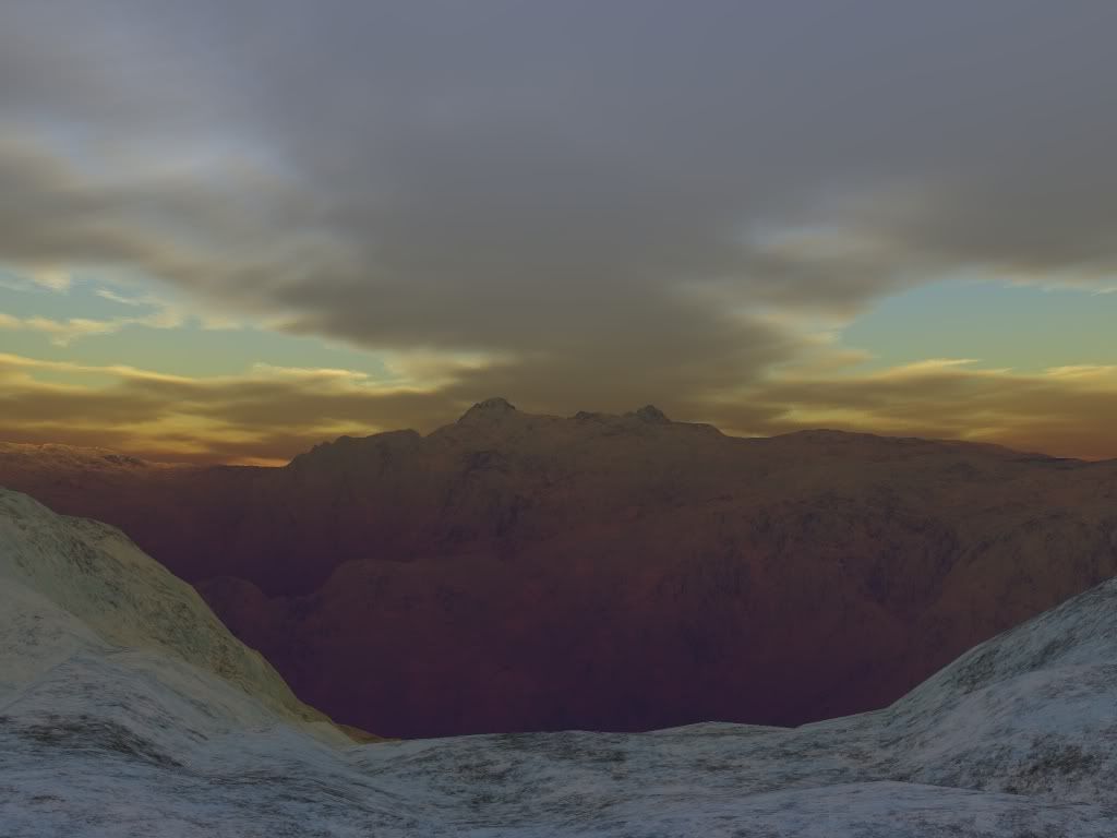
Among my favorite uses of Paint.NET is using it to spice up landscapes created in Terragen. There are untold worlds of possibilities to play with.
Here are my latest. 8)
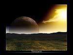
All images created entirely by me...
With the help of countless manhours between Rick and the folks at Planetside for making the programs of course.

-

I don't do pixel art often, but this was my favorite pixel person to make. It's an interesting art form, I'll be trying to do it more often soon.
-
Pluberus' Perfect Pictorium Palace is Perfectly Imperfect, A Fine Addition to the Pictorium Forium
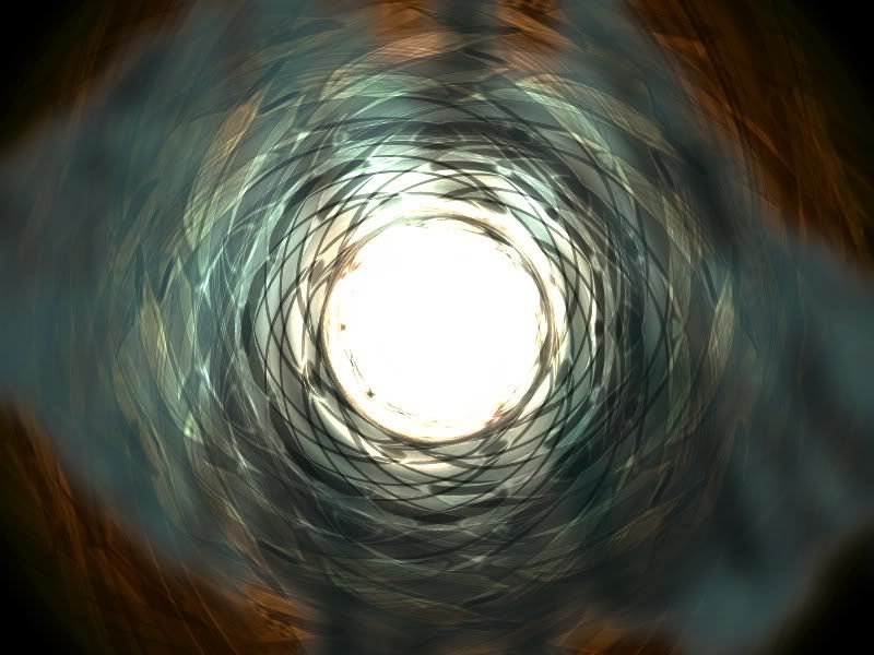
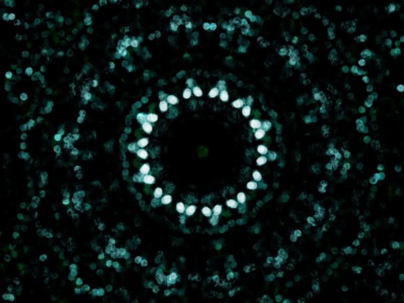
I really enjoy the Blue Ripples and Borealis pieces.
The Shape3D spheres are cool too, but I'd like to see what you could do with other shapes and patterns.
-
:shock: I go away for awhile and I come back to find the Pictorium up and running?
omgwtfbbqhaqs!?!one
Ok, now that the initial shock is over, let's get to business.
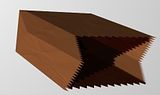
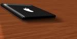
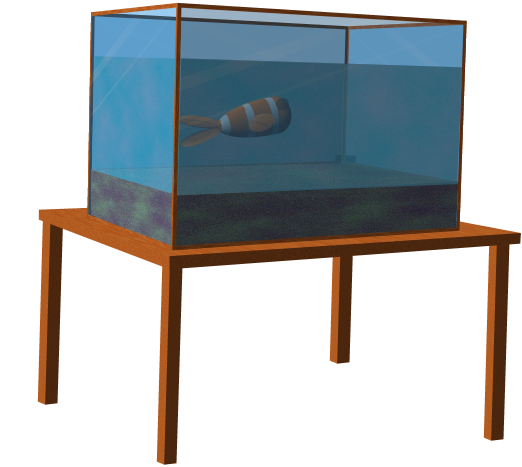
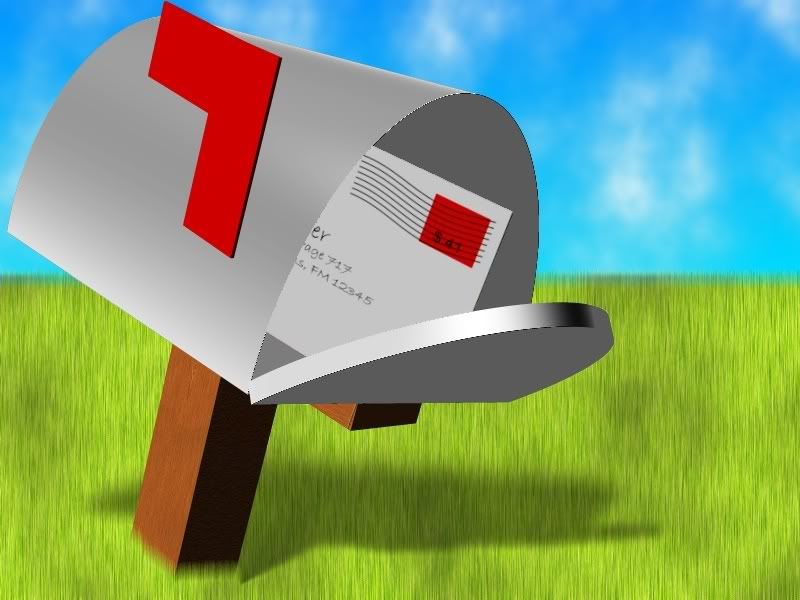
For those who've been paying attention in the past, I really enjoy using Shape3D to make real life objects. How realistic they look is a matter of opinion. I feel these five are the most realistic representation of the object I could manage.
It all really started to take off when I made this drumset. It was a good challenge at first and really taught me a good deal about how Shape3D and all the other aspects of Paint.NET work.
This laptop was fun too. The Apple logo was chosen because it's so easy to draw.
(I tried making an open version of this too, I'm not as pleased with it. [link])
This was an experiment using the Cube map, stretching everything to look right when it got bigger was fun.
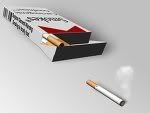
*Smoking is still dangerous, just read my warning labels.
One day I noticed people making iPods and such. ... A few hours later I unleashed this upon the world.
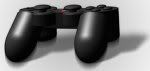
Shortly after making this, I was challenged to make an Xbox 360 controller. ... It just isn't happening.
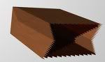
And finally, the paper bag. The angles are tricky to figure out in Shape3D, but now I can tell my friends that I wasted about an hour or two of my life figuring out the perfect angle to apply to a computer generated paper bag. I'm so fulfilled. :]
Ok so that's all of them.
In my opinion, these are realistic (well, as realistic as I can get anyway.) If they belong elsewhere... tell me where. :shock: -
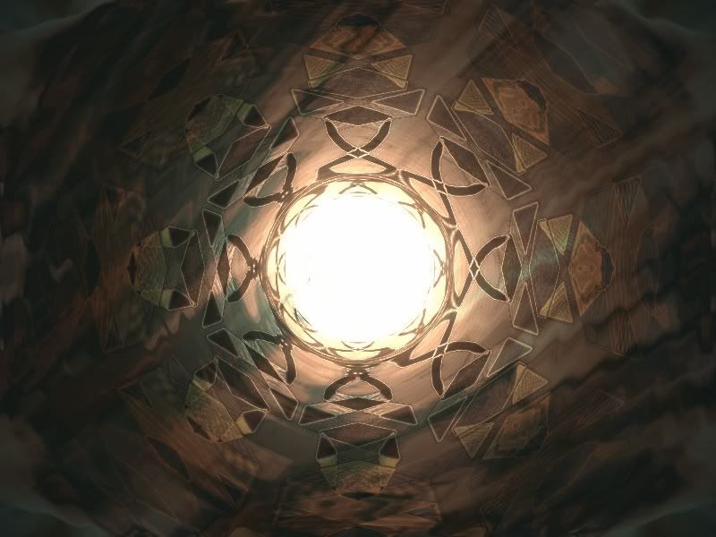
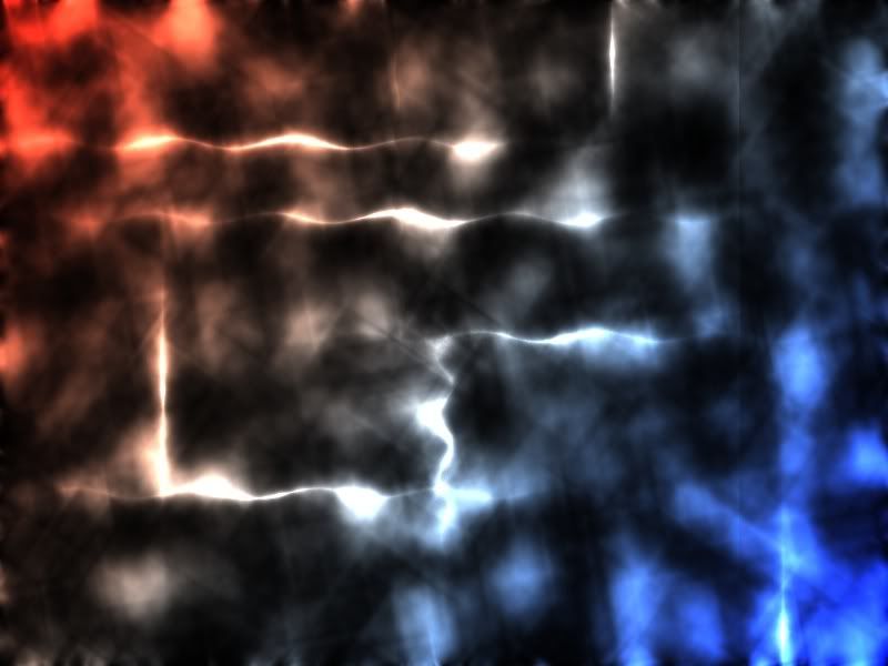
I call it 'Threads of Light'
-

I made this long before that handy brick plugin. I did it the 'hard' way and used Grid Maker... then dragged every other one over...

---
@ Kreeo - That first one is good!
May I suggest playing with the Shape3D light settings a bit though? Because the highlight doesn't stay consistent with the light source. -
Glad to see it worked out...
Just to reiterate what you noticed there.
The following was all done with an opacity of 80.
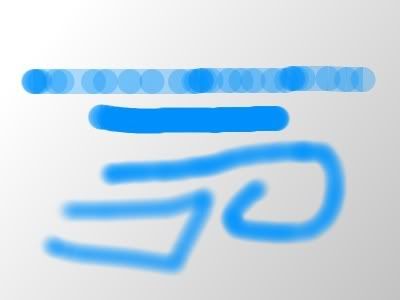
The top is a quick streak across.
The second one down is a slow 'smooth' streak.
The bottom is the clone stamp method.
What's great about it is that regardless of how quickly you move the brush around, it maintains a consistent softness.
-
P.S. That image was made entirely in Paint.NET...no photo
:shock: i actually thought it was a real picture :shock: ... ive been punk'd.
:shock: I = punk'd
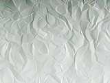
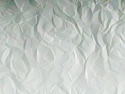
Curse you, Brad! And you're ability to make better paper than me! Dx


Coordinate Tracer Plotting
in Plugins - Publishing ONLY!
Posted
The response to this simple thing reminds me of why I love this community!
First attempts at adapting that code snippet haven't been terrific, but I'll keep googling and compiling until it clicks.
Good to be back!