


Stephan
-
Posts
1,010 -
Joined
-
Last visited
Content Type
Events
Profiles
Forums
Blogs
Gallery
Downloads
Posts posted by Stephan
-
-
It's here!

(Clickie for full size on dA.)
Features:
*Picture preview when hovering over a mainpage article (where available). Saves space in the tables itself.
*Hot grey/silver layout, with the Calibri font, tabs, and panels.
*Different costum flags.
*(Almost) All original material!
*All made by yours truly!
Sources:
Wikipedia's logo, and those of Wikimedia.
http://arstechnica.com/reviews/4q00/mac ... ap-big.jpg
Lorum Ipsum.
Tiny sublimal message : Vote for me!
-
Already done. But there are lots and lots of sites and apps we can skin, or even make up, so don't worry. (Maybe skin PS?)
-
I believe its not...
RESPONSIBILITY: Except contrary mention, the rights of ownership intellectual on the documents contained in the site and each element created for this site are the exclusive property of the company ISSENDIS(translated to English with babelfish...)
it claims PDN for itself, and probably sells this, even though i can't find it anywhere. The Other stuff is OpenOffice.org.
-
I think this is a job for... Shape3D!
-
On erkansus' entry, a few tips:
-
[*:1e3moxag]Try to keep the flags constant. 3 of them are borderless, 2 beveled, and 1 with a border that (In my mind) indicates selection, but isn't selected. This can be overcome by producing the flags yourself. Most flags are relatively easy made, and won't come with any resizing issues if you keep them on the scale you want, and a reasonable size.
[*:1e3moxag]Resizing issues with the pictures on the top. Art, history,biography and science all look squashed together. If they don't fit normal sized, then make them smaller to the point where they still have the same ratio, but fit into the border. The tech tab looks as if it could use some antialiasing. Never resize clipart/vectors within Paint.NET. it won't turn out very pretty most of the times.
[*:1e3moxag]Background Wikipedia logo: It seems you used the wikipedia logo located on the top left of the actual wikipedia main page. However, this uses a background, and thus does not blend in with the rest of the picture. You could've tried finding the full sized SVG like a did. It's on wikipedia aswell.
[*:1e3moxag]Text issues. Your text seems resized. Try not to do that unless it's WordArt, which i do not recommend altogether. it turns out messy and blurry when you resize text.
I do like the font you choose for the search bar, and the black that's so easy on the eyes. Please read these tips everyone, it's meant as constructive critism, and the first person to say that they can't do anything with it, is wrong.
-
-
@Wither, Page 841: Something like this?

-
Yup, almost done...
Am I overusing the panels?

-
That work is outstanding, and if you continusly make those flags I would resize them and place them as a small bar accross the bottom. Just a suggestion though!
Concidently, i just saw the light, and made the smaller ones, but placed them at the top 2 minutes ago! Thanks for the compliment also

-
Looks really cool! But try a gaussian blur on the star, it'll gibve a much more star-like glow...
I need your help people... Where should I place the language thingy? Please note that it's LONGER then the normal tabs due to the flag, which was all made by moi.
I need your advice, or I won't be able to continue... Not knowing where it should be bugs me...

-
Are you asking how to intergrate the graphics into a CSS template? If so, find another forum, this is really not the place for such questions.
Otherwise, please explain what you mean by putting it on your website.
-
That would be meant as in tiles with blood on them, not as in "damn" tiles.
-
Except that theres no links, so it might be one huge picture for all I know
It's dynamic, try changing your browser's size. And thanks!
-
Can I ask you what you mean by "swear words"? This forum is as family friendly as it can be. (Except for maybe the difficulty levels of some tutorials)
As for a nice tutorial:
Bob deemed it "Too easy..." But it should be the level of a junior school.
Good luck!
-
You could also select the entire inside with the tolerance set to 68%, but this will only work if the shape is completely closed. You will still need to create a new layer, but you won't have to blur it.
-
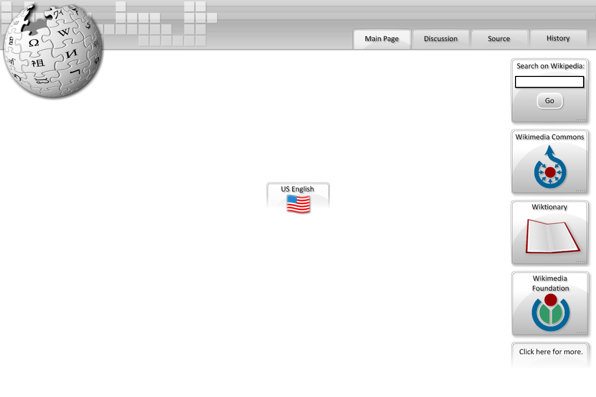
http://img152.imageshack.us/img152/1879 ... diadj3.png
Something a made. <_< Credit goes to wikipedia for their logos, apart from the wiktionary book. Made that myself. I also might be able to produce a webpage, just for fun, but don't expect too much.
EDIT: Eugh, Photobucket resized it...
EDIT 2: Fixed link.
EDIT 3: Here's a link to the page i've done already, showing all of my 1337 CSS skillz.
-
I'm gonna have to disagree with sabrowns' submission. I think this goes under the "do not just color/recolor" rule. IMHO* hardly any work has been put in. My suggestion is to disqualify this entry, and let sabrown try again.
*In my honest opinion.
-
My try:

I did outline it to show that it is in fact 3d... Kinda... Sort of.
-
What i have lost previously will be integrated here. Only... Whiter. Wikipedia deserves to be white.
EDIT:

And so it begins...
-
This should be the tutorial you're looking for:
viewtopic.php?f=15&t=3305&hilit=Software
You could do it in Shape3D, but it's harder to change the sides that way IMO.
-
It's a triple tie! What to do...
-
Last 2 days to vote! I'd love to skin dA...
-
Very simple solution: Limit the third... I built Madjiks' into a DLL, and it works great
Angle chooser, anyone? -
Just to tell you: I won't be competing in the MSC this month. My computer graphics broke down, and when trying to get the files from the disk, the folder was damaged, and i couldn't extract anything from it. There is one upload of a v0.6 but i believe it's in someones chat logs i won't be able to receive before tomorrow.
I will ofcourse be voting, so please do your best.
-
I think it should be possible to generate one for each layer... But then again, you'd get a carp load of layers, that will definitely kill your pc's RAM. So, no.
Monthly Skinning Competition Discussion -- #8 = Wikipedia!
in Paint.NET Discussion and Questions
Posted
That was really freaking fast... I even forgot to post that it was there! Thanks people! I'm voting for Expiration's. It definatly the best out there. (apart from mine obviously [/narcsim])