


livewrong811
-
Posts
489 -
Joined
-
Last visited
Posts posted by livewrong811
-
-
Nice work, Code Ember, I love the orange and black together.
This is an oldish signature, that I just decided to use now. The background is pretty bland, I should fix that...

And here is my 30th (not really) try to do 3D text, it didn't turn out too badly...

And my newest avatar, that took me about five minutes to make but looks cool.

Comments, suggestions on all of these are welcome.
-
Here is an example (look at the bottom) of dirt:

Step-by-step for the dirt:
1) Line tool for the surface, do a few lines and put some gradual curves in, nothing too tall.
2) Fill under line with same color of brown used in lines.
3) Make the top line really smooth and fuzzy, whether you use anti-alias or a blur.
4) Use ellipse tool to make small dots of varying sizes and shades of brown.
Step 4 is optional, you may find a better way to do it by experimenting.
Good luck!

-
Here's what I made a while ago, Olli... I started with a picture of the iPod Touch, and then edited the insides, like most of the text and the song list.

-

Like that?
-
That's pretty cool! The blue/black thing makes it look like an eclipse, just going the wrong way. And the stuff at the top left is interesting, too.
-
Try doing rough clouds for the beard, and then smudging it on another layer, and turning the opacity down. You could do that for the hair, too. Also try throwing some noise onto the hair and beard, to make it look more rough. And on the staff, and other parts of the body, the fill isn't complete and has some open spaces near the edges. Try a higher tolerance for paint bucket/magic wand, to get the whole selection in. Nice work so far, though.
-
Nice concept, but it's hard on the eyes, and not easy to pick the text out from the background. Maybe put a small background right behind the text, like a white fill with low opacity?
Edit: After a second look, it doesn't seem so bad. So you can disregard all of the above, if you want. Cool effect on the text!
-
Topezia, it's beautiful as usual.

And MonkeyFox, you could try using a more common site for hosting your pictures, like ImageShack, PhotoBucket, or even TinyPic.
-
I suppose this Fireballl can be in the collection.
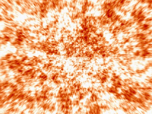

Let me see... Very rough clouds, curves, and a zoom blur?
Edit: I changed some stuff on it, just to see if I could, and it ended up looking not-so-bad.

Here's what I did:
1) Use Shape3D on a duplicate layer of the background (original), and get a sphere. We're going for a fireball here, remember.
2) Duplicated the Shape3D layer twice, put one on Overlay blending mode and put the other on Color Burn blending mode. I did a few other minor things, but nothing too big.
-
Cute! Exactly it reminds me of the leafs of a poinsettia or euphorbia pulcherrima or as we call it here xmas star: http://www.jonioeventi.it/galleria/d/37 ... tale+1.jpg
Yeah, that's exactly what I was thinking of.
Nice job on your "a new something in red", I like it!
-
I was just fooling around, trying to convert Thistutorial into a Paint.NET one. So I ran clouds, did Polar Transormation at default settings, and ended up with something resembling a waterfall. Then I ran a fragment blur, with the blend mode on Darken. It ended up making the sun reflection things, so I thought I'd post the image here.

-

I took Drew's flag, did a black angled outline on another layer, then did a tiny white angled outline on another, to make it look separate. Does it look good?
Edit: To answer my own question: No, it doesn't. I fixed the edges in a bit of a hurry, so they look like bloody potato. It takes a while to get anti-alias on the right settings. :? This was more of a concept than a piece of art, though.
-
Nice! That kind of looks like a leaf, because of the texture.
-
I changed the font in my signature, does anybody like it?
Old Signature/Old text:

New Signature/Changed text:

^^ For clarification.
-
That signature is awesome! The sky color goes really well with the white of the tree and the grass. I think your only problem is the text.
-
Yeah, that looks a ton better. Maybe run some clouds on the text, or something similar, so it isn't as smooth.
-
Noise, anyone?
-
Excellent work! I think that you could make the lines for the sides less obvious, and maybe make them thicker with a blur so they look like edges. You could also make the green things less shiny, and darker.
-
^^^^
*Sniff*
Beautiful, absolutely beautiful.
:wink:Edit: My current avatar is one of my many results of this tutorial... Here it is, in case I change it at some point:
Now I'm gonna go try it with the alpha mask method.
-
I think it would be cool if you had some more different colors in it, you don't have much "varitity", as TopHATslash said.
-
My avatar and signature made a couple years back. I have no clue where the stock image is (the skeleton reaper). They were made in Photoshop (Either 7 or CS1), not PDN, but I'm new to PDN for anything other than cropping/resizing. I thought I'd post these anyways. I've got to learn my way around PDN, as the only experience I had is with Photoshop. I've used GIMP before, but it was the same deal as PDN. Now I'm off to find some Photoshop-to-PDN guides...


Welcome to the Paint.NET community! I hope to see some 100% PDN coming from you soon.
-
Awesome, Mike! I've been looking for someone to do this for a while. It made me look at some things differently, but for the most part, I agreed with it. Nice job!
-
Very Nice. However it is a bit empty on the right.
My newest sig. Could someone tell me where to put the text? I couldn't find a decent place to put it.
Here's my spiel:
Zehro, I think that you have text-related problems. In the three signatures of yours that I've seen, you've had a pretty normal looking and standard font, and it has been in a place that makes it look like it was just jammed in there last thing. I think that it would suit you well to do some cool effects on the text, and have it be understated, not a point of attraction. An example of this is Blooper's signature, you should find one of his posts and check it out.
...I write too much...

-
It's nice, I really like the background, the blue with the light looks great.


Pestilence's Gallery
in The Pictorium
Posted
You're really good, man! I like the pestilence cell, you did an amazing job with it. The balance of the green is just right, too, it's not an obnoxious amount (that's a positive thing, in case it wasn't clear ). Keep up the good work!