


georgiabrat1978
-
Posts
21 -
Joined
-
Last visited
Posts posted by georgiabrat1978
-
-
I love the first picture. It looks like something you would find on a magazine cover. I'm very impressed.
-
Here is something that I created with Paint.NET (Duh you're saying to yourself.)
The quill is downloaded from online. Other than that, everything else is made strictly from PDN.
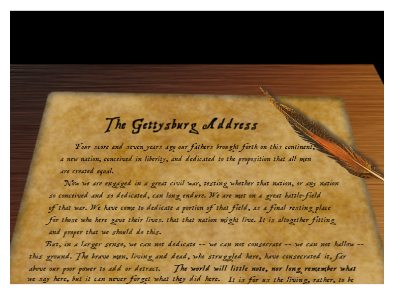
I wasn't really sure what to do with the background. I thought about leaving it white, but with the wood texture it didn't quite mesh well. I know it's not the greatest thing in the world, but I think I did an okay job.
-
honestly, DarkShock... because i didn't know how haha

it wasn't coming out right for me so i gave up
but thanks!
What I did was use the rectangle selection tool, selecting the picture at the top(leaving about a 1 to 2 pixel gap, or where ever you want the fraying edges to start, ), to bottom invert the selection and then do the frosted glass effect.
-
I have seen this on the "tools" window, but I don't know what it does. What is this tool for?
-
I have felt that there have been harsh remarks made to people also. I'm not sure if it that the "reader" may be insecure about something and is taking what the poster wrote to mean something harmful, or if the poster just isn't relaying or thinking about how their words may or may not be perceived. My guess is a bit of both.
The bad thing about the written word is that it is difficult to express what it is exactly that needs to be conveyed. Either you will end up sounding too technical (a business letter format almost, as mine, I'm sure is reading that way), or you will end up sounding too vague, and possibly implying emotions which are not necessarily true.
What is written might imply a snarky, rude, or snobbish, attitude or emotion, but the poster might not have meant it to read that way.
Try not to take anyone's comments on the Internet too seriously. An imporperly worded sentence can and does imply an unintentional attitude or emotion which isn't there.
I am trying to be diplomatic in explaining what it could be. But then again, there are mean people in this world, and no amount of anonymity on the Internet can hide that.
-
I love paint.NET. It is my favorite piece of software used to edit images. I have seen some of the things that people have done with PDN, and I am floored by it. With me, it feels the most difficult thing I can do is antique an image, and even that is rather simple. How did you become "seasoned" at PDN? I have seen some amazing things done, and I the people who can do these advanced graphical effects, I can't begin to describe the awe I'm in at seeing this.
-
On the tutorials section, is a topic on antiquing. I tried my hand at it and this is what I came up with.

This is the original picture.

I like it, I just don't know how well I did compared to others.
-
Here is my attempt at antiquing.

Here is the original

BTW if anyone is wondering the photo is of me when I was a baby.
-
I've been trying to master the glass orb, (it's more difficult than it looks). Can you please give me your honest opinions.
Thank you

and

The first one is just the second one but with a pencil sketch effect.
If you've been able to master the glass orbs, please give me tips on what I might have done incorrectly.
Thank you.
-
I've been trying to master the glass orbs (that is on the tutorials section) and have never been able to really. I finally have one which looks, decent, but I could be bias.
Please tell me which of the two you like the best.
The first one is just the second one, but with a pencil effect. If you have done the glass orbs tutorial before, did I do it correctly? If not what did I mess up on.
Georgia Brat's Pictorium Thread
in The Pictorium
Posted
The font I downloaded online. I googled for "pirate font" and it's actually called "treasure map deadhand" or something like that. As for the actual site I downloaded it from, I'm afraid that I cannot remember. I'm sorry it took so long to get back, busy, busy, busy.