


olav.k.m
-
Posts
265 -
Joined
-
Last visited
Posts posted by olav.k.m
-
-
Simplistic and pretty cool, but I'm not sure I like the white background. Seems a bit open, like somethings missing if you know what I'm saying.
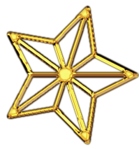
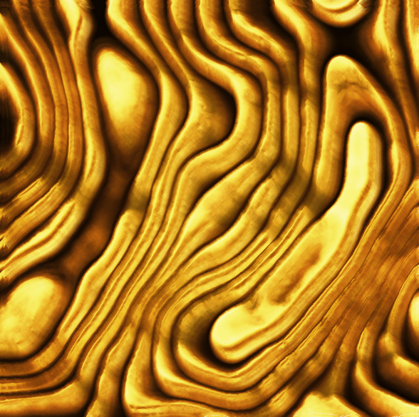
Some weird gold stuff:
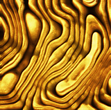
EDIT
A variation of the same image:
-
Ah, yes I can see what you mean. Good job covering it up, I didn't notice it before you wrote it.
A WIP I'm not sure I'll ever finish
 :
:
Painted using (mainly) paintbrush and smudge.
-
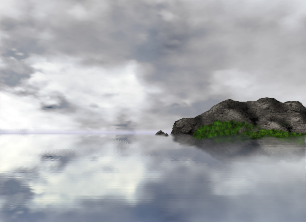
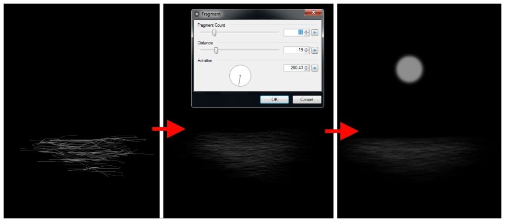
@ TheGuitarist: Actually I tried making something pretty similar to that scene a while back LINK
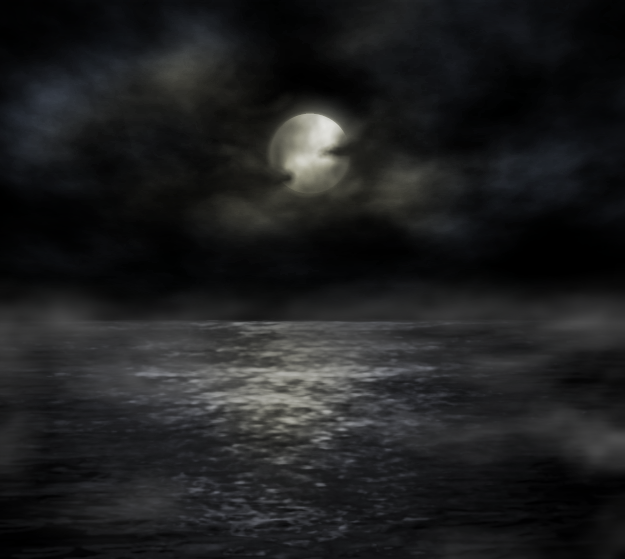
What I did for the water basically was first just draw a lot of lines with different shades of gray over a black background using a small brush size. Then I used fragment blur which gave me the basic look that (with quite a bit more experimenting) can give a pretty decent ocean-look. In the image below i then blurred and scaled the "water" and added a simple little moon.
@ Skitzo: I like that planet, cool idea using different colors like that.
 For learning spaceart techniques I think I would search for some photoshop tutorials. There's really a lot of material out there and I'm sure a lot of the techniques are easily transferred to Paint.NET. I'm no expert on the subject though.
@ Aislin: I like both of them, especially the first one. It's a nice crop and the simple background fits the subject very good. In the other one I thought I would like to see a bit more of the persons face, but seeing the original image I realized the hands would come in the way. It looks good though, maybe just a bit dark, but good job anyway.
-
I love liquify and smudge!

 Hidden Content:
-
Okay I'll post it as is (I'm going on a trip and don't really have a lot of time for improving it now).
If anybody does mind it you can just exclude it from the voting

-
I guess I could incorporate it into a bigger picture. I'll see what I can and have time to do about it. I liked the concept regardless of the competition so it's no emergency for me if I can't enter.
-
I should be more careful when reading the rules. Just finished my entry measuring 301x450 pixels...

Well it was fun to do anyway, I liked this theme, and there's a lot of really cool entries!
-
Metallize also works well if you use bevel selection first. I would look through the different tutorials posted, try playing around with curves, metallize and different blending modes.
I gave it a go using bevel selection, metallize, and a whole lot of messing around with blending modes:
-
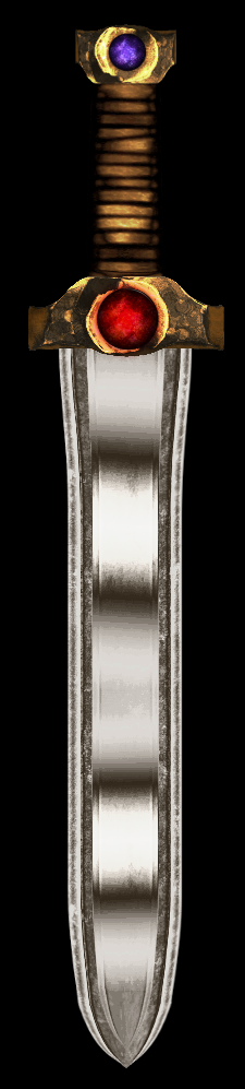
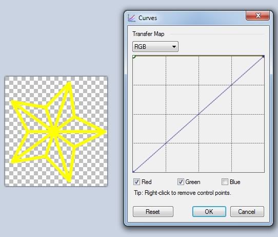
There are many different methods people use for making gold, but you could try this:
1. Cut out the star using magic wand (just hold shift and click on something white then press ctrl+x to cut it out )
2. Then using curves, make the star yellow by switching to RGB mode, unchecking "Blue" and moving the left anchor point of the other two colors to the top left corner. Like this.
3. Add another layer, move it under the layer with the star and fill it with black
4. Then you have what you need to make a gold star following step 5-12 in this tutorial: LINK
Just mind that your picture is a lot smaller so you will need to adjust settings like "depth" when using bevel selection to a lower number.
Good luck
-
This is AWESOME
Love it! -
 simply incredible!
-
Happy New Year all
Stocks:
+ A few pictures of curtains and drapery
Inspiration: This awesome photoshop tutorial
Mind you I didn't follow the tutorial at all, but that was what made me open PDN and start playing around
-
@ oma:
The tree is amazing, very nice and detailed.
I agree that christmas lights, and some "christmassy" surroundings, would really add to the piece.
It has potential for a beautiful christmas picture!
Edit:
@ AireDaleDogz:
That is really cool actually!
Nice jobEdit 2:
Just finished (more or less) something I've had lying around for some time.
-
That's horrible chrisco. Hope your family and yourself will get well soon, I'm sure no one will mind you taking all the time that you need
-
@ LFC4EVER: Thank you
@ barbieq25: Thanks, was considering making some gold text for it actually.
Tiger Wings is really nice. Nice colors, and the gold is looking excellent.
-
@ Possum: Very nice, neat looking 3d text with lots of gloss and shine, i like that
The golden wire-frame football in the back is also really cool. Not sure if the background with the "Indianapolis Colts" really fits, I think that adds a lot of the "busyness" csm725 is talking about. But I guess it's a matter of taste how much you want to have going on on your desktop background.@ aguba: Definitely professional looking. Simple idea yet very nice, neat and glossy. Beautiful.
-
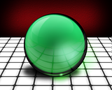
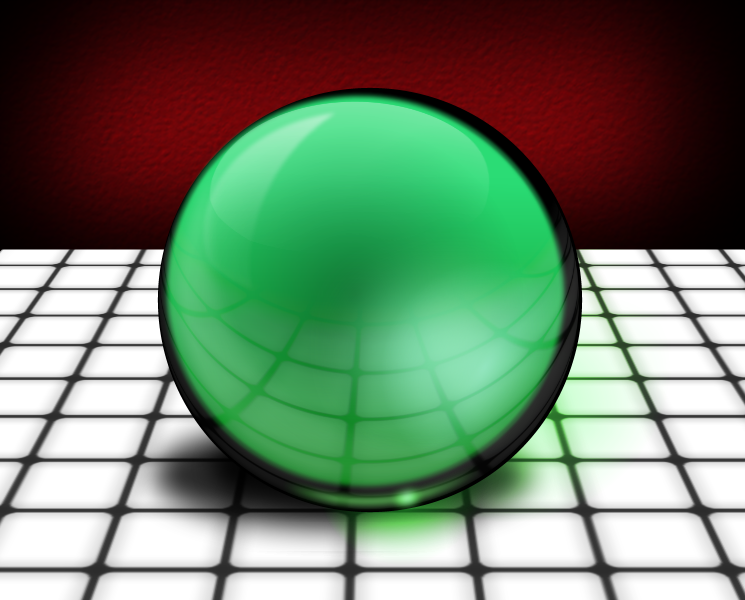
Nice tutorial. I tried combining it with SargonIII's Gloss Orb tutorial
-
I second tut/how to.
Made some textures which I used in this:
Textures:
-
And you claimed that other pic was as realistic as you get?
This is really cool, the water is superrealistic!

-
Amazing Falken! Your space art is always original and very VERY good! I'm a fan
-
Thanks for the comments
@ PsychoHarmonic: It's a bit dark in my opinion and I'm not really sure what it's supposed to look like, so I can't say if it's realistic or not. Is it supposed to resemble anything particular?
-
@ Mayor_McSteeze: Thank you, glad you liked it
@ Possum Roadkill: Thank you. As for the AOTW I was quite happy with the outcome, but still I guess I focused mostly on the looks of it whereas it seems Oma often really thinks it through and expresses something through her art. And that's a lot harder to mimic than just the look of something.
-
I've commented on it before, but can repeat that I think the phone looks excellent. I agree with chrisco97 that it's a bit pixelated/aliased in some areas, but that's the only flaw in a great looking picture. I think the background looks good too, kinda looks like northern lights.
Here's one from me:
100% PDN
-
@ Heat Stroke: Really out of this world! I like it.
@ Possum: Nice, I've always liked mysterious pieces with a lot of symbols and stuff.
Don't make much abstracts myself, but gave it a go:

 :
:


 simply incredible!

Image Umbrella: Abstract Images
in The Pictorium
Posted
@ skullbonz: Cool work. I agree with barbieq25 about the satin look. I like the copper colors too.
@ Tiharo: Very nice. Good stocks and choice of colors. My only complaint would be that it's kind of hard to read the text, but that might just be my computer screen.
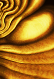
Inspired by a photoshop tutorial for a "grunge lines" texture: