


stefTACULAR
-
Posts
47 -
Joined
-
Last visited
Posts posted by stefTACULAR
-
-
Thanks pyrochild and sagedavis! I'll try and make it more readable, sagedavis.
-
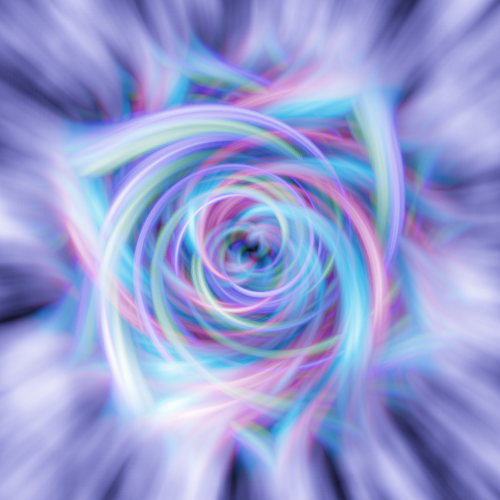
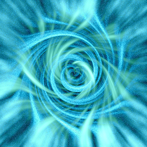
I finally made an avatar/sig set I like, so I wanted to show it and see what you guys think.
Oh, and the saying is an Italian proverb.
-
@snospmiS: No prob, I knew there had to be a way to invert the gradient without switching the primary colors. You learn something new everyday, thanks a bunch!
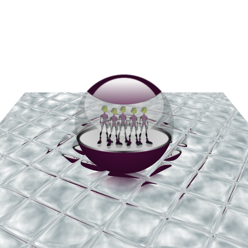
@Ash: Thanks! Although, in reality you wouldn't be able to see the top of the ball in the reflection since, well, it is a ball. Secondly, I do know that it is highly unrealistic to see the front of the ball in the back reflection... but otherwise it's pretty neat. Thanks again, though!
-
8.6) On "Layer 4.2", take the Gradient-Tool on Radial and Transparency Mode. Draw the gradient from 400,400 to 0,400.
That's why switching the primary/secondary colors doesn't fix that.
In response to Diva42 and Desktop_Bob, I couldn't understand how to fix that, either. If you just go on with the tut, it should be alright. I just added more transparency, though it does bug me.
-
I just realized that I forgot the shadowing of the Beast boys inside... but I saved the pdn file after I flattened the orb. Oh well, I still love the outcome:
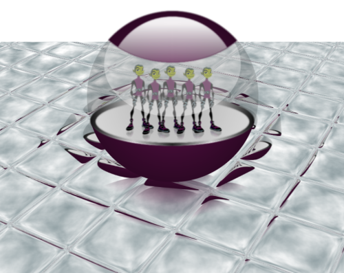
^Click for larger image.
-
I actually used to read those stories! You know, a kid wrote those while he was in school... lol. Pretty cool.
-
@mustang maverick: Yet again I am quite impressed.

Edit: Oh, and thanks!
-
@mustang maverick: You're getting pretty good at this! Nice light bulb! I can't wait to see your next creation.
I don't know if I like it better than my other sig. Suggestions/opinions?
-
This is really neat! I can see a game in the Overflow popping up from this...
-
Dang MM! That's pretty sweet. It's so... surreal, like a dream or something. Nice.
-
It's quite simple, actually. Right before you merge the two layers together (before step 10) add some noise (:AddNoise: EFFECTS > ADD NOISE) to one of the layers. I used Intensity of around 50 to 60 and Color Saturation at 0, but you can play around with it to get the effect you're looking for exactly. Let me see when you're done!
-
Which, I must say, is pretty awesome. Nice job!
-
EvilNeko, the second one is really cool, nice job!
-
How did you get the multiple colors? I have tryed paying around with the curves but only make things varients of one color or another. Sometimes the colors get really harsh. Apparently I don't understand the curves attribute yet, but anyway this is one of my favorites so far.
By using multiple layers. Use curves on the different layers before you flatten the image. I used four different layers to get those colors.
-
Using shape3D I made a castle:
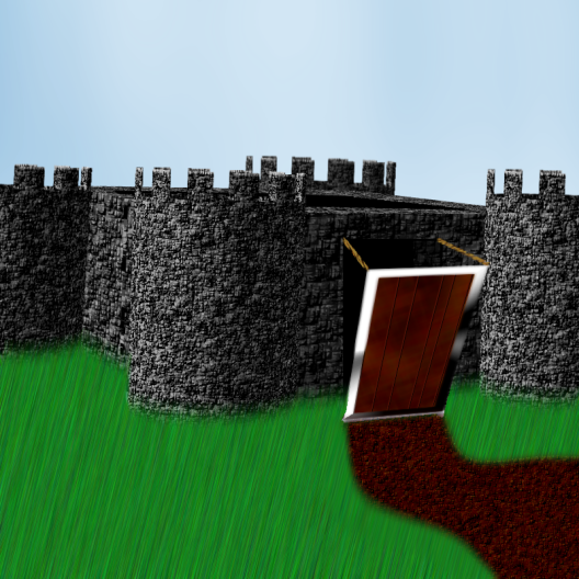
100% pdn!
Could use some more work, though, but it's getting late.
-
Angelaz, I really like your sig. It's so simple, but for some reason I'm captivated by it.
-
AND, if you see you double posted, there's a small red X at the top of your post to delete the second post.
Yea, I never understood why people would edit the second post instead of just deleting it...
However, that's off topic...
Jerkfight, I really like that! It could be even better if you smoothed out the rounded corners, but other than that it's pretty awesome. Nice job!
-
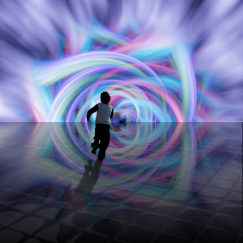
I like it a lot. Did you render the boy's shadow on the reflective floor, or was it created from the reflection itself?
Thanks! And yea, I rendered it myself.
-
Buzzkill, pyrochild, oma:
Thanks!
Pyrochild has been setting an oriental trend... I thought I'd take a stab at something original rather than his sig with my name and in a different colour (not naming names ):
): I was wondering who actually started that, and I must say I could've guessed because I like his the best.

I like that font! If you don't mind telling, what is it?
-
I'm proud of it, at least...
-
Spongey, that's pretty amazing. The spiderman/venom one is my favorite. Was that all one picture, or did you find 2 separate ones?
-
Why thank you, Talacake. That's what I wanted to accomplish, and I'm glad someone noticed it because that means it worked.
-
I def. skipped over this tutorial, and I'm so mad I did. I've been wanting to do this for so long, and could not figure out how. THANK YOU!

-
Sweet, I use your method a lot.
The Pictorium! Post your created or edited images here!
in The Pictorium
Posted
Yea, that was annoying me too... I think I fixed it.
I also made the font more readable .
And thanks all for the wonderful comments!
@ jpope: I really like that tiger one, nice job! I also went to the zoo the other day and got some pics:
Those two are my favorite pics, but nothing as clear and beautiful as yours.
Oh, and here's my tiger one from the beginning of the summer:
[click for larger images]