


cjmcguinness
-
Posts
494 -
Joined
-
Last visited
Posts posted by cjmcguinness
-
-
I don't spend as much time around the PDN forums as I used to, but I drop in from time-to-time to see what's going on. I saw this competition and it really piqued my interest.
It was unfortunate that the response, in terms of entries, was a little disappointing - but this is a great concept for a competition and I hope it continues, as I would definitely be interested in entering again.
I have to confess that I didn't get round to voting before the deadline, but if I had voted it would have been for entry #3 (the camouflage one - by Skullbonz, I believe) so, morally, it probably should probably be a tie for 1st place. Anyway, thanks for the votes and if, like some other competitions on the forum, the winner gets to choose the next theme then let me know and I'll come up with something to get the PJC#02 up and running.
-CJ
-
About 6 or 7 weeks ago I put a placeholder in my gallery stating 'Under Construction' - this was something that I though might take a few days, perhaps a week.

A subway map is something I've wanted to do for a long time and I decided to go for something fictional, so started producing a map that would cover all of Ireland - many sleepless nights ensued and work was scrapped and started over (and over) again. Finally a concept started coming together that fit in with other famous subway maps and after, literally, weeks of plotting places on maps, moving them, changing line directions, etc, I settled on a finished diagram.
I just threw a logo and a line-key on, so it is still work in progress: I hope to flesh it out and make it more of a recognisable map poster, that looks somewhat official.
This has been, by far, the piece of artwork that has taken me the longest - and, to be honest, it was a great exercise in patience, but I don't think the final result will quite be worth the time spent - in fact, I may call it a day as it is.
-CJ
-
Work in progress.....
Coming: Summer 2011
-
@cjmcguinness: I once made a set of tools to ease the stereogram manufacture process Stereogram Tools (beta). I didn't get around to releasing them as they didn't seem that popular (the plugins that is).
You might find them useful.
The 'Backfill' effect is definitely useful, cuts down on a lot of tedious work. However, the 'Echo' effect would benefit from a greater scale of Vertical echo height - 512px seems a bit limited, especially if you want your stereogram to be 800x600. Also, I tend to try and make my backgrounds look as seamless as possible.
I have been starting with something like a 100x600 strip and using the Random Shape Fill plugin to cover the area (repeated), then with the Panelling effect I shift it 50px so the seam is in the middle, then select a 60px wide strip, in the centre, and use the Random Shape Fill again to cover the seam (this time keeping all objects inside, so none cross the edge).
This creates a nice 'tileable' texture. Your 'Echo' effect would be great if I could then paste this into a new layer and 'echo fill' across, however (again) it only works if the image is less than 512 in height. Maybe if I created a 300px height tileable texture I could then panel this in two rows, but I prefer full height strips.
Good work on the 'Backfill' though, I will definitely be using that on any future efforts.
Cheers
-CJ
-
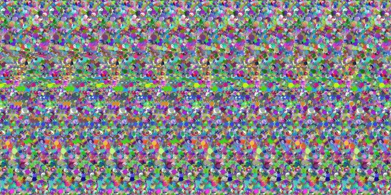
Beam us up! Fabulous stereogram. How many tiled strips did you use?
The image is 800x400, and I used 8 x 100px strips for the background. I then cut the 'image' into 10 x 80px pieces.
I've always loved these 'Magic Eye' pictures - probably because I have no problem seeing them and so many others do, lol.
I am currently working on one for my daughter, based on Twilight (go figure!). I am trying to work out if I can get multiple layers (i.e. one on top of another). My first effort was unsuccessful
 - I'm also trying to see if I can do a true 3D style one, you know, like a shaded 3D texture map image - any ideas?
I suppose that kind of thing would require a sophisticated program, and do it 1 pixel strip at a time, each at different focal distances.
Anyway, I am happy with my first results and will still use this method in the future.
-CJ
-
Nice one: I remember making a request for someone to develop this type of plugin over 2 years ago

This should be very useful.
Thanks.
-CJ
-
A couple of times in the past I tried to figure out how to do these with PDN - gave up in the end, but great to now see the methodology.
Nice tutorial - I will definitely have some fun playing with this (BTW - Pyrochild's Random Shape Fill plugin is great for backgrounds):
Thanks
-CJ
-
I present the ZX Spectrum Emulator Application, for iPad.

This is approximately 95% Paint.NET. However, I had to make use of some stock images as references:
- I recreated this ZX Spectrum Keyboard Layout, in the iPod style.
- I used this as a base reference for the home screen.
- I recreated the first level of the classic 8-bit platformer, Manic Miner (then added touch-screen controls to the bottom).
- I also used this plain black Apple Logo, inverted it and coloured it in.
Additional stock was used for the little Game-App icons at the bottom:
-CJ
-
Hmmm... the 'Daily email digest' option does not seem to be working, either - I am still getting separate notifications of all thread updates.
Is this just me, or is anyone else having similar 'email notification' problems?
-CJ
-
Have you tried the "Delayed Email Notification" option?
I have now - we'll see what happens.
Unfortunately, no joy. I just got 8 forum email updates in a row, all from this thread, without having visited it in-between.
On the old forum I would have gotten one mail letting me know there had been an update and not received another until I had visited that thread again.
Sorry, it's just too many emails for my liking. I've changed my notifications to the 'daily email digest' - not ideal, but the best I can do until such time as a solution can be found.
-CJ
-
-
It's been a long time since I entered any sort of competition on the forum, so I thought I'd give this one a go.
http://i263.photobucket.com/albums/ii129/cjmcguinness2/PaintDotNet%20Forum/WorldCupMagazine.jpg
Stock used:
World Cup, Background, Soccer Babes Wallpaper
World Cup Logo, World Cup Wallchart, HDTV & Sky+HD
Fonts used:
Agency FB, Century Gothic, Impact & OCR A Extended
(edited to convert original image to thumbnail]
-
Have you tried the "Delayed Email Notification" option?
I have now - we'll see what happens.
-
I have a question regarding email notifications of 'watched topics'. In the old forum I would receive an email when a topic I was watching was updated and would then not receive another email about that topic until I had been back to the forum and viewed it.
However, since the migration of the forum I am receiving email updates for every watched topic after each update, whether I have visited the board and viewed that topice since the previous email update.
I have had a good look through the notification settings and cannot find anywhere to change the setting to the way it used to work. There is the option for 'immediate' or 'daily batch' (etc) updates, but nothing that will allow me to prevent further updates to watched topics until I have acted on the previous notification.
I am finding that my inbox is getting very cluttered with email notifications for every watched topic on a constant basis, much more than ever before.
Is there a way to configure the new forum so that I only receive email updates for threads once, then not again until I have re-visited that thread.
If not, I am going to have to turn off my notifications, or at least restrict them to just once-a-day.
-CJ
-
Welcome back! It's great to see one of the greats here.
I just realised that my 3-year anniversary of joining the PDN forum has just passed - and that it has been virtually a year since I posted anything new.
The migration of the forum brought a flood of thread update emails and inspired me to dive back in and throw together some pieces.
It's good to be back!
-CJ
-
-
-
My wife is seriously considering buying this car, despite all the recent bad publicity for Toyota (she's been driving a Toyota for 5 years, and absolutely loves them).
The Avensis Tourer and it's toy counterpart:

-
...i did not use the plug in at all.
If you are not going to use the Gravity plugin to sew all the parts back together, you have to be very careful to get everything lined up properly.
-
This is my try:
What do you think?
My first opinion is that you need to use 'anti-alias' in Shape 3D, in order to get smoother edges on the chips and cards.
Also, and it's only a small point, but the angle of your chips makes it appear more like you are looking down from above - and the separation of the chips in each stack is quite large, making it appear improbable that they are stacked on top of each other (I hope you know what I mean).
It all goes towards realism and believability - if there is something that doesn't look quite right it kind'a throws the whole thing off.
I have to say, I like the colour of the background and the actual designs on the chips - so some work on the image quality (anti-alias) and composition and it'll be heading towards excellent.
-CJ
-
I just updated to the official 3.5 version and have immediately come across a weird bug.
It relates to using the either the Rectangle or Circle select, followed by resizing the selection using the 'Move Selection' tool, followed by switching to the 'Move Selected Pixels tool and trying to resize using maintaining the aspect ration (by holding the Shift button while resizing).
Steps to reproduce:
1. Open Paint.NET (v3.5)
2. Choose the 'Paint Bucket' :PaintBucketTool: tool and fill the entire canvas black
3. Choose the 'Rectangle Select'
 tool
tool4. Make a rectangle selection, anywhere on the canvas
5. Choose the 'Move Selection'
 Tool and change the size of the selection
6. Now, switch to the 'Move Selected Pixels'
 Tool
Tool7. Holding the [shift] key, now try and resize the selection (maintaining the aspect ratio)
Expected result:
When you make a rectangle selection and then change the size of the selection, when you switch to the Move Selected Pixels tool and hold the shift key, it should revert to the aspect ratio of the initial selection (before you started resizing) and only adjust that selection.
Observed result:
While the aspect ratio of the initial selection is maintained, and it appears that you are changing the initial selection, the pixels from the resized selection are removed from the canvas.
Try holding the shift key and continually changing the selection size, you will see the final resized selection as a blank space in the canvas.
This now has the result of deleting the final selection as well as resizing the initial selection - which is different from the behaviour pre-3.5 and I believe constitutes a bug.
I can provide some screenshots demonstrating the issue, if this cannot be reproduced on other systems.
-CJ
Additional Info:
OS = Windows XP Professional - SP3
-

100% pdn creation no tracing just a reference pic to know what a lady bug looked like in detail. not the best and a little ruff, what the verdict
Looks pretty good; I like the colours and highlights in the tiled background.
Just a couple of pieces of constructive criticism: Ladybirds (or Ladybugs) generally have a symmetrical pattern on their wings, so it would have been better to pattern one side and mirror it. It seems like the splatter patterns are a bit flat compared to the curvature of the wings as if you put them on after you highlighted them; the highlights and shading should also affect the splatter pattern. Also, the head of the bigger bug seems a little blurred.
Just my opinion of how you could make this even more realistic, or to incorporate into future pieces.
Keep up the good work.
-CJ
-

I assume you are not claiming to have created this image yourself (see here), rather that you have made some 'enhancements'!
That being the case, this should probably be in the 'manipulation' gallery, and you should reference your source material.
That being said, the 'enhancements' are subtle, but effective; nice work.
-CJ
-
That is so wicked cool. I'm happy you added an awesome piece. Great, great job!!! :shock:
It's so...awesome. Love it!!!!
One of the legends have returned....Awesome piece of works and I tremble in the presence of greatness.
Truly amazing work. Thanks for sharing it.Thanks for the comments, folks; much appreciated.
Chuffed that you've enjoyed my latest stuff.
 tool
tool Tool and change the size of the selection
 Tool
Tool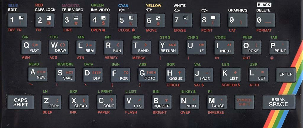
PJC #1: Opening contest!
in The Archives
Posted
As the saying goes, "There's more than one way to skin a cat".
I would like to propose that the theme for PJC#02 should be to give these rather bald looking felines a new coat (or an abundance of body art).
No cats will be harmed during this competition.