


Tendercrisp
-
Posts
189 -
Joined
-
Last visited
Posts posted by Tendercrisp
-
-
Beautiful sig.
That is all.
Meeting adjourned.
-
Very nice, far better than my first sig.
But a few minor complaints.
1. Needs a border, a 1px black border will do, you don't need anything too fancy, just something to separate it from the forum background. Just a small simple step that makes the sig look loads better in my opinion.
2. For next time, something slightly more original. No offense, but I see so many halo sigs they start to all look alike. Not saying your sig is bad, because it most certainly is not, but yeah, lack of originality.
-
No. You don't need a bunch of filters and effects on text to make it look good. Just make it contrast less with the cover is all.
Or put it in a more suitable place.
-
Very nice work on those headphones.
-
Really helpful tutorial. I started at the same way Mike Ryan did, and developed similar techniques myself that he mentioned in this thread to keep me motivated organized, and relaxed.
One thing I want to add on:
This sorta fits under the "Enjoy what you do!" section, but don't be afraid to procrastinate a little. If you're working on a long art piece that takes quite a bit of time to finish, save finishing it for another day. I used to be the kind of person who NEEDED to finish everything in one day. This was my worst bad habit and it was the hardest one to quit. But once I learned to work on my art slowly and thoroughly, the process was much more relaxing, and yielded much better results.
When you try to finish a large project in one day, you get bored towards the end, and want to get it done as fast as possible and end up rushing through the last part. Not good.
The second you start to get bored with it, quit. There's no deadline for your art. Go do something fun, come back later. By that point you'll be more excited about finishing the piece and therefore more dedicated to the quality of the work.
-
Eh. They're alright.
I made one awhile back when the first GTA IV artwork was released back in early 2007.

-
And you said you were not good at drawing, you
 !
!Not traditionally I'm not.

Give me pencil and paper and I'll fail miserably.
there's no ctrl+z in real life.

-
No problem. Feel free to comment my gallery as well [/shamelessplug]

-
Very nice. I like the bottom one most. The glowing ball around her hand is very cool.
-
The Joker *work In Progress*

Artist's comments
Made in Paint.NET. Not sure if I'm finished yet.May add a background/touch it up in photoshop. (which I now have!
 )
)Art Specs:
Time taken: About 5 hours
Programs used: Paint.NET (will touch up in photoshop CS3 though)
Techniques used: Viewed a few stock images and basically colored with the brush tool as I looked at them. I did not trace over them though. That wasn't it though. I used lots of other techniques that I don't feel like typing up.
Stocks used:
-
Well now this is really cool! No flaws, I like it!
And b.t.w. would you please give a more detailed explanation on how you worked on that?
I'd love to learn a new technique that could (eventually...) help me to improve my really poor drawing abilities!
Good work!
I start off with a white background layer (so I won't have to look at the annoying transparencies.
I then add a new layer. Using the brush tool with a width of about two and a light blue color (I'll tell you why later), I draw the basic outline of the figure I'm making. Just the figure. Not their hair, clothes, or accessories.
on a new layer I continue using the brush tool, this time drawing a basic outline of the clothes that surround the body, paying close attention to detail but not concentrating too much on making the lines perfectly smooth. The brush color for this layer will be pink. The reason I'm using different colors is so I'll know what I'm doing when I go to do the line art in black. (which are the lines you see in the final version of the picture.)
At this point save frequently. Especially if you lose power a lot like me.
Once you've got the clothes down, add a new layer and do the hair in a different color. Like green.
Once done with hair, the final layer will be the face in a color you haven't used yet. Make sure you're still using the brush tool.
Once you've got all your basic outline layers, add a new layer. Select the line tool with a bold black color and 1px wideness. Make sure you make both ends of the line rounded. Use the line tool and trace the lower layers and add a few details. Make some changes that deviate from the original plan if you like. This will be the final outline before you start coloring. Take advantage of the bezier curve (right click line nubs instead of left clicking them) option to get the smoothest lines possible.
Save this file as the first phase of your drawing. Save it as a PDN file.
Now copy and paste the black outline into a new file. This will be phase 2, the texturing phase. (phase 3 is finishing touches and adding background)
It's hard to explain how I color. But I basically color and shade on a different layer than the outline. Every texture layer is separate (one for hair, one for shading on hair, one for tie, one for shading on tie, one for pants/jacket, one for shading on pants/jacket, etc.). And almost all of the texture layers minus the hair (which I wanted to look fuzzy so I put it above the bold outline) are below the outline layer. This is to prevent giving the lines an aliased look and so you won't have to spend as much time smoothing out the edges of your textures.
-
Wow, nothing like looking at other people's submissions to make me feel inadequate, lol. I made this as my first wallpaper and basically my first 'big' pdn project:
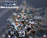
(thumbnail links to full verison)
You did a great job. You cropped every one of the players cleanly, and you stacked/layered them efficiently as well.
I like.
-
This IS a Tasty Burger

Artist's comments
OM NOM NOM MOTHA****A!100% PDN
Art Specs:
Time taken: 5 hours.
Programs used: Paint.NET
Techniques used: I took a new approach to drawing in Paint.NET. I'm still just using a mouse, no tablet yet.
I started out with a basic blue outline of the character's posed body
On a new layers I drew out clothes (in purple), face (in pink), and hair (in green).
I saved that in a .PDN as phase 1 of my drawing process.
In a new file, I took these three basic outlines and drew a 1px black lineart version of the drawing. I then used layering techniques, the brush tool, the fill tool, feather and gaussian blur effects, and a lot of time to color in the lineart.
I saved this as the final version.
Stocks used:
None, and I'm proud!
-
Nice job on rendering the COD4 character in that one sig.
Just some constructive criticism, if I may?
The sig is far too tall. There are few respectable forums on the internet whose rules will allow you to sport a sig that tall. Even if it's just part of the render sticking up from the main body.
The sig background itself is pretty bland, seeing as it's just a gradient background. Try adding brushes, borders, and some more COD4 related stuff. Maybe even a large shadow/reflection of the character you rendered. That's always a legitimate space-filler.
And lastly, the text. This has always been my personal opinion, but I think non sans-serif fonts look goofy in traditional box/render sigs most of time.
-
Kill Nolan: Volume 1

Artist's comments
Would be funnier if it weren't an inside joke and my name rhymed with Bill.And yes, that is my head getting sliced open.
Purty, ain't it.
Art Specs:
Time taken: About 3 hours.
Programs used: Paint.NET
Techniques used: See "Staring Death in the Face". I used similar techniques for drawing and coloring.
Stocks used:
None
-
RIP George Carlin

Great comedian. Died earlier today. Or last night, not sure. But he was a legend.
Artist's comments
Art Specs:
Time taken: About an hour
Programs used: Paint.NET
Techniques used:Typical Photoshop-esque Brush/render sig.
Stocks used:
A few abstract brushes I nabbed from PS brush packs on deviantART. I used abrviewer to convert them for use in PDN.
Photo of George Carlin > http://members.cox.net/jritland1/images ... lin-L1.jpg
-
Also I am not familar with endorphin 2.7.
It's animation software as opposed to graphics editing software. I posed a character with a guitar with it so I would have something to look at as I drew the guitarist.
And thanks. There is indeed a ton of flaws in the image. But In never was good at drawing.
I suppose I should get a tablet so as to improve my skills in that area.
-
El Guitarrista

Artist's comments
Took a few weeks. But I was working at a snail's pace and I was working in short bursts of about 30 minutes every 4 or 5 days.Art Specs:
Time taken: 4-5 weeks. Working at a Snail's pace of about an hour a week.
Programs used: Paint.NET, endorphin 2.7 LE.
Techniques used: I used the Line tool for drawing of characters, my own canvas isolation technique (an extension of the technique I used in my "Cutting out images the easy way, v2" tutorial) for coloring/texturing, and I used the simulation characters from naturalmotion's "endorphin 2.7 LE" program as 3D pose-able mannequins (a better explanation of this can be seen in This thread on the naturalmotion forums). I also used the soft brush technique outlined in Wither's awesome "Faking soft Brushes, etc." tutorial .
Stocks used:
None.
-
A few things though: why the characters have no pupil?
I don't know. Ask her, she's the one who drew them with no pupils.
and why did you highlight yourself with an halo, are you undergoing a process of beatification?
Ciao
No, I was parodying the last supper, hence the name of the deviation.
Last supper:

-
Hehe -- very cool!
The coloring is really great - and I like the expression you added to yourself!
I wish my school was over already... I have math finals monday and tuesday, and wednesday I'm finally out.
I didn't add the expression to myself though. My friend (the blonde one in the drawing) drew the original picture while we were all sitting at the table. I scanned it and messed around with it on my own time. I just colored and textured it basically.
-
Today was the last day of school! And with this day comes a small update.
The Last Lunch

Artist's Comments
So, my friend Peytonn (Anime-Rocker [link]) drew a sketch of all of us at the lunch table on the last day of school.She gave it to me to take home to scan and upload to myspace.
I did so, but I got bored and decided to add some color to her drawing. This took longer than one might think.
I'm the one with the halo.
Art Specs:
Time Taken: About 5 hours on and off.
Programs Used: Paint.NET
Techniques Used: Same techniques I used when making "Staring Death in the Face", except the lines were drawn over my friend's drawing, rather than originally made by me.
Stocks Used:
[link] <<<< Original Drawing (Scan)
-
Another small update. I made another GTA IV sig. *Yawn*
Was practicing making stencil art in PDN and decided to make this:
Niko Bellic Stencil Sig

Artist's Comments
Made a stencil out of This Screenshot:... and then I decided to use it as a sig.
Art Specs:
Time Taken: About 2 hours from concept to finish.
Programs Used: Paint.NET
Techniques Used: Used the techniques outlined in my "Cutting out images the easy way, v2" tutorial to isolate Niko from his background, used the ol' ctrl+shift+G to get the image black and white, Messed with the brightness/contrast and level adjustments to turn it into a stencil, and used the brush tools with black and white colors to get rid of gritty edges, create bridges, and make it look like a cleaner stencil.
Stocks Used:
-
You make good use of the shape 3D tool.
Nice gallery.
Some of your works I didn't care for too much
like this one.

But, there were some that I absolutely loved.
Namely this one.

My verdict: Stay away from random rainbow pieces that just use a bunch of distortion plugins. Make more Shape 3D art. Work on making your work less pixelated. Feather more. And lastly, get a deviantART if you don't already have one. Because you definitely have talent and I'm looking forward to seeing more of your work.
-
Thanks for the feedback (finally).
Anyone else have any constructive criticism or anything they want to give me. I would always like to get better. Even if I have 2 years of experience I can always improve.


![[link]](http://a102.ac-images.myspacecdn.com/images01/40/l_d60569f0a8ad6b3d1049ed526b513bcd.png)
![[link]](http://image.com.com/gamespot/images/2008/114/reviews/933037_20080424_screen018.jpg)
Tendercrisp's Forum Gallery [Last updated 9-07-08]
in The Pictorium
Posted
TF2: Meet The Tommy
Artist's comments
Art Specs:
Time taken: About a few weeks, working randomly on and off in little bits of five minutes at a time.
Programs used: Paint.NET
Techniques used: Typical techniques I use. See past works.
Stocks used:
None. Except for the avatar on the front of the minigun. Which was made by the person that the person this art portrays.