


13_15_4_14_1_18
-
Posts
226 -
Joined
-
Last visited
Posts posted by 13_15_4_14_1_18
-
-
I have no idea what that meant, but cool.

-
Thanks Gadfly!wow, thats really good! i like it.great job!

-lol i like your sig too

-
Okay. After a good three days of making this, here it is. My submission to Alphabet Contest '06. In my opinion it's probably the best image I've ever made.
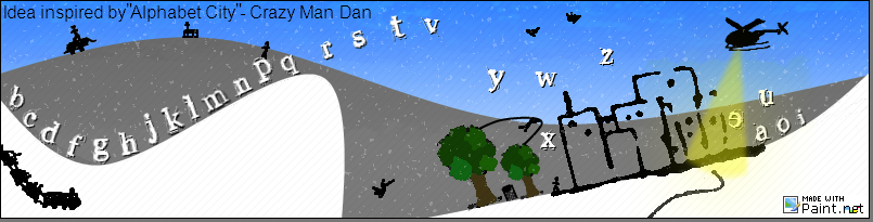
Click here for the PDN file. (Be warned, it has 75 layers!) Also, filelodge is very slow.. so give it time.. (You might have to refresh a few times too.)

Hope you guys like it! Tell me what you think.

-
I like the phone idea. We sure have some creative people on these forums
-
I've been working on my submission all day. Damn Crazy Man Dan! He is so hard to compete with!
Everyone else's works are so good too! This was actually a very good idea for a competition. I am enjoying making my image immensely! Thanks Flohrian! -
Clone Stamp: Hold Ctrl and left click to select an origin. Afterwards, left click and draw to copy.
-
@Picc84: Read the first page of this thread
@Jake2k: Creative! The subtle white lines really define the keys. I like it.
-
-
Hey, trickman, what font is in your sigbar/s ?
-
Sonic is great. Such a unique concept/character. Im still working on my submission for the alphabet contest. Nothing Sonic about it.

-
Count me in Flohrian. No bold name yet though. Still working on it
-
Yeah that's real nice. The subtle highlights you have on the text reminds me of BuzzKill's sig.. and that's a good thing
-
Batfinger, all you need to change is "cows" to "dog", and "jumped" to "jumps", that is the correct sentence.
-
:o That's sweet aatwo! w00t!
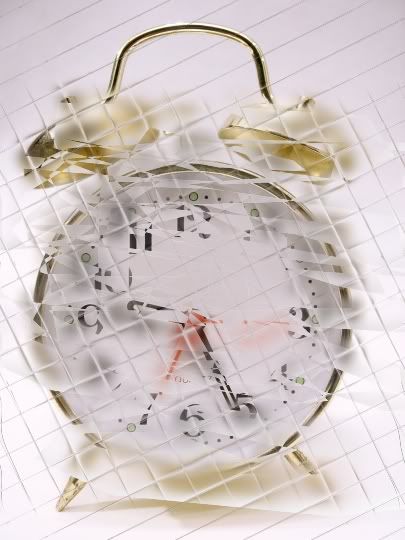
Here's a pic I just mucked around with. I call it "Time Lapse"..
-
You really enphasised that "very".. bold, italics and underline all in one.
-
I like what you ended up with. I don't see what that soccer match has to do with Paint.NET.. but anyway..
-
Yeah extract the DLL into the "Effects" folder in your "Paint.NET" folder.
(Default is C:/Program Files/Paint.NET/Effects)
-
Nice image trickman, hooray for you making the 400th post in the pictorium!
In regards to your background, from what I've found, if you use the same colors throughout your image it will make it look considerably better. I advise you make a red/white/black background. If you'd like I'll make one for you, but I'm sure you'd prefer to make it yourself! -
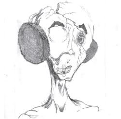
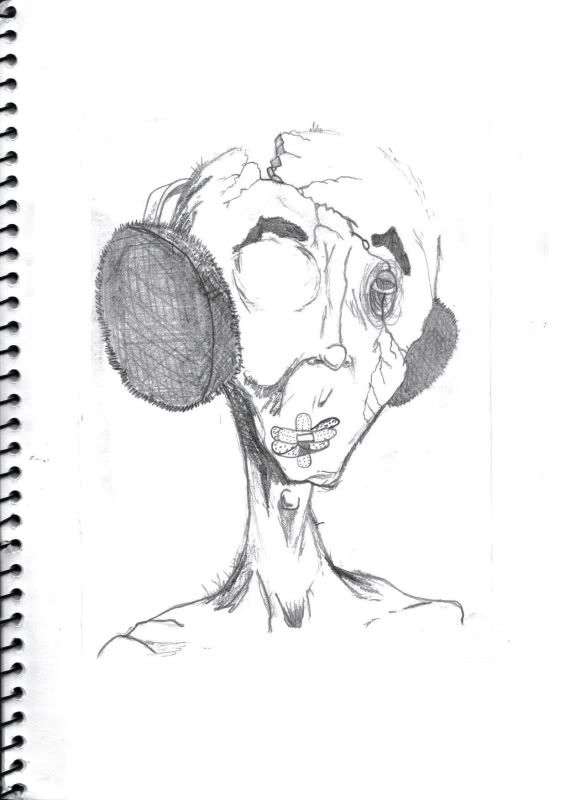
I've done a sketch of an artwork by Alex Pardee a while ago and thought I should upload and share it with you guys. Enjoy!
-
I've been searching for the meaning of BAMF for the last 30 minutes. Seriously, I ended up on Dane Cook's website, his myspace, the myspace of his friends list, all in the attempt to find what it meant. I am working on some more pics right now that I should be able to post up in the next few days.
-
Thanks Gadfly. I love your sig!
-
-
This all depends on what format you save the image as. When saving, just hit the drop down box and select a different format like "JPEG" or "GIF". It is only a PDN file that can only be opened in Paint.NET (understandably..)
Hope that helps!
-
So if there's any doubt... he's joking!
No pressure! I'm just looking forward to seeing what you end up with

Alphabet contest ;)
in Paint.NET Discussion and Questions
Posted
I've edited my post to reflect the.. inspiration