Mangasakka
-
Posts
9 -
Joined
-
Last visited
Everything posted by Mangasakka
-
 I hope that your hat contains correct stuff, MJW... (that even sounds lik a cat), because it would mean I don't have to worry about all the CYMK-business! I do remember that professional printers always ask for posters in CYMK, I don't know why. It was when I was making a magazine, and they wanted me to do it with InDesign which I hate as much as I do Photoshop, being a 100% pc-man, not an apple in sight. I did everything in MS Publisher, and that went perfectly. In the beginning, they al said: "oh, publisher is just a toy, you can't even do anything in CYMK! You can't print without that". I never checked whether that was true, though. That Krita thing looks a lot like what I tried before, but stopped trying right away, because it looked too complicated: MediBang. It seems there really are a LOT of those programmes! They all look alike, but at the same time, each one is a bit different from the others, although always different in an ohter way! One could spend years trying them all out thoroughly. Takes so much time...
 -
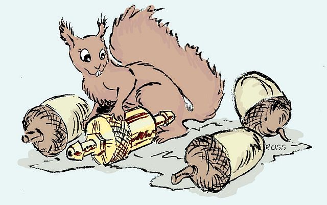
Thank you It was meant as a publicity logo for a device called a HTKC, a little brass thing you put in your carburator somewhere, and it makes your car consume less petrol and produce less exhaustion fumes. Since it's economical and natural, and it actually looks a bit like a brass acorn, the idea of drawing a squirrel was obvious. The order didn't come trough, the guy who sold the things left and I'm stuck with my squirrel, but it can be still useful to practice coloring, while I'm trying out all sorts of programmes. I started out as a comic artist in times when there weren't any computers yet, let alone digital art programmes... only brushes, real ones, Chinese ink, water colors or poster paint. That I can handle real nice! But editors want the stuff digitally colored nowadays, so I have to find at least one programme that I can handle. Most young colleagues use Photoshop, they learned that in Art School. But I hate it... when you look into a Phs. studybook, they spend 90% of it nagging on about fiddling with photographs, and I don't need all that! Just a tiny bit in the back of the book is about making art. And I'm too old to learn tons of useless stuff! I'd rather keep it simple. Paint. net was easy to color, especially because it fitted my drawings, they're not exactly Tintin style. (that's called "Ligne claire" , clear line school). That sort of drawings can be colored in Paint, even. But in my rough style, none of the patches are closed, so that is useless. In Photoshop you have to fidget with that lasso for hours, so boring! So slow! That's why I really want to use this, unless I can't put it into CMYK afterwards, some way or other. Thanks for the links, I'll check them out
-
I don't know, I'd have to color it all over again in Photoshop, and I don't like coloring in Photoshop, it's too complex and the brushes are not handy enough. But If I tried it, I would be able to choose from RGB to CMYK and back. If colored in CMYK, on the screen the greens would look pretty much like the green of a fluo marker. But afterward in print, it would look normal. That's why you color things in RGB and afterward switch to CMYK to please the editor. CMYK is required if things have to be printed professionally. So, if I color my stuff in Paint.net, I can't ever get it in CMYK? And is Paint.net compatible with Photoshop? Since you all know about it, I might as well ask before I struggle for days and find out it's useless anyway... Or, by "file format", did you mean something else? This language barrier is really a problem, isn't it?
-
owww... It's gréén. I was thinking 'primary colors' as in red, yellow, blue! In the mind of an old-fashioned artist, green is a secondary color, isn't it.... That's how I never thought of RGB being actually English, since yellow is Geel in Dutch, and that makes RGB rood, geel, blauw (red, yellow, blue). Never thought of finding out what it actually meant in English. 0r that anyone would call green a primary color! Anyway, I'm still wondering what to do if someone were to require my work in CMYK? That's often a requirement, from editors.. I'll do all the tests you gave me in a while, I've got to do something else right now, but thanks already!
-
Oh? I always thought RGB was for Rood - Geel - Blauw. So I translated that into RYB. It means something else, then? And if the editor wants CMYK, what do I do? Simply convert it into Photoshop (psd?), and then put them into CMYK? Won't the colors change a lot in that process?
-
thanks, ma'am. But that I already knew from the other digital art programmes. Only, in my initial picture, everything turned out a lot more vague and bland and greyish than in the color slots, so I couldn't take anything from my existing picture with the color picker tool, everything was bad. Apparently I had the wrong "dekking", since everything in the picture looked more intense as soon as I had upped the dekking: the acorns look much more like real ones as well as my squirrel, don't they? I then wondered why the black drawing stayed black everywhere, except on the HTKC device, where it turns yellow. But I clicked on mutliply layers, and hey presto! the black drawing got trough the brass color, which also looks more like real brass after the upping of the mixture. Clicking on multyply layers was a lucky guess, I had no idea it was going to get better. Anyway, it did the trick. All I need now is to know how to make my own palette. I hope that will be explained in the Help, for I have no idea how to get all the Hex codes on colors before I actually have mixed them on a drawing! But I'll get to that. This is the only painting programme that allows me to color drawings like that, where none of the patches are hermetically closed, and brushes that look natural. I am worried whether the editor will accept my coloring in RYB, instead of MCYB ? Oh good. So I can switch from English to Dutch and back without having to desinstall and reinstall all the time. Great. Thanks. I realize I'm at the "Dummies"-stage...
-
OOhh! Everything turns much redder! is that going to be only for this color, or is it meant to make all the colors brighter? Or do I have to discover how to make colors one by one? In fact, I haven't found much in the Help on the colors, except for how to press Ctrl to make a circle in the circle and Alt to make a ray, and the fact that the 2 little square frames are called "slots" in English. Nothing much about what all these things like "opacity" and other things mean and what they do. I made a printscreen. So what's called "dekking" in Dutch is Opacity in English? (in fact, according to the dictionary, it isn't, but hey, when computerstuff is concerned, my experience is dictionaries are totally useless). And on the menu bar on top, the 75 % "hardheid", what's that called in English? I'm saved for now about the colors, but I'm guessing in order to get information on this forum, I'd better uninstall my Dutch version and get me an English one... at least I won't have the problem with the translations!

-
Hmm... transparency is at 255 alright. If that's what the Dutch equivalent of "opacity" is, for my Paint.net is in Dutch (Belgium, here). There's one on the menu bar that says something that is to be translated literally like "hardness", that I put at 75%. I don't know how they call it in English. And yes, the blend mode is at normal. " I did that but all I see is something that translates as "coverage", and that's at 103. It's a bit confusing because English names are not always translated litteraly in other languages. One should maybe download 2 versions, one in one's own language to work on, and one in English to see what you guys use as terms... Anyway, I hope you can give advice based on what I've given. Now what do I do? I can't put the picture here again, since the forum says "you're only entitled to twohundred and something kilobytes" when I want to upload the entire page. I had to turn it into a small jpg and shrink it even, before I could put my sqirrel over there. Thanks in advance
-
Hello, As I've put into the title, I make a color and put it into the primary slot, but when I use it on my drawing, it becomes different. I am a comic drawer and use Paint.net to color my drawings. It works fine, only I drew a red squirrel, mixed a nice red fox color, used the paint bucket on my squirrel and he turned out some sort of taupe... now taupe means mole and a squirrel is not a mole. I tried to make the required color in every which way I can, but it always turns out something different from what I see in the primary slot. I am stuck. Can anyone tell me how to make the colors I need to turn out that way in the picture, instead of just in that slot? Am I not doing something I should do, or doing something I shouldn't? Thanks for some advice...