


minni
-
Posts
67 -
Joined
-
Last visited
Posts posted by minni
-
-
I hear, and thanks for the well-rounded answers!

As for the rest, I explained where I'm at in the past, including asked advice. It's a loaded issue. For now I remain lagging with my vulnerable thinkpads and my non-supported "dangerous" 3.xx Chevy. But taking it into perspective - nearly the whole world now is fried smoke...
-
Sorry if this was already asked before, and also if its too a loaded Q then no problem.
As I mentioned in past, I don't see myself bothering to get a Win7 or later system for the foreseeable future. My question is - would old-version users be at a HUGE disadvantage due to non-updating?
I.E. is it radically improved (rendering 3.5.11 sorta primitive by comparison?
-
Ego, thanks! Regarding an active selection, I don't quite recall, but its highly unlikely because by now I'm more or less "reconditioned" to be alert to the quirks which selections impose.Glad you found a solution Minni. The Recolor Tool can be a bit tricky to learn. Without seeing you image or system, it's difficult to explain what the issue was. Could you have had a selection active?
BTW, it was not the "recolor" tool, but rather, as stated above, I was recoloring using the line-draw tool. The Recolor tool was contraindicated in this instance anyway, for the reason that the Gradient's effect caused the Text-letter to become a non-uniform color.
Aside from that, I mentioned elsewhere that a well-rated "recolor" tutorial on youtube failed to work for me. (That particular scenario was a case of having used Paintbrush to change the black background surrounding an object (to yellow) leaving a sorta rough-black outline still surrounding the object. So I was trying to change the rough-black outline to yellow, using the Recolor tool, but as I said, even though I step-by-step followed the video's instructions, it did not work for me. And yes, I'd ensured the image was flattened.
-
Consider this rhetorical, for the record, even if its a freak glitch. If this was already mentioned, or if it was due to some unknowing error of my own, by all means delete this. But for the record:
I have Win XP + SP3 + 2gb RAM.
Today I was using line-draw to re-color the outline of a capital-letter (and also recolor within the letter), after having used the Gradient to "shine lite onto a pool".
Anyway, the colored-rays wound up spilling over onto the adjacent outlined text.
...which is why I resorted to recoloring using line-draw. (Probably crude, I know, but besides the point.
...the point is, that it was not recoloring.
I tried a few times - also checked that I was on the right layer (even flattened the layers).
So I gave up and self-resolved my issue by attempting to freshly reset everything:
- saving it as JPG,
- then opening it into IrfanView
- then again saving via Irfan to Desktop as JPG
- then exiting paint.net cold-turkey
- then opening the Irfan-saved jpg into a freshly-opened paint.net
- whereupon coloring in the lines became fully functional
-
xod, regarding the multiple layers, I'm far from expert, so its hard for me to visualize how to achieve curves over an extended area without seeing an animation of someone connecting several Layers containing fdcomposites.
Some people are talented at tinkering, and acquiring experience that way, but tinkering takes me forever.
(speak of composites, I similarly wish the Windows Wizard enabled Printing 2 composites of my FD logo
to achieve an 11x14 poster
versus a wimpy 8x11 poster
It all about finding the correct font and mixtures of! This is what I came up with:
http://i.imgur.com/uto9tbQ.pngPixey, is the upper & lower part of the Cygnet f able to be manipulated somehow into more rounded curves?
Also is the Cygnet f able to be thickened?
Where are Cygnet & Forte & Calibri located? I don't see them in paint.net 3.5.11 which I have (Win XP here)
Are there no fonts which are thicker, and with a more curved f??
Now for a stupid question:
I don't suppose there's a set of Vertically-tiled Script Fonts
(just as there's the Horizontally-Tiled Script font (which connect with each other precisely.
P.S. I guess I'll take further suggestions "off-the-air" so to speak (as mentioned in my O.P. which had been posted on Grand-Theory. Thanks for all the input!
-
Hi, xod, while yours is very pretty, is there anything closer to my own design for the fd-combo,
....except with the f made more pretty?
Because I'd prefer it to match up with the rest of my logo (which is already incorporated with a picture)I should also clarify that it would be used as a LARGE POSTER so needs to be HEAVY.
Unfortunately I can't seem to get Windows photo printer to set it up as 11x14 and print on two 8x11's.
As of now, my -f- looks sorta like a coat hanger because I can't leverage the curves the way I want them due to having had insufficient Nodes to work with (which then caused me to resort to pencil & paper, followed by digicam & Eraser-tool.
BTW, though this is not really relevant, (since its a Demo) - the demo was intended as a cute sign to hang up at a diner, or on a dining room door.
Made to look as if a prankster crossed out the E and inserted ALLY instead - to poke fun at the non-punctuality of served meals.
AGAIN - ONLY THE "FD" COMBO IS RELEVANT TO MY ACTUAL LOGO.
the INALLY INING is not relevant. -
I'm posting this here, because I'm lacking the stamina to handle a formal thread. So consider this a rhetorical question-or-comment, and if anyone here is in the mood to beautify it, so much the better.. If you can believe it, the below wimpy combo took me hours resulting in a severe migraine (usually the case when I try cranking out graphics).
At worst case, if nobody can fix it, I guess I'll wind up using it in its current ughy form.
To the point - I designed a logo for an idea I have.
It involved connecting 2 alpha letters vertically (vs. horizontally, as in the case of alpha-script)
The below fd combo is the initial letters of my actual logo.
I cranked it out on pencil/paper, due to insufficient Nodes.
Then I used my digi-camera, then the Paint.Net Eraser painstakingly.
The remainder of the below logo is just a demo for purposes of this post.
(BTW during cranking out the inally, I couldn't find a font mimicking a sloppy grafitti scrawl.
As you can see, the f is quite ugly, so if anyone's an expert at fixing something like that, I'd consider it a windfall.

-
Even though this is a 5-year-late response, its still relevant to this thread.
kartracer, answering yours:
With my limited scope, there's these other tools I know of with a double life:
...the Move-Selection Tools.
Left-Click - moves selections Up/Down/Right/Left, like a Castle on chess board.
Right-Click - rotates selections like a merry-go-round clockwise or counter-clockwise
P.S. Here's a retroactive thanks to Helen, since I was seeking info re: bezier-paint.net
-
oops, have you seen my above Edit? (originally I couldn't find liquify, but then googled & found it.
Also gotta take a break as per above.
Does it matter if I resume sometime in future, with a link referring back to this.
And the new subject line could be something like:
Letter C tree roots
(and maybe 3rd part of series - Letter C tree leaves.
Thanks a million

-
Uh, whats the diff. saving as PNG or JPG?
I just now magic-wanded the white-area of the JPG Letter_C.
Then hit delete to delete the outer white area.
So does it really matter - saving as PNG or JPG?
Re: the Liquify stint, I was attempting to get the hang of it, but a poor attempt!
Please see screenshot.
Note, too, that when I tried fooling around beyond the bottom edge (of transparent checkerboard) I obviously couldn't go beyond it.
Increasing canvas size only created a white boarder surrounding checkerboard.
Is that cuz I'd saved it as JPG instead of PNG?
Off-topic - is it OK to take a break for now? Because I got busy with bugs on my system bringing me to turtle speed, and outdated Win-XP, and trying to figure out if I should try Linux or shop for Win-7 (and I'm limited due to eSensitivity requiring Low Ghz and matte-displays yada yada. Long story, i'm going out of my mind!

-
Pixey, thanks yet again! Maybe I'm catching on a bit

Did not understand the part about "PNG" format.
I just did CTL-SHIFT-F
Here's the latest screenshot, though I've a feeling that somewhere along the way I forgot to switch the Opacity back up to 255.
On 2nd thought I F4'd just now, so mine is a bit darker than the screenshot.
The next step needs to be shaping the bottom of the "C" so it's more like a tree trunk
...while still being able to discern that it's the letter "C".

-
Uh
 magic wand - as in my below screenshot?
I.E.
Did the wand need to be inside or outside the C?
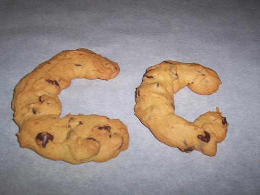
At what percentage-selection? (in screenshot its 32) By the way, are patients often given choco-chip cookies? I bypassed walnuts for tree-trunk due to the "nut" factor.
Update:
Meantime, I'm now going to try instruction #10 above.
OK, now see my 2nd attachment below
...which is outcome of instructions 1-8 (of post #10.
Am I on the right or wrong track?
Like a babe-in-woods didn't know what the heck I was doing!
BTW, each time I experimented (above) I just Exited without Saving anything.
I mean, no use saving PNGs unless I comprehend what I'm doing.


-
Thanks again Pixey for your helpful instructions
So far I've been experimenting, but wasn't familiar with the "Aligning" part.
So after a long time searching for info, I noticed that View offers a Ruler, but I didn't quite grasp how the ruler works, or for that matter why it's necessary to center align.
While I've not yet reached the Gaussian part of your instructions,
am I correct in assuming you meant to BLUR the sharp-outline for a more realism look?
Thus far, after resizing to approx. 800, then flipping vertically, here's what I got.
Is that OK so far? (see attachment,
...but I'm thinking the bottom part of the "C" ought to be less wide than its upper part, in order to make a more realistic tree trunk.
Also, it may be nice for the logo to look somewhere between 3D photo-realism, and 2D painting-drawing, but that's a tall order I guess.
BTW, as stated above, I'd been considering rather putting romaine leaves or herbals, rather than dryad, as more compatible with cookies.
Then green-pears in shape of musical-notes descending from "romaine leaves"
Any wonder I marvel at the complex designs everyone here pulls off...


-
Update:
I just now fooled for quite awhile with Dryad, but finding that I cannot curve it into a letter C.
The most I could do was "Random" which curved various parts in every which way except the letter C.
So at first I was considering using the Letter-C in my below attachment and somehow filling it in (masking??) with the brownish bark of the following trunk (which would probably take me all day to figure out if at all):
But then I came across this choco-chip-cookie in shape of C:
http://ourcraftsnthings.com/wp-content/uploads/2008/09/letterc51.jpg
And I think for my purposes it would be preferable to have the cookie as tree trunk
then romaine (or herbals) as leaves
and bartlett pears (made to look like musical notes) descending from the leaves
So if anyone can figure out an easy way to go about my objective, I'm game.
FYI, my objective, or more accurately pipedream, is a logo called CPR (Creative Patients Revolution)
- wherein the C is a tree with musical-note fruits
- and the P is a crutch looking like a trellis with blue flowers shaped like blue-cross centered within it, and a blue-outlined cloud-puff to finish off the rounded part
- and the R is sorta a sliding pond, with the steps being an aqua paintbrush, and the slide/chute shaped like the right-part of the R, with an overturned paint-can causing aqua-blue "culture-medium" to rush down chute and turn into a stream wherein blue veins & red arteries (and eyes) are growing as if they're hydroponic flowers.

-
Oh, now I remember. The reasons I was confused was:
(1) I actually had clicked Effects but saw nothing listed. But now I realize my previous DLL install was on my other thinkpad
(2) Last time, I must have referenced the main forum. But this time, I'd keyword searched, as well as sought for stickies on this discussion forum.
Bottom line, I'm finally seeing "Iterative Lines" under Effects, so now it's time to fool around.
Thanks so much Ego Eram, and hope to report back next chance I get.
-
Sorry about the static - I deleted the post.
-
Thanks so much to all of you for your input
As for Dryad (not that I quite visualize its abilities yet until I'd get to fool with it)...
....I forget how I installed that other plugin, way back when
Is there a stickie anywhere on the forum where there's permanent instructions, for people with memories like sieves?
So here's what I tried:
Once the Dryad zip file was installed to downloads folder,
I then copy/pasted dryad.DLL to ---> program files\paint.NET
(since that seemed to be where other DLL files were)
Was that incorrect, and if not, how do I now locate it via the Paint.net toolbar menu's
I can't find it under the Effects submenu's.
-
What's the simplest way to turn an upper-case C into a tree?
Sorta like the below idea, but not so fancy:
-
I see. I don't suppose IPB has suggestion forums, where users can point to XYZ forums (such as in the OP) to explain what they seek..whatever...
cheerio
-
POST DELETED BY MINNI.
-
Bump - any tips re: my above followup?
Or are there any tutorials or video's of logo's similar to what I'm trying to achieve, for me to use as a guide to follow?
-
Yep,responses were rude.Sure the op could have left out the VERY IMPORTANT bit sure.If his wish list was over dramatic then so were the responses.Not all of them mind you.Anyway,I really like the number 2 wish.
Just a little 2 cents from my perspective. While most of this topic is way over my head, I MYSELF OFTEN USE UPPERCASE -NOT- BECAUSE MY INTENT IS RUDE SHOUTING, BUT RATHER CUZ IT'S THE QUICKEST WAY FOR ME TO HILITE A POINT.
UNFORTUNATELY, THE MAJORITY OF THE WORLD ARE CONVENTIONAL THINKERS, AND (FOR SOME REASON WHICH I CAN'T FATHOM) - THE MOVERS & SHAKERS OF NETIQUETTE CHOSE TO ESTABLISH UPPERCASE AS "SHOUTING"
But logically speaking, it's not logical to interpret a posting's INTENT as rude, on the mere basis of a technicality.
Yet people do it all the time. Which is why I often appreciate smilies.

-
I think it could actually work, if a forum-designer would program it in a certain way.
For example:
Say someone does not click Neither beginner Nor advanced.
whereupon:
You can't proceed until you choose "beginner" or "advanced"
So that person then carelessly clicks "advanced"
whereupon:
Just double checking:
Are you sure your question is an advanced, and not a beginner question?
_ yes - Note: if the answer is no, click the Back button and re-decide)
Then again, I'm not sure whether my own questions have been considered beginners or advanced, so that might have to be clarified to Newbs in a stickie.
-
I don't read allot on the computer since it makes my eyes wet after a while, (also why I work less on it and things take longer)
and those small IOS/Android phones, I don't have them since i can't read anything of them text too small.
Interesting to know there's someone else around here who is (sorta) where I'm at!
The difference is that I'm beyond the point of wet-eyes.
That was in my past.
At this time, they're way more parched than they're wet.
I too prefer paper (never owned kindle)
and preferably no more than, say, 40 pages geared to basics such as logo's and posters.
...and, yea, bumper stickers
The majority of the world don't understand us old fogies with sensitivities.
It's why they're not rushing to make Chemical-free, ZeroBacklight LARGE tablets.
Sorta like Fit-PC2 coupled with Larger Pixel-Qi displays (and chemical free)
With all that, I've no doubt the book must be fantastically well-written, given the numerous concisely-informative responses by Scott on these forums!


Newer Paint.Net radically better than 3.5.11?
in Paint.NET Discussion and Questions
Posted · Edited by minni
Voila - smoked fries http://www.stayatstovedad.com/.a/6a00e55503a4a388340154361c1e71970c-800wi
Seriously - even paint.net's burnt 3.xx leftovers are more palatable other menus!