
Leaderboard


Popular Content
Showing content with the highest reputation on 02/21/2017 in all areas
-
Pyrochild wrote a marvelous Gradient Mapping plugin. However, its possibilities are uncovered not completely. I found some gradients at our Forums. Note: gradients for old version of a plugin (like MiguelPereira's Gradients) are incompatible with the new version and can lead to crash paint.net. Gradients.zip by MiguelPereira for new version Gradient Mapping. Contains 4 gradients: Lemony, Rainbow, Weird, and Weird2. Sarkut's Yellow Gold gives golden color to elements of your image. ThermalImage by natjo1986. It fades from purple to red or fading from cold then to hot. Pop_Art_Hope colors the image in PopArt style. Pratyush's Metallic Presets contains 16 different gradients of shades of metal. Pratyush's Sky Presets contains 23 different gradients type of sky. I made some presets to stimulate usage of Gradient Mapping. Note: put in a folder Gradient Mapping only gradients necessary for you. At a large number of gradients, you can not see them all in the drop-down list of gradients. Black and White.zip contrast gradient for tutorials. Bokeh.zip contains 11 different gradients which allow to paint parts of the image in color inherent Bokeh effect. Chocolate.zip contains 9 different gradients of chocolate color. Colors.zip contains 9 different multi-colored gradients. Fire.zip contains 12 different fire gradients. Fruity.zip contains 13 different gradients with fruit undertones. Gels.zip contains 25 different gels gradients. NEW! Golden.zip contains 9 different gradients of golden color. GreensAndBlues.zip contains 12 different gradients in green and blue tones. NEW! Harmony.zip contains 7 different multicolor gradients. Metalls.zip contains 5 different gradients of shades of metal. Neon.zip contains 10 different gradients like a neon glow. Pastel.zip contains 8 different gradients (an analogue of the Photoshops gradient set Pastel). NEW! Pop_Art.zip contains 15 different presets for creation of portraits in Pop Art style. Rainbow.zip contains 9 different gradients in rainbow tones. Silvery.zip contains 10 different presets with silver shades. Simples.zip contains 14 different two-color gradients. Spectrum.zip contains 5 different four-colored gradients. Vintage.zip contains 10 different preset for changing the image like a vintage photo. I hope to see your work with presets for Gradient Mapping. Open for itself the wonderful world of colors! To be continued...4 points
-
@ReMake! Thanks for all your hard work. The combination works really well.3 points
-
Dear @Pixey! This is very interesting tutorial. I hope I did everything right. Thank you so much for your effort.3 points
-
Thank you, thank you, @ReMake! My head is swirling with ideas already!3 points
-
This tutorial is available as a PDF. Click here to view or download it Bevel Selection AA's Assistant Sarkuts Yellow Gold - found at the bottom of his tutorial. Gradient Mapping Metalize Emboss - which I think is standard now with v4. Font used is: Frankenstein (can be found on fontzone.net) Tip: Remember to save your work frequently in case of a crash. 1. Begin with a canvas of 800 x 400 and fill with black. 2. New Layer - with color FFD800 and size #192 type your text. Align centre & Gaussian Blur at default. 3. Holding down Shift select just outside of the text with the Magic Wand - then Ctrl and Invert selection and make a New Layer. Then go to Effects - Stylize and Emboss and change the layer mode to Overlay. 4. Go back to layer 2 – which should still be selected and go to Effects – Selection - Bevel Selection at default. 5. Now you must deselect! 6. Use the Magic Wand with shift held down to select directly on the yellow text on layer 2. Play with the Hardness/Tolerance in the top tool bar until you get a nice selection inside of the text – about 20. 7. Make a New Layer and use the Paint bucket to fill the inside selection with a light grey color # 808080. Deselect and Gaussian Blur at #4. 8. Select the same layer again with the magic wand, invert and add Noise at an intensity of #60. With it still ‘selected’ go to - Adjustment – Black & white and then Effects – Object and use AA’s Assistant at default. 9. Duplicate the layer and change the mode to Negation. Deselect. Remember to ‘save’ your work periodically. 10. Go to the text layer 2 and use – Color – Metalize at default and repeat one more time. Use AA’s Assistant twice. 11. Go to – Adjustments – Gradient Mapping and make sure both the boxes are checked. 12. Finally play with the Curves Plugin and then the Brightness and Contrast of about 13 and 2. Or as to your liking. 13. Duplicate the last layer for more intensity and also you can play with the layer modes on the two layer # 4’s, as well to change the color of the inside of the text. 14. Finally save your work in PDN first, then Flatten and save in .png. Hint: To add depth to the text use Effects – Object – Trail.2 points
-
Today something completely different ...2 points
-
My version.. I've used Artistic -> Sponge... instead of Noise for the silver look and changed/simplified some other steps too. The second one shows a combination of Sponge, Bevel Object of the resulting two tones in alternate directions and Noise. After flattening Star Glow was added like in the first one.2 points
-
Here's my attempt:2 points
-
Thanks for this compendium of presets, ReMake! I'll sure test them all ? ?2 points
-
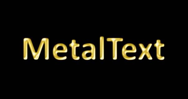
This tutorial is available as a PDF. Click here to view or download it A way of making gold metal with Metalize, Gaussian Blur and Gradient Mapping. Metalize, AA's Assistant Align Object Alpha Mask Gradient Mapping Demo. Open a new canvas of 200x500. Fill the background with black, make the layer not visible, make a new layer. Add some 108 size text, Gaussian Blur @ 1 radius, AA's Assistant at default, name the layer "Mask". ====================================== Copy the Mask layer into the clipboard. On your keyboard, press: Ctrl + A Ctrl + C Ctrl + D This will select All of the layer, Copy the selection into the Windows clipboard, and Deselect. Make the Mask layer not visible. Position a new layer below the Mask layer, fill it with a vertical linear gradient of Hex C0C0C0 to Hex A0A0A0. Name the layer "Text". ====================================== Apply Alpha Mask with all checkboxes filled. ====================================== With the Shift key down, Magic Wand the alpha outside the text, Invert selection (Ctrl+Shift+I) Make a new layer and apply Bevel Selection at default settings. ====================================== Deselect and Gaussian blur @ 4 radius. Merge down. Duplicate the layer twice. Apply Metalize Type 1, to the lowest text layer, Type 2 to the middle layer, Type 3 to the top layer. ========================================= Set the middle and top layers to Negation blending mode. ======================================== Gaussian Blur all three text layers @ 2 radius. Merge the middle text layer into the bottom text layer, then merge the remaining upper text layer into the bottom text layer.. Apply AA's Assistant at default settings. Use Gradient Mapping to colorize. Be sure to have the Preserve Alpha box checked. ======================================== The key is to apply enough blur at each step to eliminate internal jagginess without blurring excessively. Objects of different sizes, shapes, and gradients of different character will require adjustments to these settings, blend modes, etc. to get the best results. ============================================== Can be used for jewelry making. With Trail plugin. Regarding Gradient Mapping Hidden Content: Copy/paste the XML into this folder. "C:\Users\<"Username">\Documents\Paint.NET User Files\Effect Presets\Gradient Mapping" Then choose it from the top dropdown menu. The Load button doesn't seem to work for loading the XML file. (Maybe it has a different purpose.) Sarkut\'s Yellow Gold.zip


 1 point
 -
Thank you, Max!! Thank you, Seerose!!1 point
-
Thank you so much @ReMake for the additional colors . And here is my rendition using the golds - which I'm loving .1 point
-
Four sets of gradients are added to the first post: Bokeh, Colors, Harmony, and Spectrum.1 point
-
Pixey, Maximilian, LionsDragon, hope to see the results of applying presets. lynxster4, great job. Seerose, my portrait looks amusing among a gradient. Thanks to all.1 point
-
Dear @lynxster4! You play with Paint very well. I love your works.1 point
-
Dear @lynxster4! Congratulations on the Galleria nomination!1 point
-
Awesome, thank you!1 point
-
Many congrats on the Galleria promotion!!1 point
-
Cracked makeup Pressure1 point
-
This tutorial is available as a PDF. Click here to view or download it This tutorial is all about the marvelous Gradient Mapping plugin, by Pyrochild (available here). Download it first. So, there's been some confusion as to how this plugin works, as expressed on the PdN chat on dA. Now, I don't claim to be an expert, but I do have a couple days' experience on all of you, so... 🙂 Here we go, an explanation of Gradient Mapping. Now, you all know (if you've downloaded this plugin) that the dialog consists of a gradient bar, a drop-down box, and a little bit more that I won't go into here. Let's start with the drop-down marked "Source." As you may have gleaned from the title, it selects which bits in the color code from each pixel are used as the "source." Got it? No? Well, let's go more in-depth, then. How about a pretty picture? We might call this "Before." We might. But we won't. 😉 As you can see, it's a rather understated little .PNG with a white-to-black gradient stretching from left to right. Now, the default in the "Source" box says "Luminosity," no? So maybe we can understand Gradient Mapping better if we examine the luminosity of the gradient. Well, obviously, the Luminosity of the pixels at the far left is very high. In fact, it's 255. White has the most luminosity possible. On the other hand, Black has very little Luminosity. None, in fact. In numeric form, white's luminosity is 255, while black's is zero. Somewhere in the middle, assuming you have a gradient that spans 256 pixels or more, each value of luminosity is shown at least once. And that means that in the very middle, there's one that equals 126. Are we clear? (Actually, we'll get to transparency in a second. 🙂 Okay, bad pun...) All right, if you follow, let's open Gradient Mapping. It's in the Adjustments menu, which I can't remind you of quite enough. Beautiful defaults, no? Okay, enough sightseeing. Take a look at that gradient across the top of the dialog. At the far left is a black color, in the center is a red color, and on the right is a white color. Conveniently, that's the same pattern (in reverse) on the live preview behind it! Now, what do we know about the original gradient? And why is it in reverse? That's right. The luminosity decreases successively from 255 on the left to zero on the right. Somewhere in the middle, it's about 126. Hmm. Coincidence! The new gradient has a completely white color on the left, a red color in the middle, and a completely black color on the right! Are the wheels chugging? That's right! The value of luminosity is "mapped" across that gradient in the dialog box. And wherever in that photo that particular value of luminosity appears, it is replaced with the color that is on the gradient in the dialog! So the far left of the gradient in the dialog is mapped to the lowest value of luminosity in the picture; that means that the pixels with the lowest luminosity in the image (the black ones) will be changed to the color at the far left of the gradient in the dialog, and the pixels with the highest luminosity in the image (the white ones) will be changed to the color at the far right of the gradient in the dialog. See what I mean? It takes the values of the selected channel (Luminosity), and "maps" it across the dialog's gradient (0 on the left, 255 on the right). Then it finds each value of that selected channel in the image, and recolors it to the color that's mapped to that number. Let's look at a couple of other Sources to see more. How about Alpha? See, the Alpha value of the entire image is 255; it's perfectly opaque. So it recolors every single pixel to the color on the far right, which just happens to be white. Let's try Key / Black as the source now. Notice that, in the original image, black was on the far right; but, since we're measuring the amount of Black as the source now, and black is on the left of the dialog gradient, the pixels in the original image that had the least black (Black = 0) get recolored to the color on the far left of the dialog gradient, which happens to be black. (If you still don't understand, try the image with just white and see what color it turns; then with just black, and then with a shade of gray. You'll see that the white [lowest amount of black] comes out black, the black [highest amount of black] comes out white, and the gray [middle amount of black] comes out red.) Head still spinning? Try some other Source channels. You'll see that the pixels with the highest value of whatever channel you've selected in the drop-down box will be recolored to whichever color is on the far right of the dialog gradient, and vice versa. Clear? Let's see a photograph! Stunning, no? But we're not here to lollygag. Let's mess it up! 🙂 Gradient Mapping, with defaults: Notice that the part with the highest luminosity (the part where the light hits the floor) is recolored to the color on the far right of the dialog gradient. White! Alpha is completely blank. Nothing to see there. Again, it's entirely opaque, so it turns it completely black. How about "Key / Black"? This one's fun! 🙂 Oooh! See, where the light hits the floor had the lowest amount of black in it (zero), so it recolored it with the color from the Zero end of the dialog gradient! Ah, we're working up to something here! Let's try different colors. Right click on the left and right sliders and click "Change Color." Here's what I changed them to, and the result: See, the parts of the image with the lowest luminosity became the color at the left of the dialog gradient (blue), while the parts of the image with the highest luminosity became the color at the right of the dialog gradient (radioactive green)! So, how can this work for you (besides cheap parlor tricks with images)? Multicolor gradients! Let's say you wanted a seven-color gradient; Red, Orange, Yellow, Green, Blue, Indigo, and Violet. Sure, you could use BB and Ilnab's plugin, but why? Just create a black-to-white gradient, like in the first image, and: (right-click and hit "Spread Colors" to evenly space them) And theirs can't do this: (Though that might be a point of pride) Eastertime, anyone? Anyway, play around with your Gradient Mapping plugin. And share what you do below! (If you like, you can right click and save the .XML file, and post it below with the code tag) Hope this helped! For more gradient mapping fun, check out Natjo's tut: viewtopic.php?f=15&t=20738 (And BarkBark's comment is a good one)1 point


